Skip to Content

Portfolio


A look at our latest projects


CHAPUT

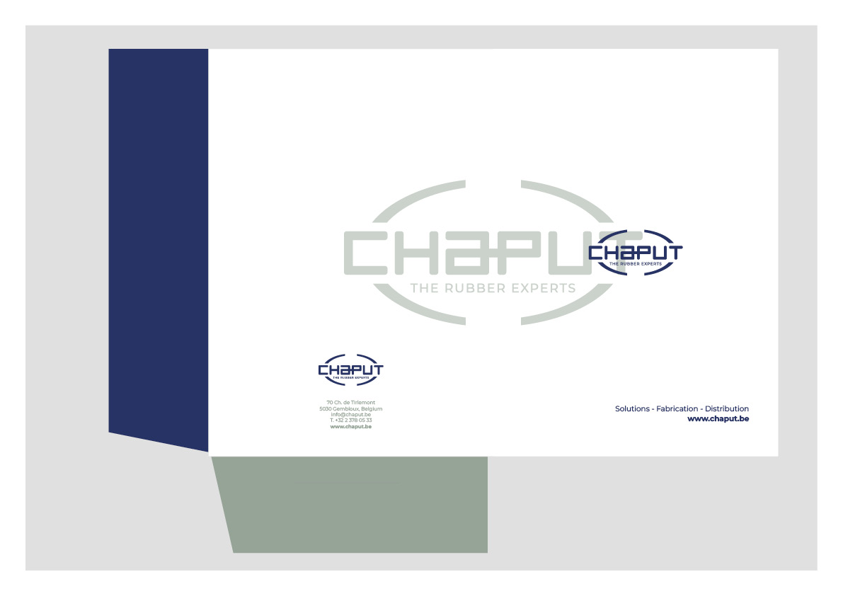
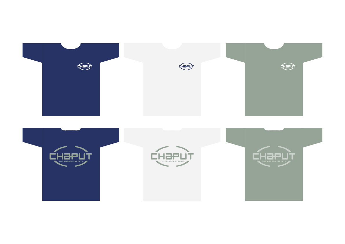
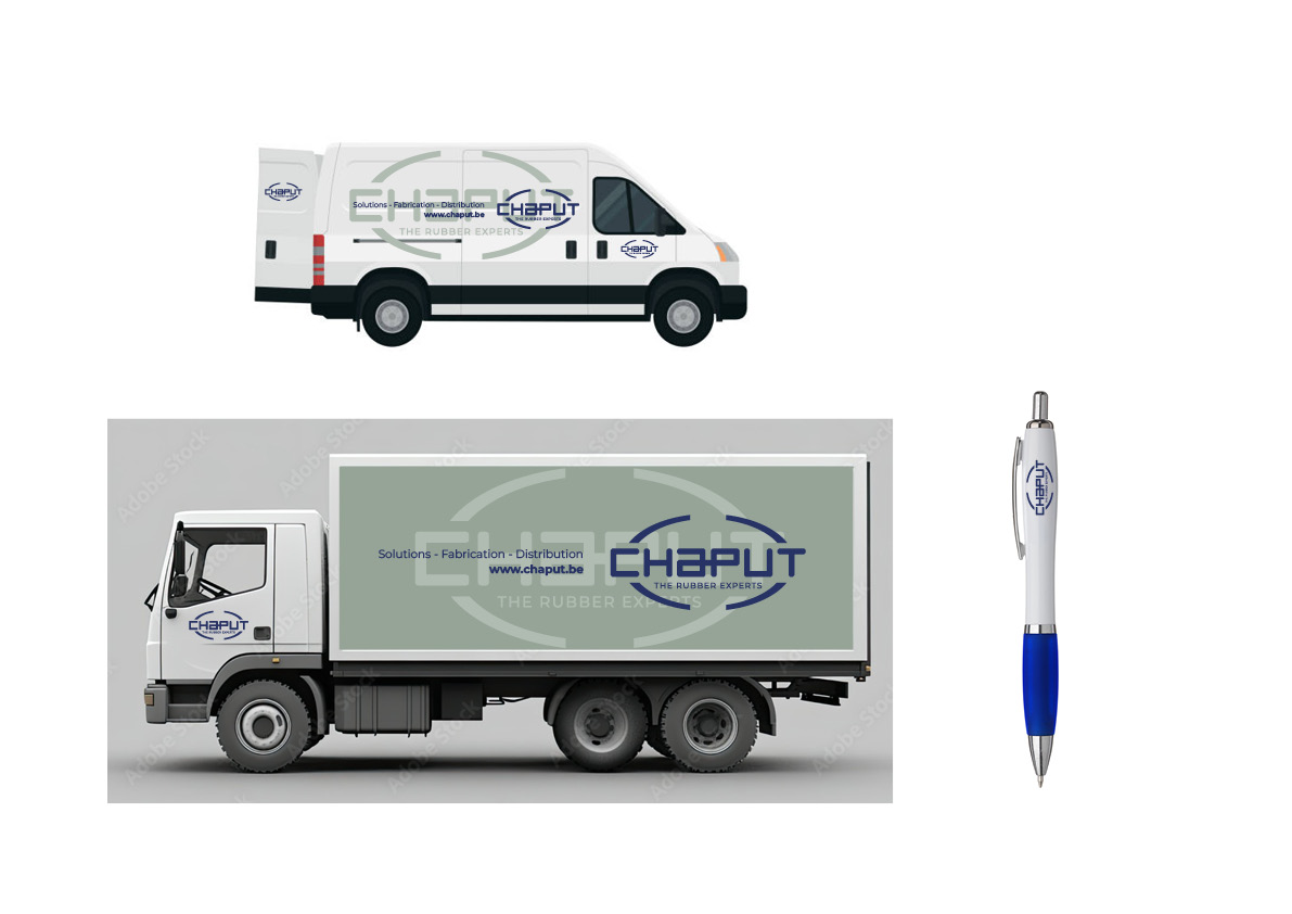
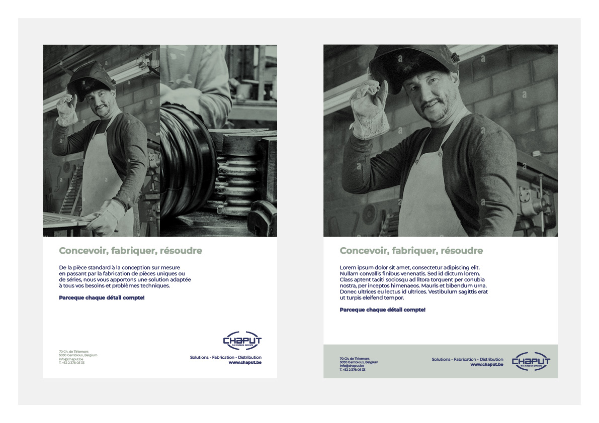
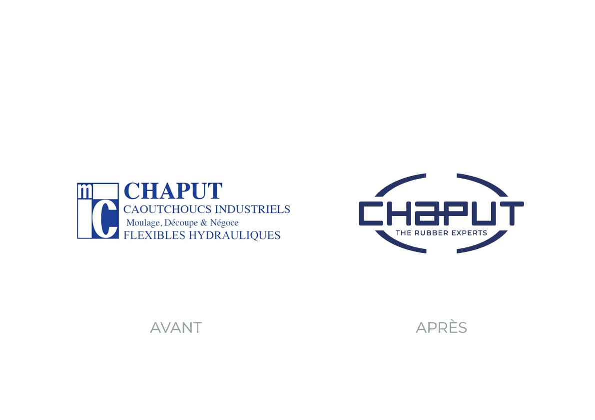
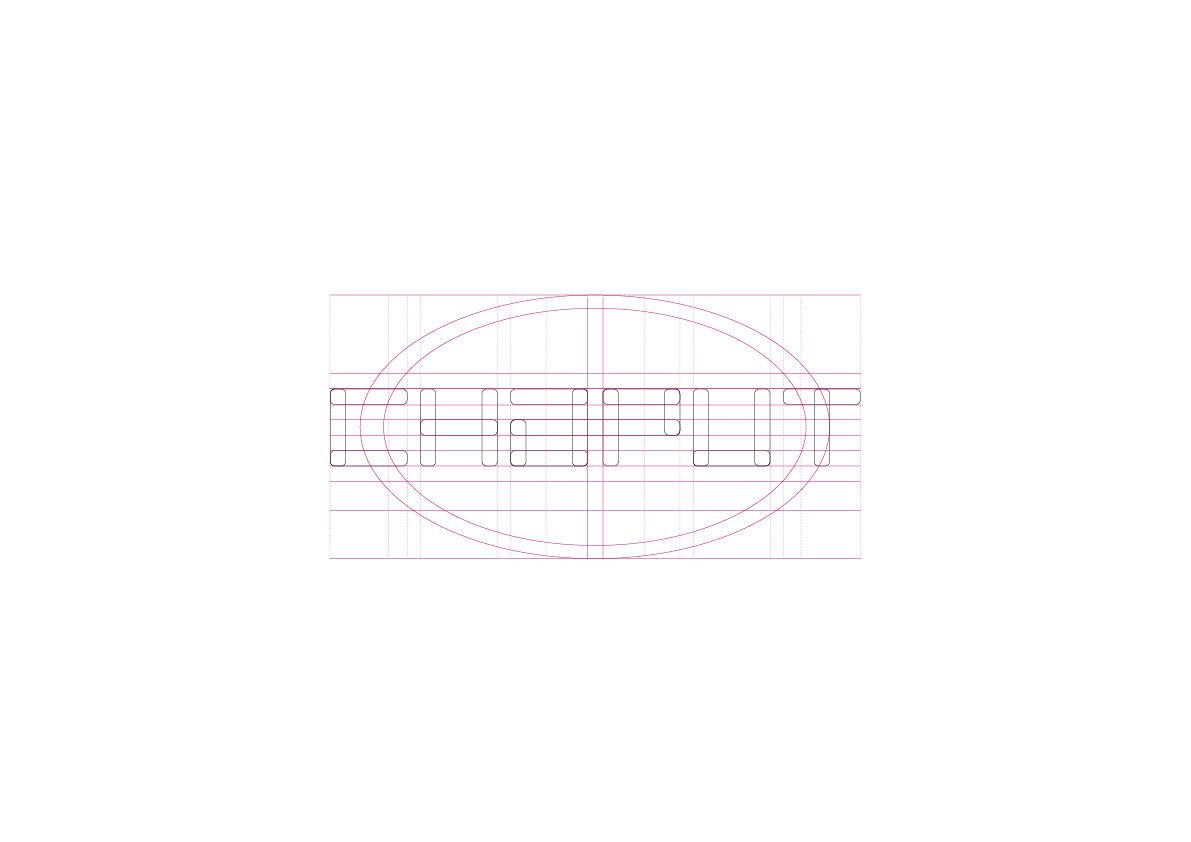
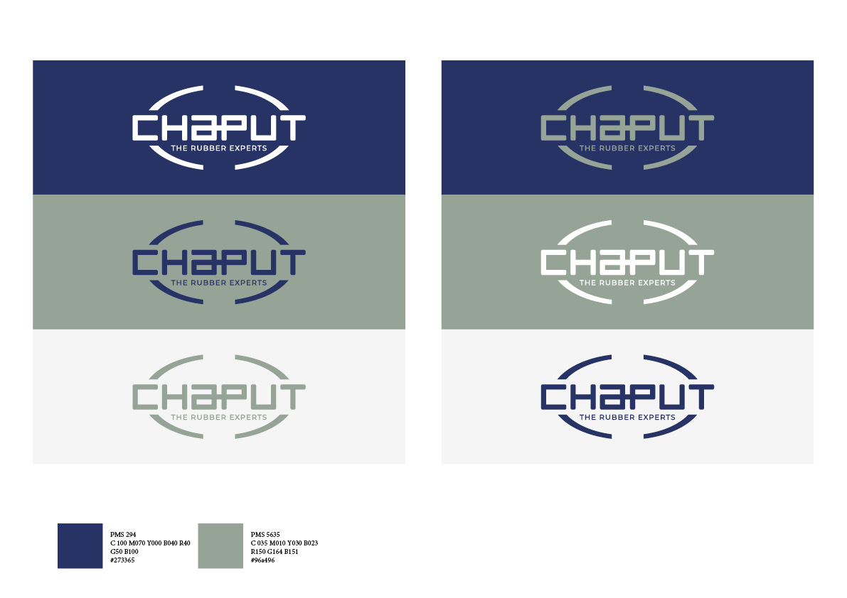
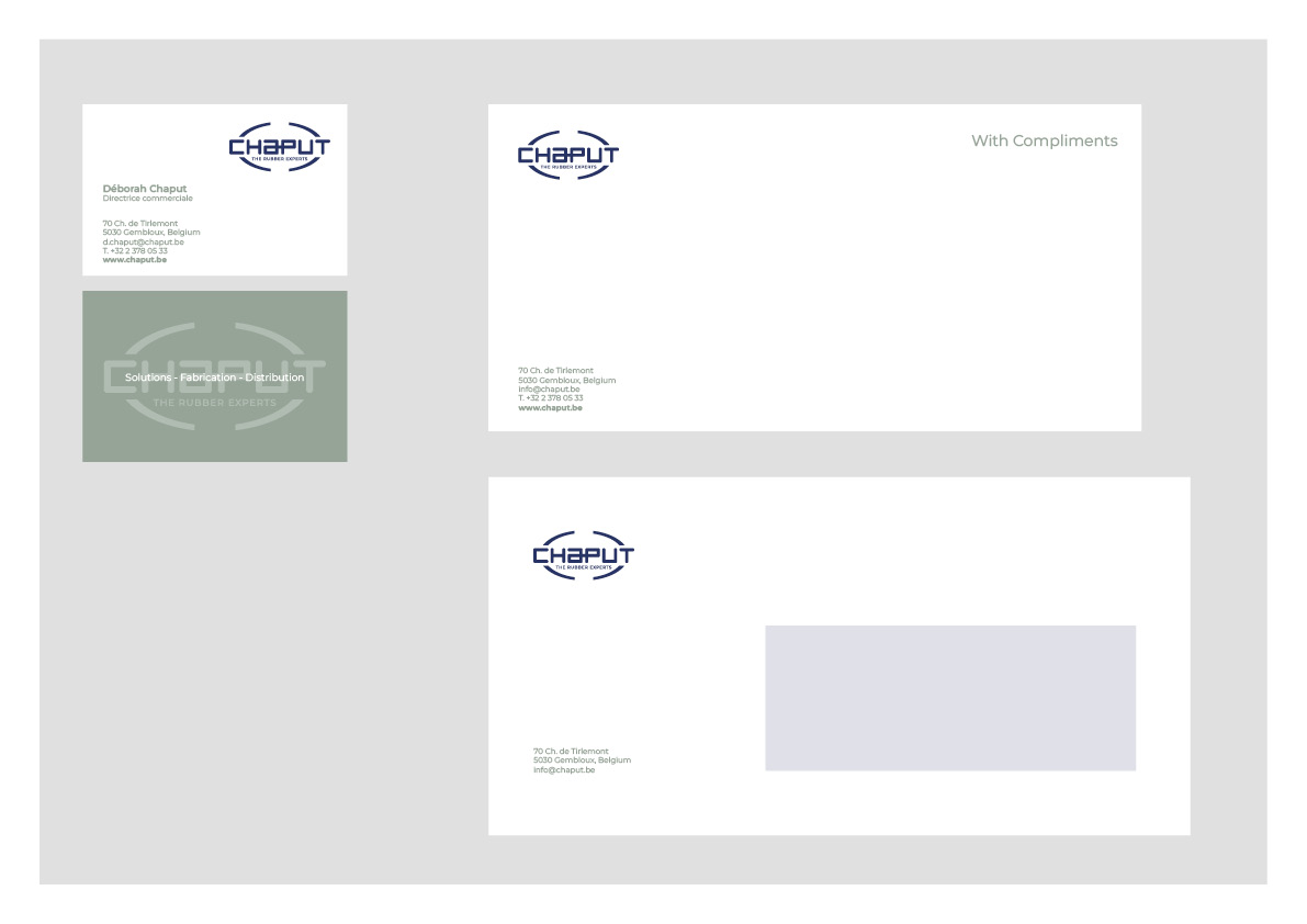
CHAPUT is a family-owned SME specializing in the design and production of industrial rubber parts. From standard components to custom designs, and including the manufacture of one-off pieces or production runs, they provide solutions tailored to every technical need and challenge.

Project Description

As a family business, a new generation is taking over the management of the company. After working on positioning and values, Chaput commissioned SKWAADRA to review its visual identity and implement it across the various communication materials of the company.

DANIÈLE ZUCKER ART PHOTOGRAPHY

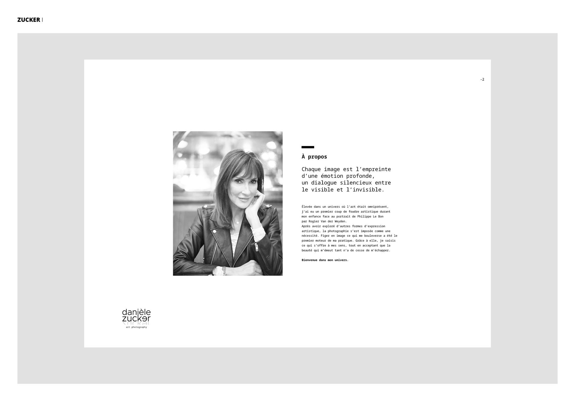
Danièle Zucker is a photographic artist who works on different themes. She has been exhibiting her works for about ten years in several major galleries.

Project Description

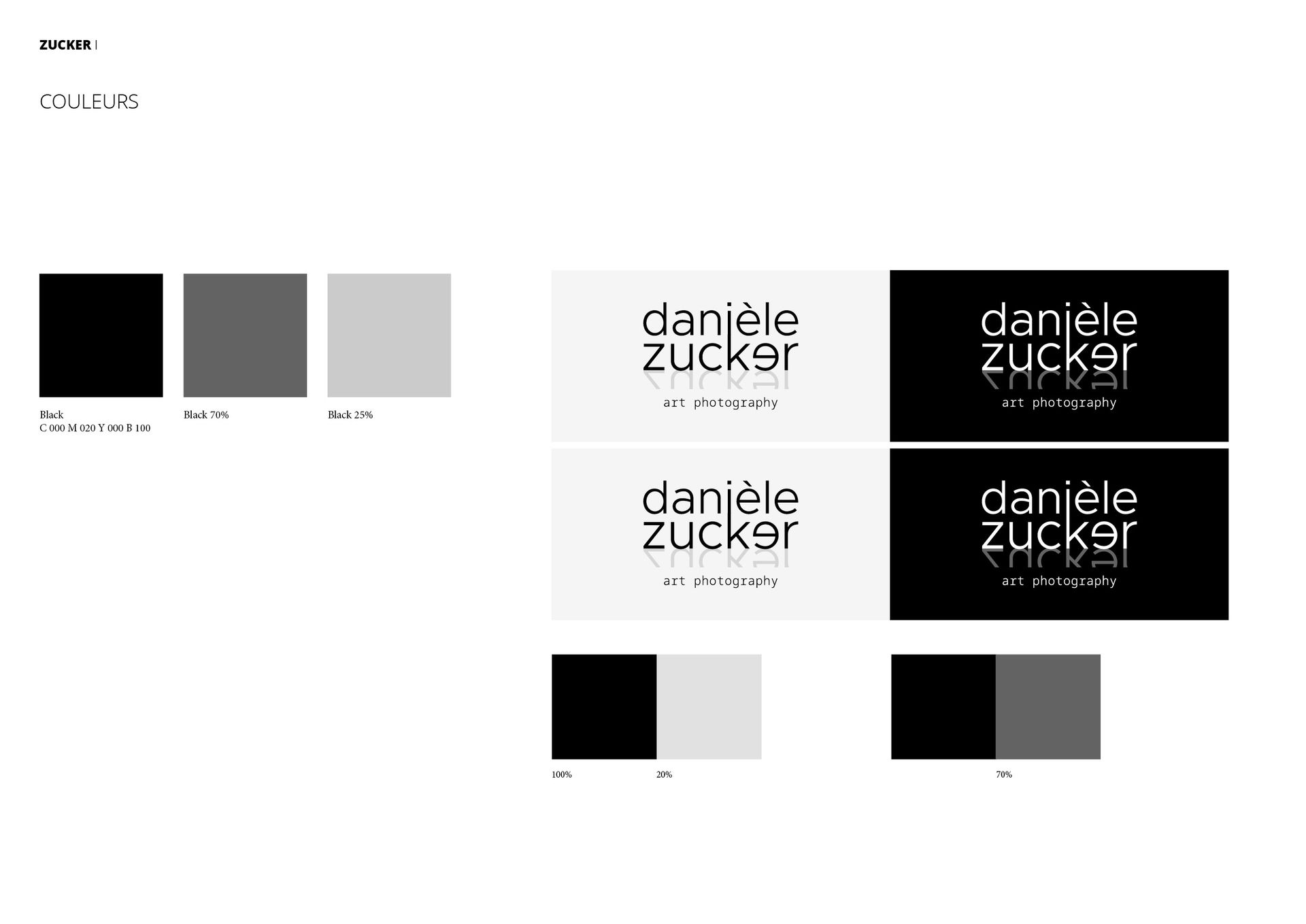
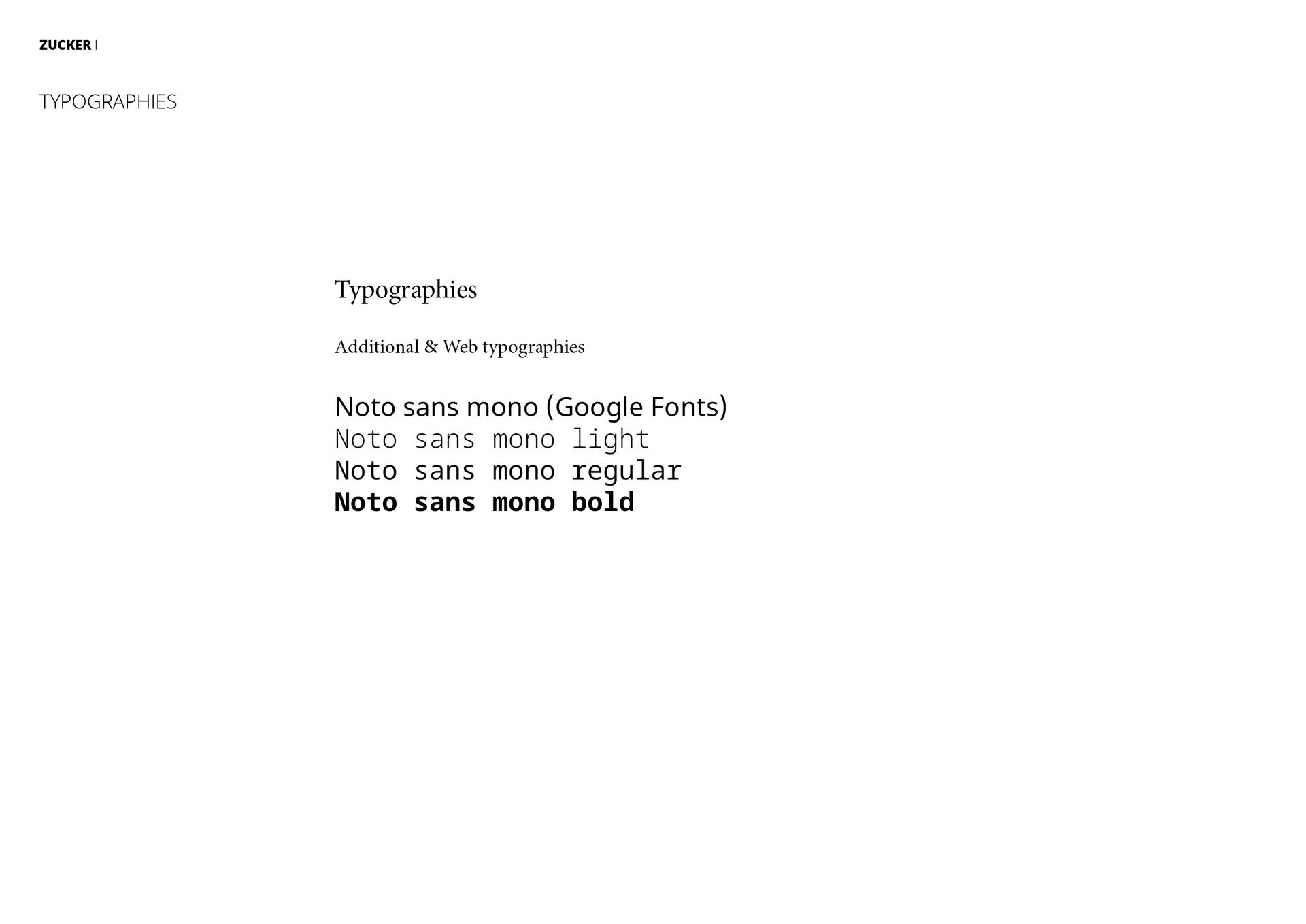
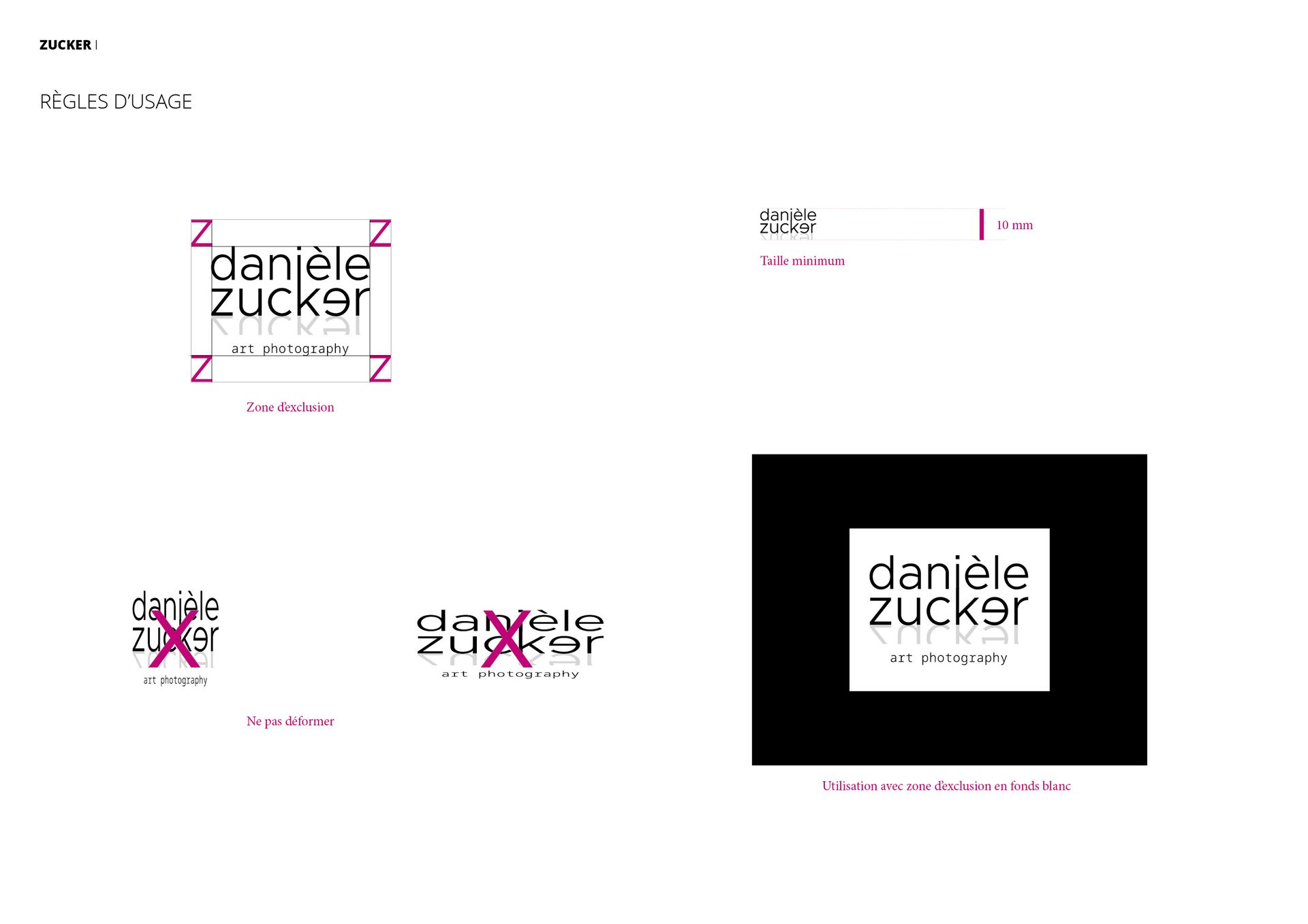
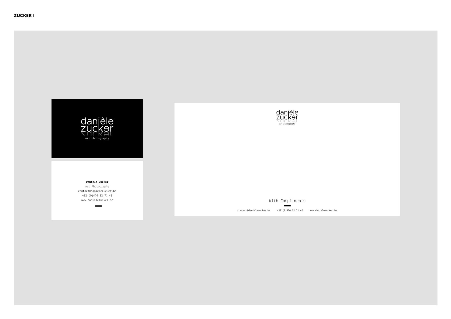
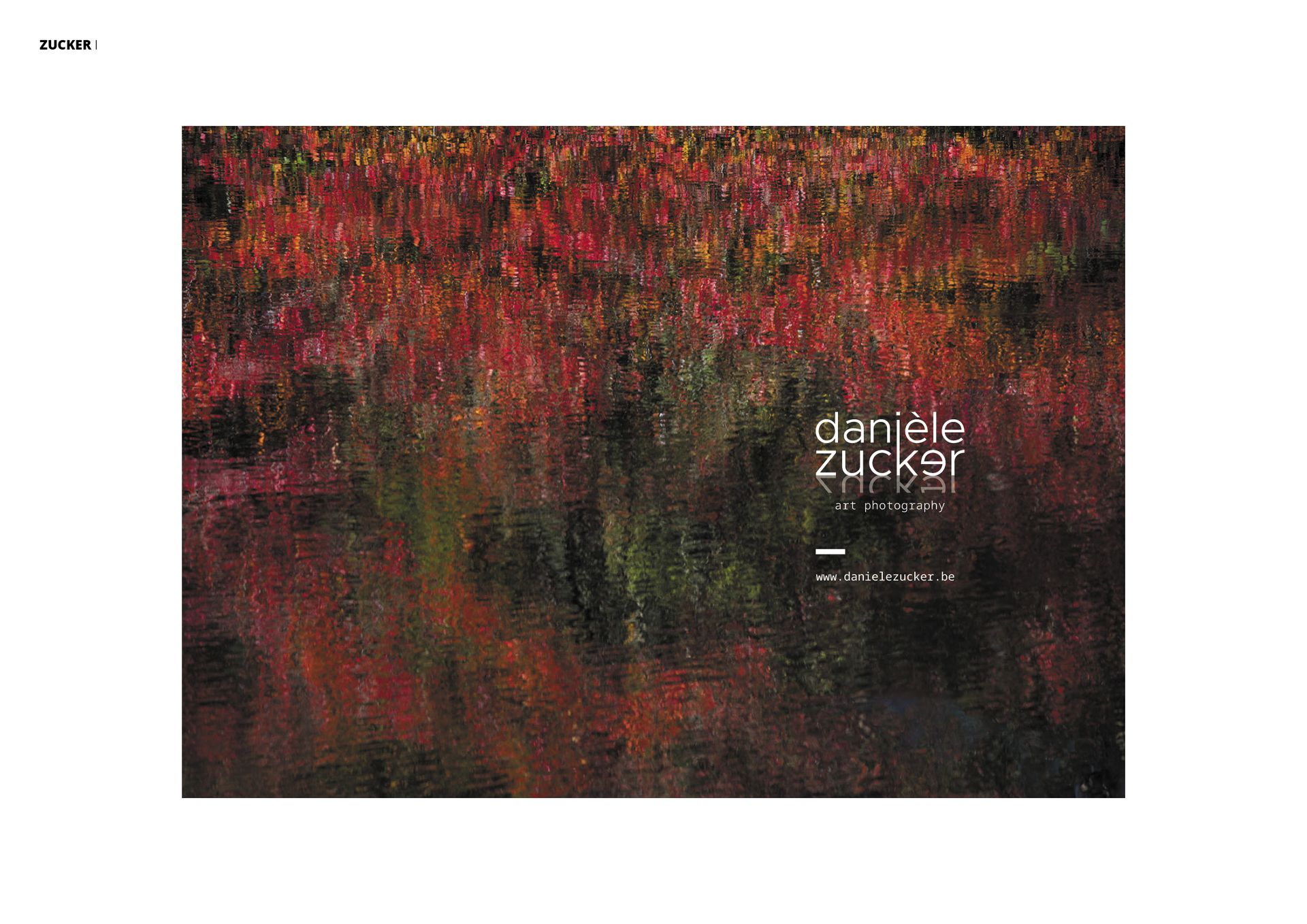
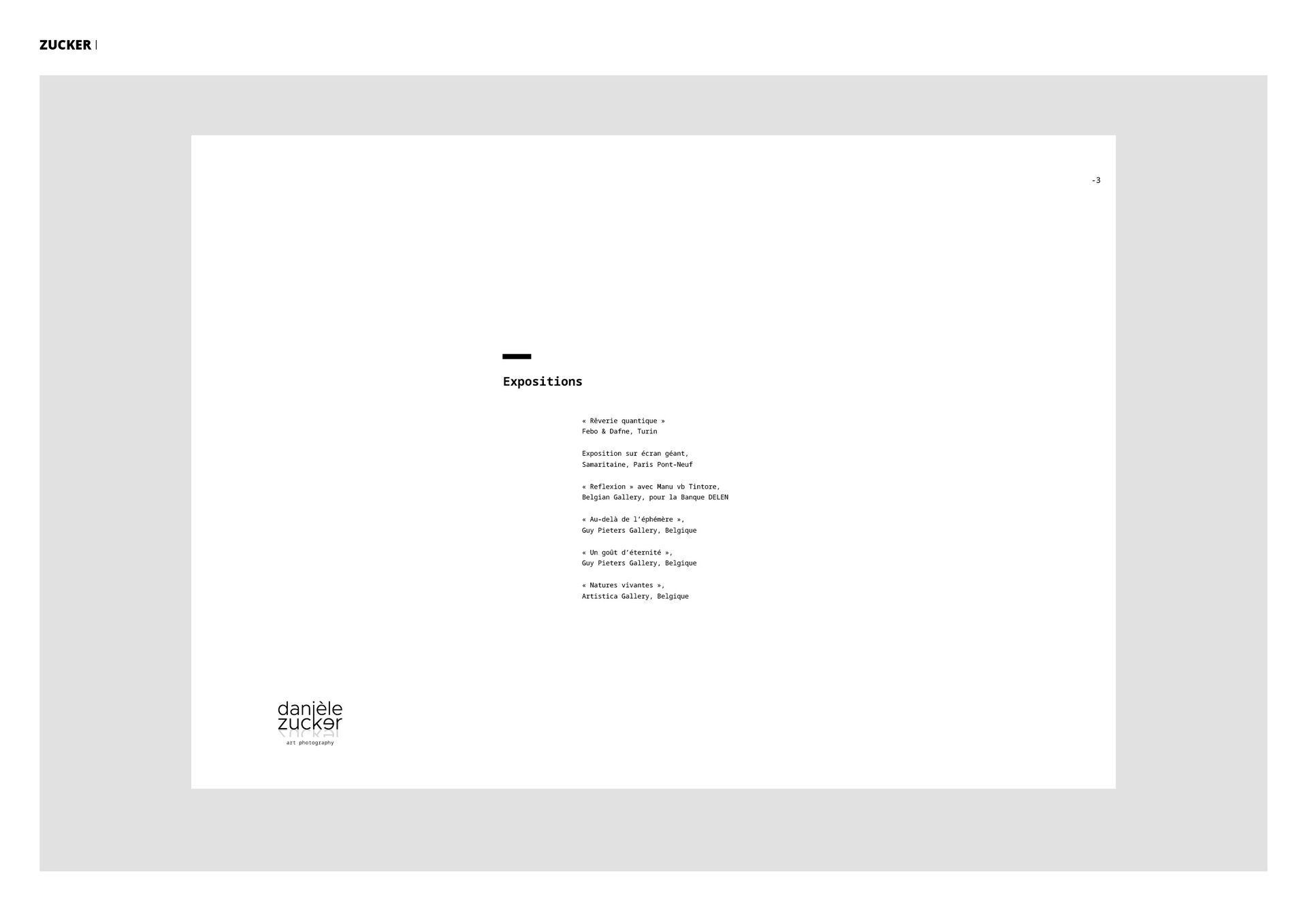
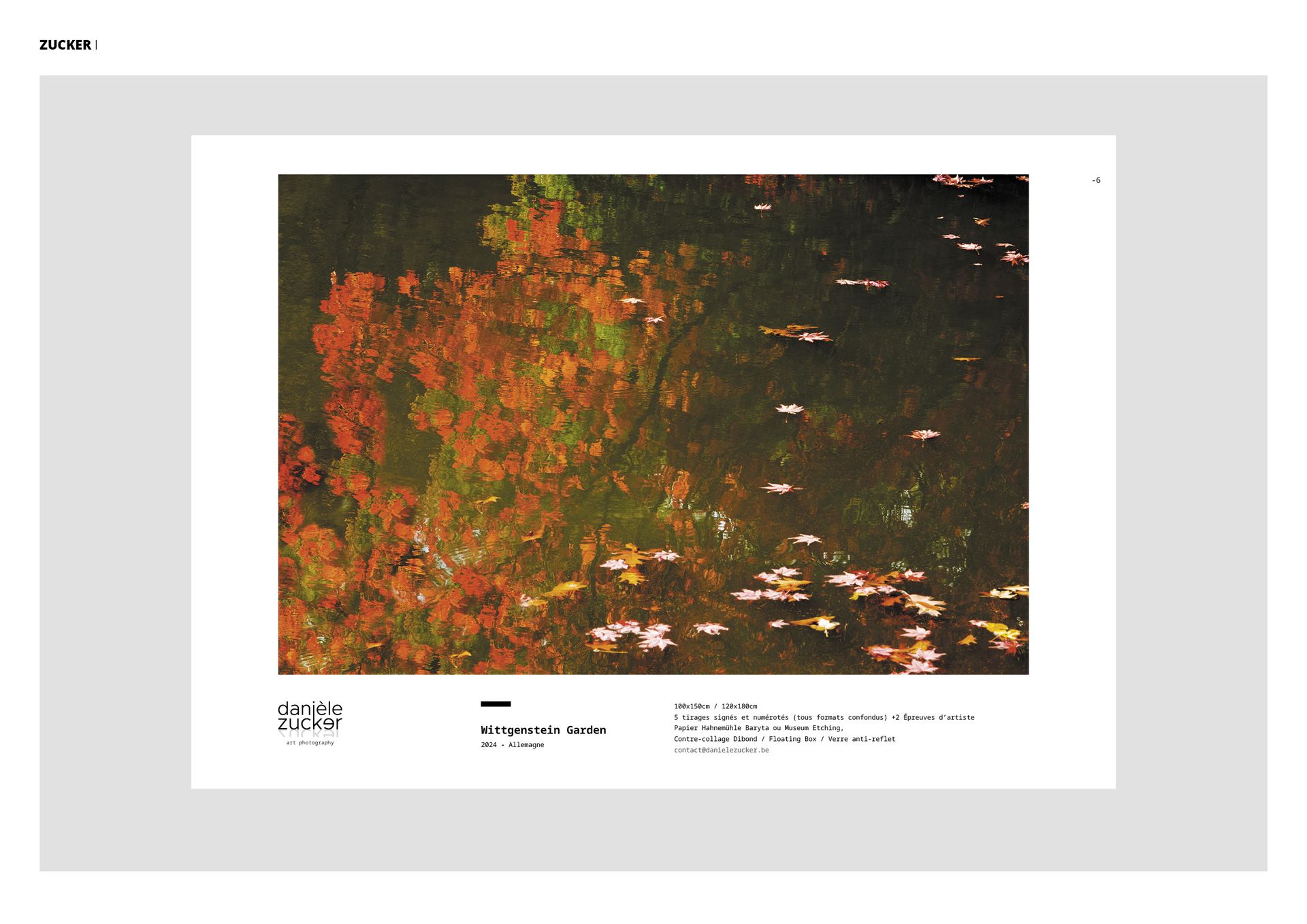
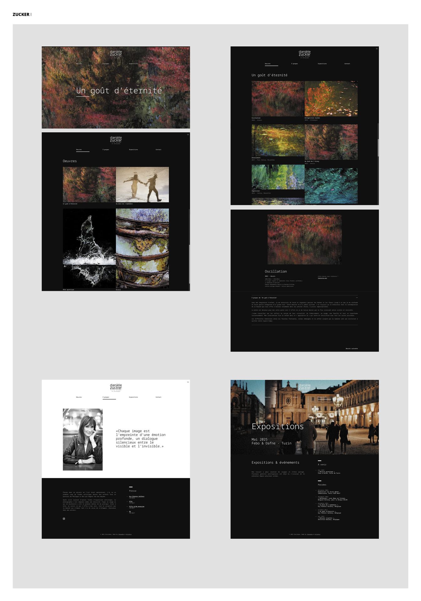
We designed the visual identity with the concern of having a logo that is evocative of the artist's personality but also reveals the originality and mystery surrounding her work. The entire black and white graphic environment plays on simplicity with the choice of a unique typography and a look & feel that highlights the works. A website has been created as well as portfolios of the different series of works, and an exhibition catalog is in preparation.


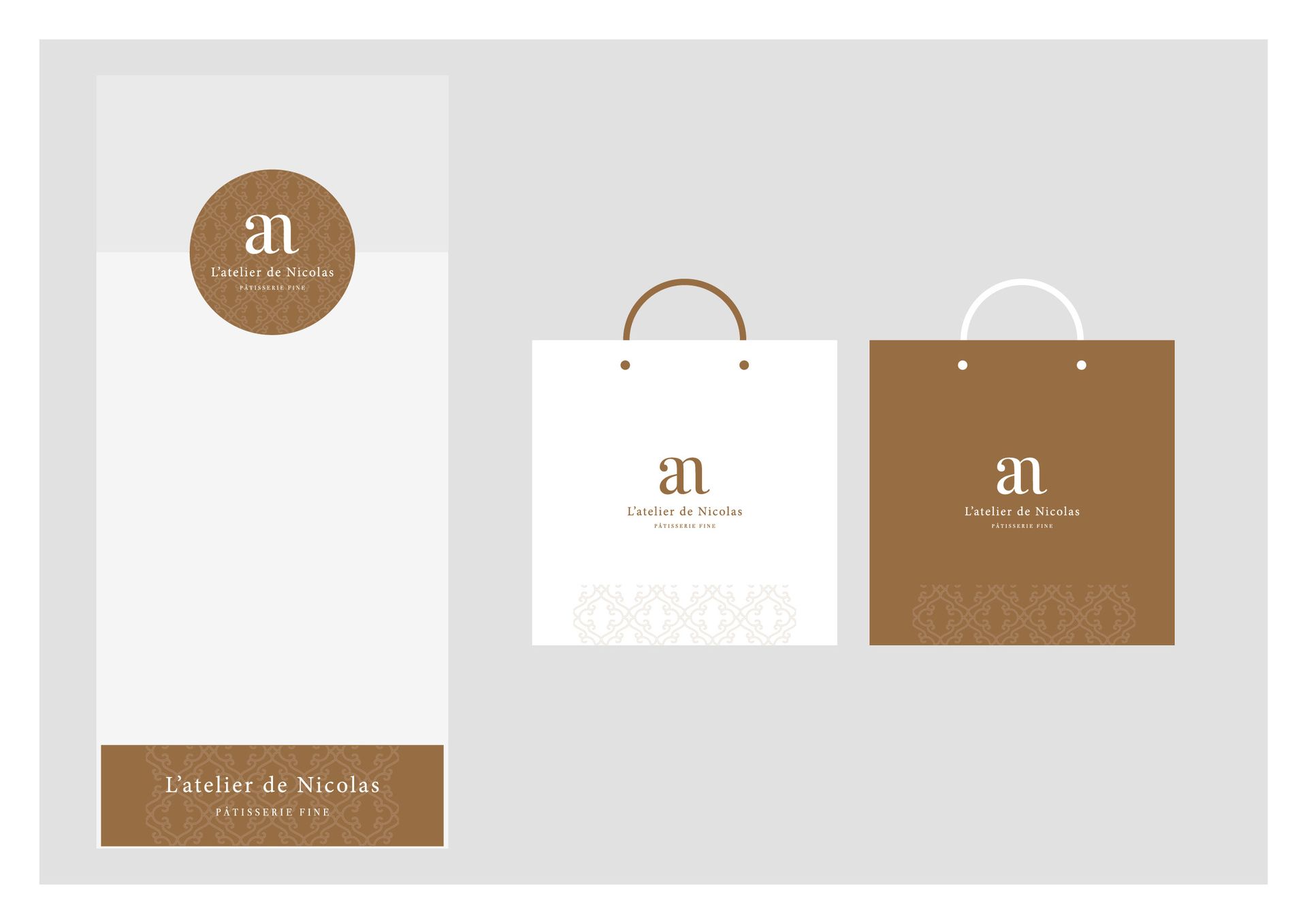
L'ATELIER DE NICOLAS

L'Atelier de Nicolas, founded by Nicolas Hermans, is a new pastry brand that highlights natural products and craftsmanship. His rigor and creativity allow him to create products that have a single common denominator, excellence.

Project Description

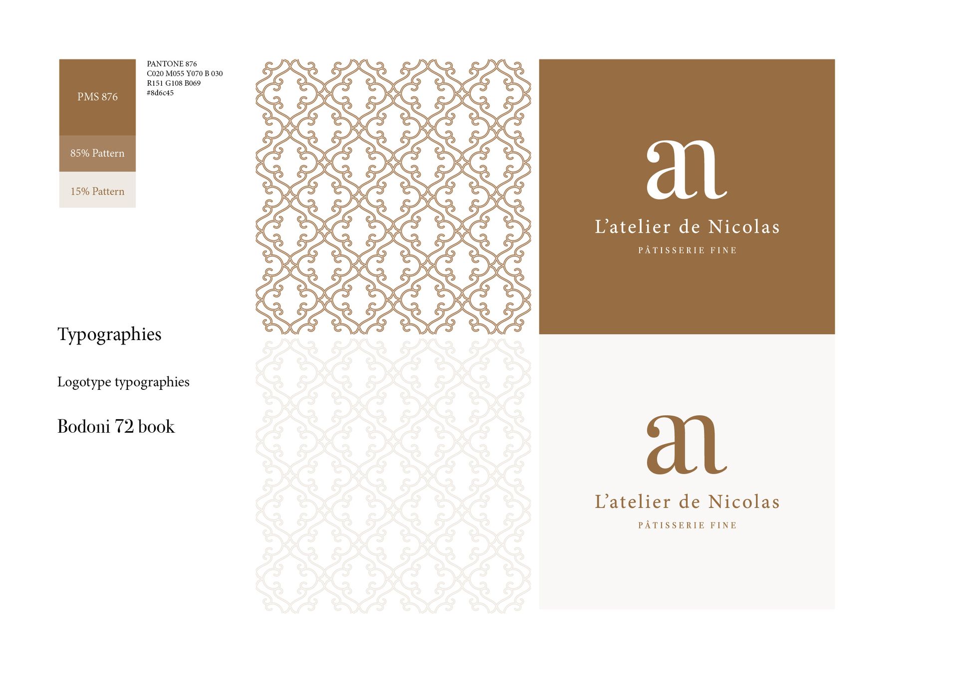
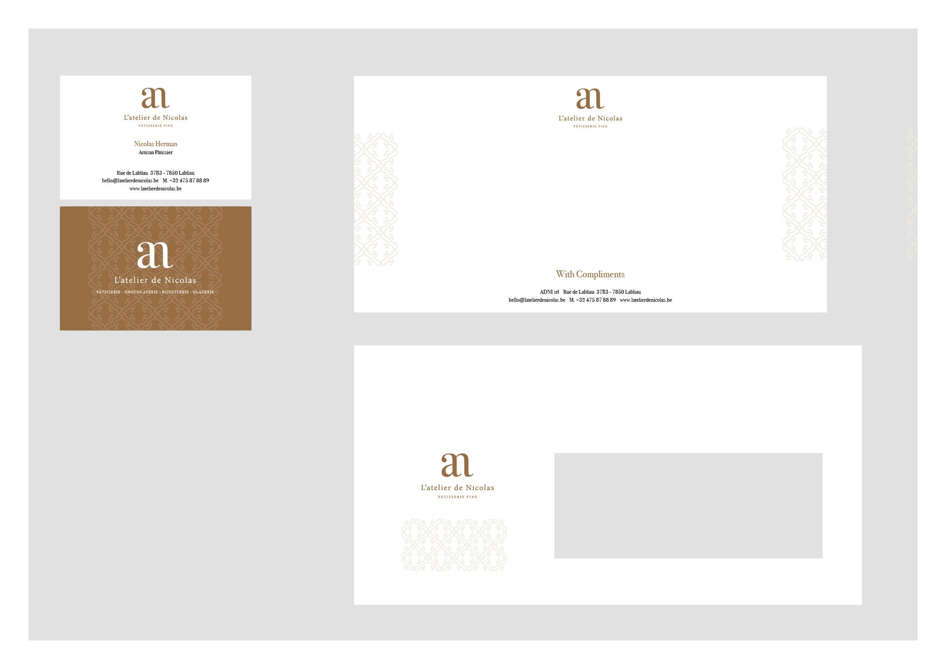
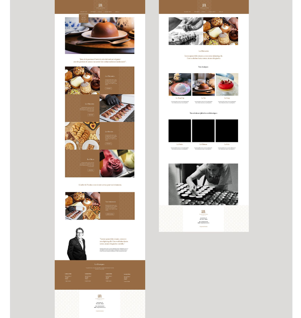
We designed the visual identity of L'atelier de Nicolas by integrating a brand concept evocative of the simplicity and excellence of its products. The design needed to reflect this blend of know-how, rigor, and creativity. We placed great importance on creating a logo that is immediately recognizable and adaptable across all media in a simple and effective way. We are currently working on the development of the website.


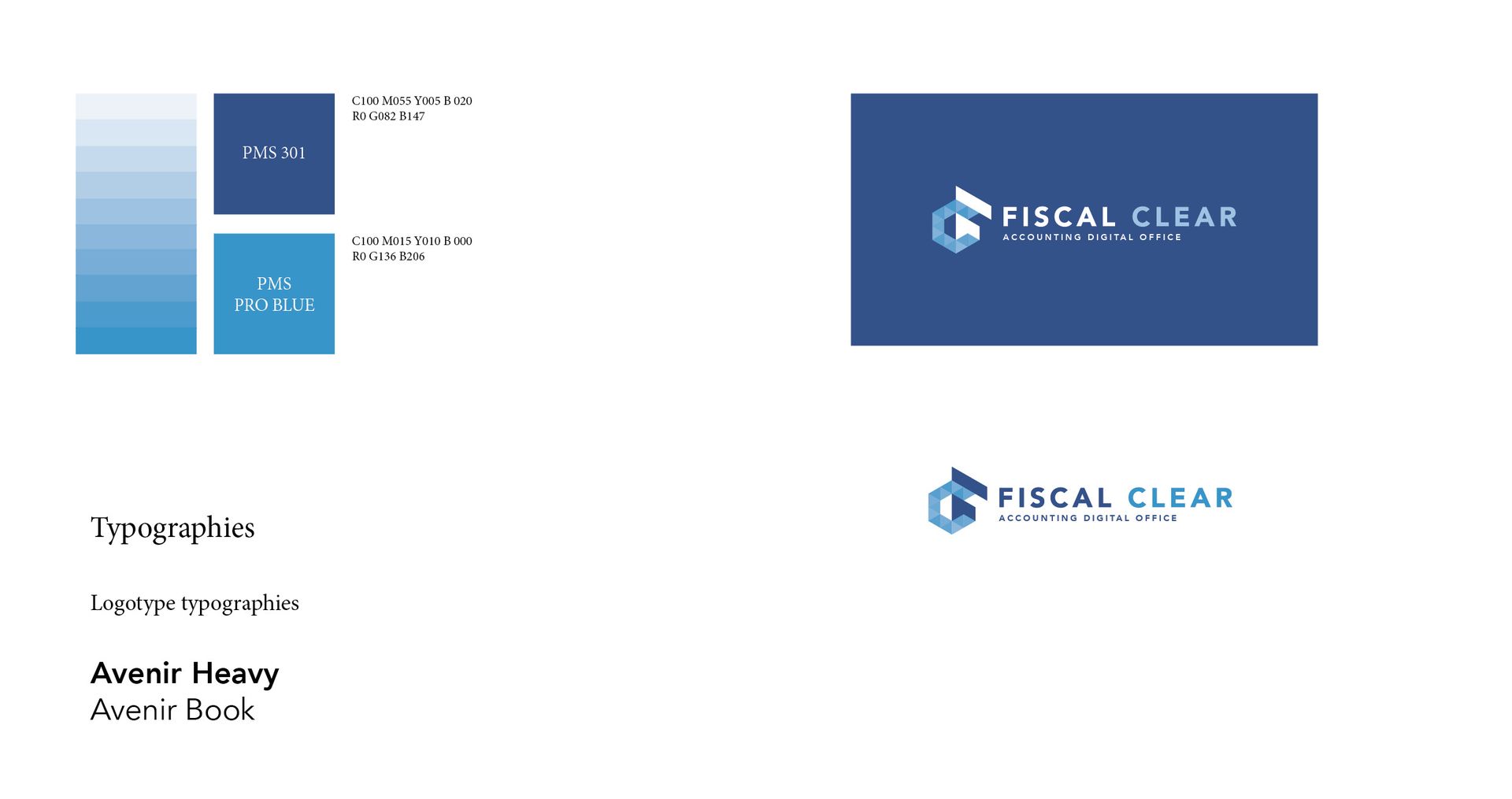
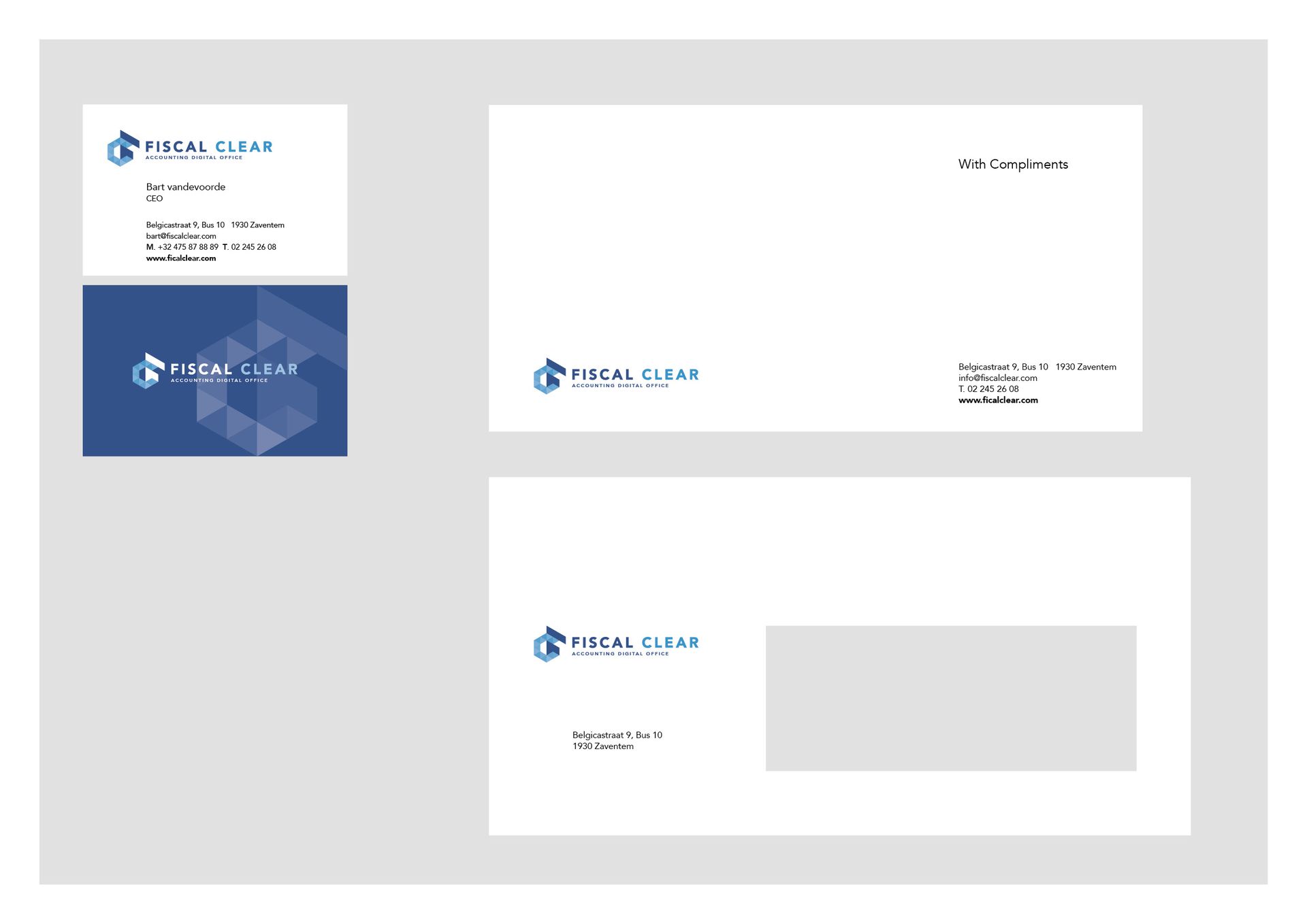
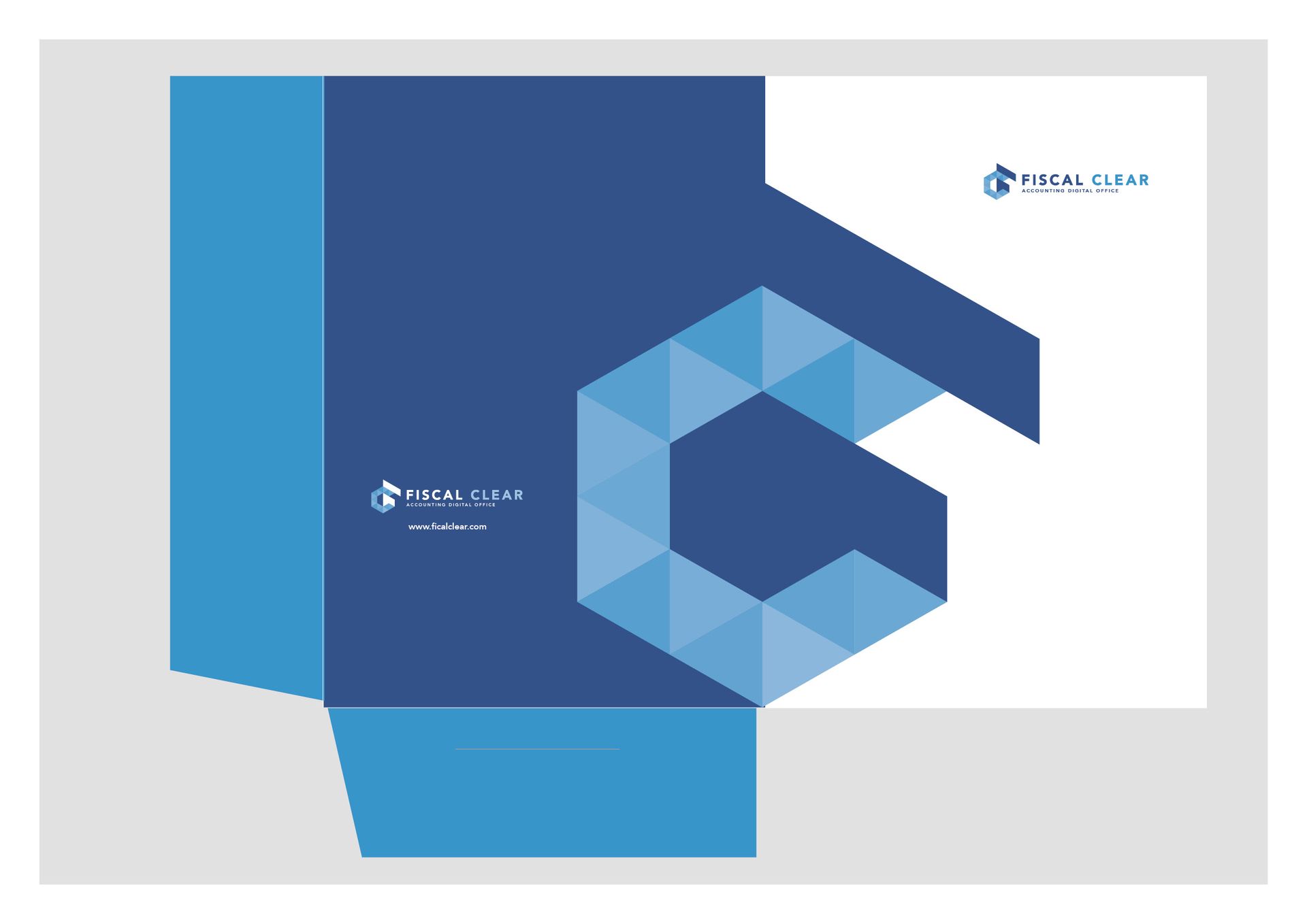
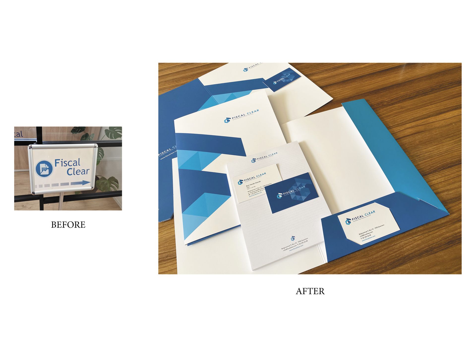
FISCAL CLEAR

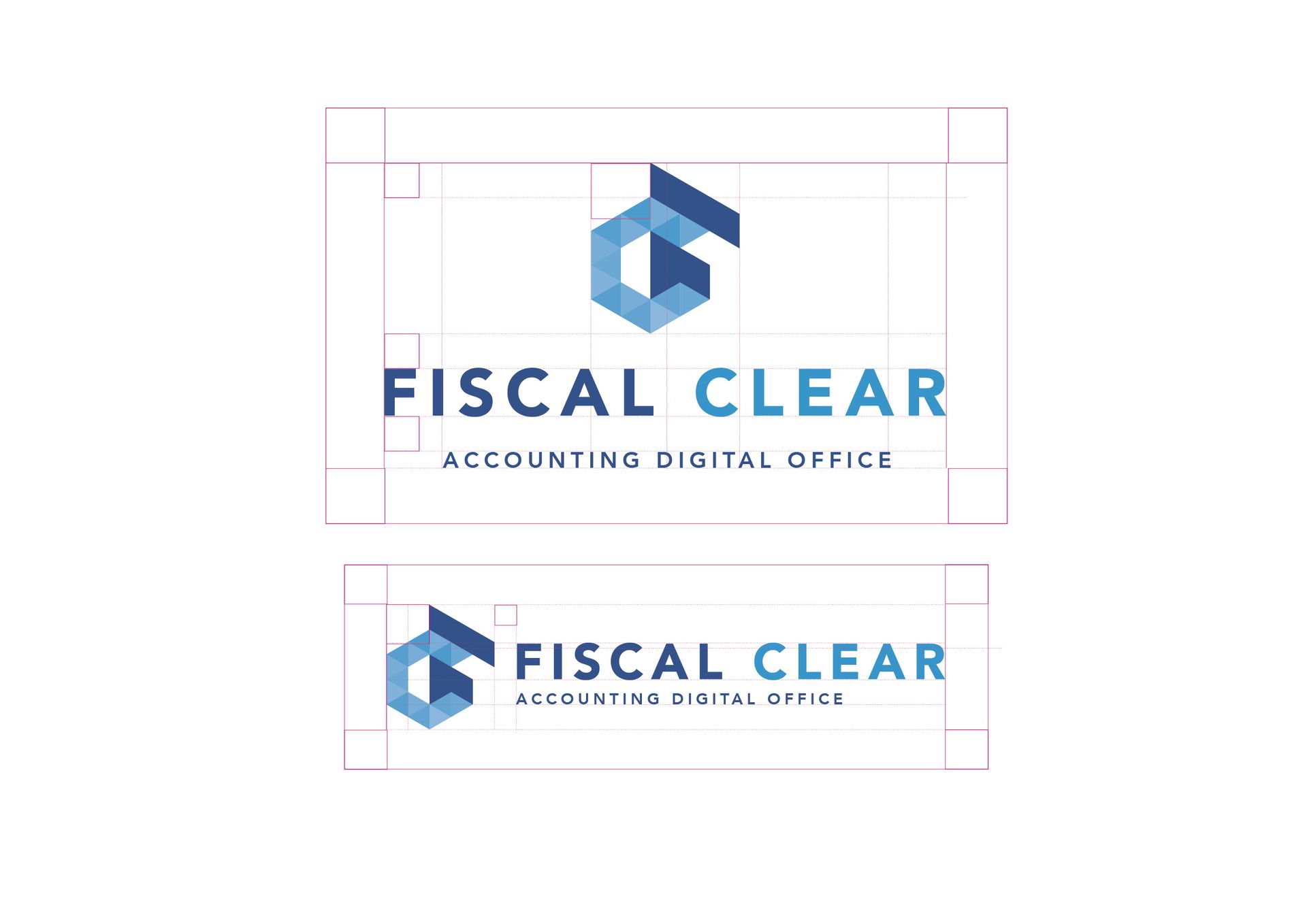
Fiscal Clear is a consulting & accounting services firm founded 20 years ago. The firm continues to evolve and pursue its development.

Project Description

It was necessary to refresh and visually reposition the company, which continues to modernize and increasingly orient its services through new technologies and digital services.


L'ORO

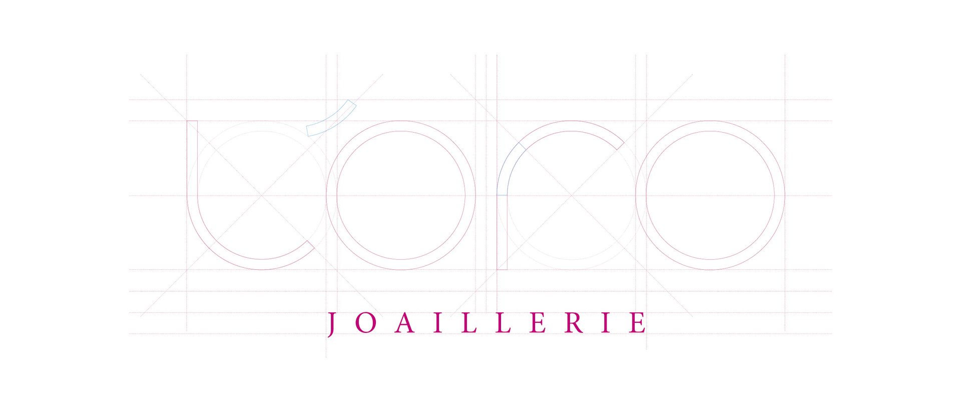
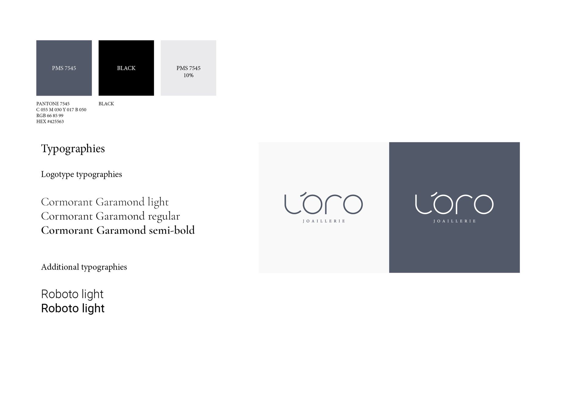
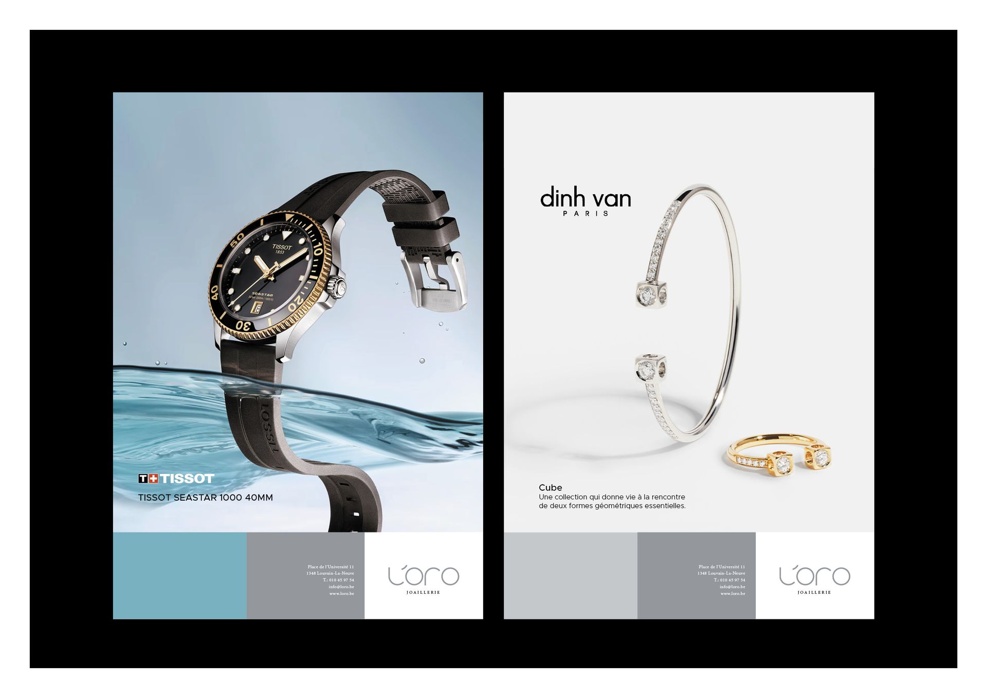
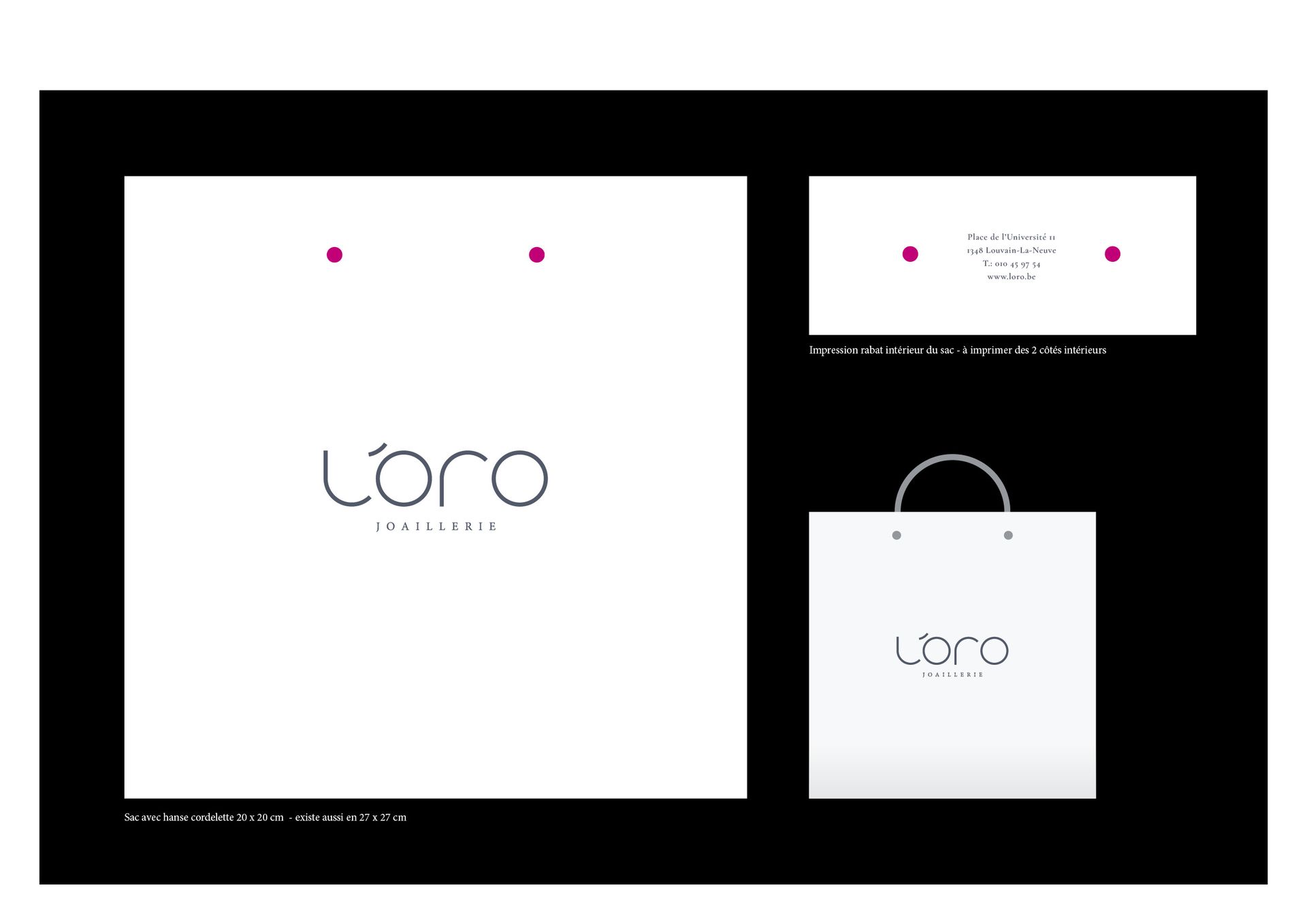
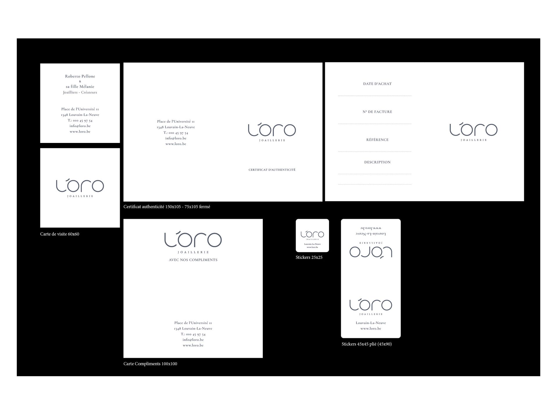
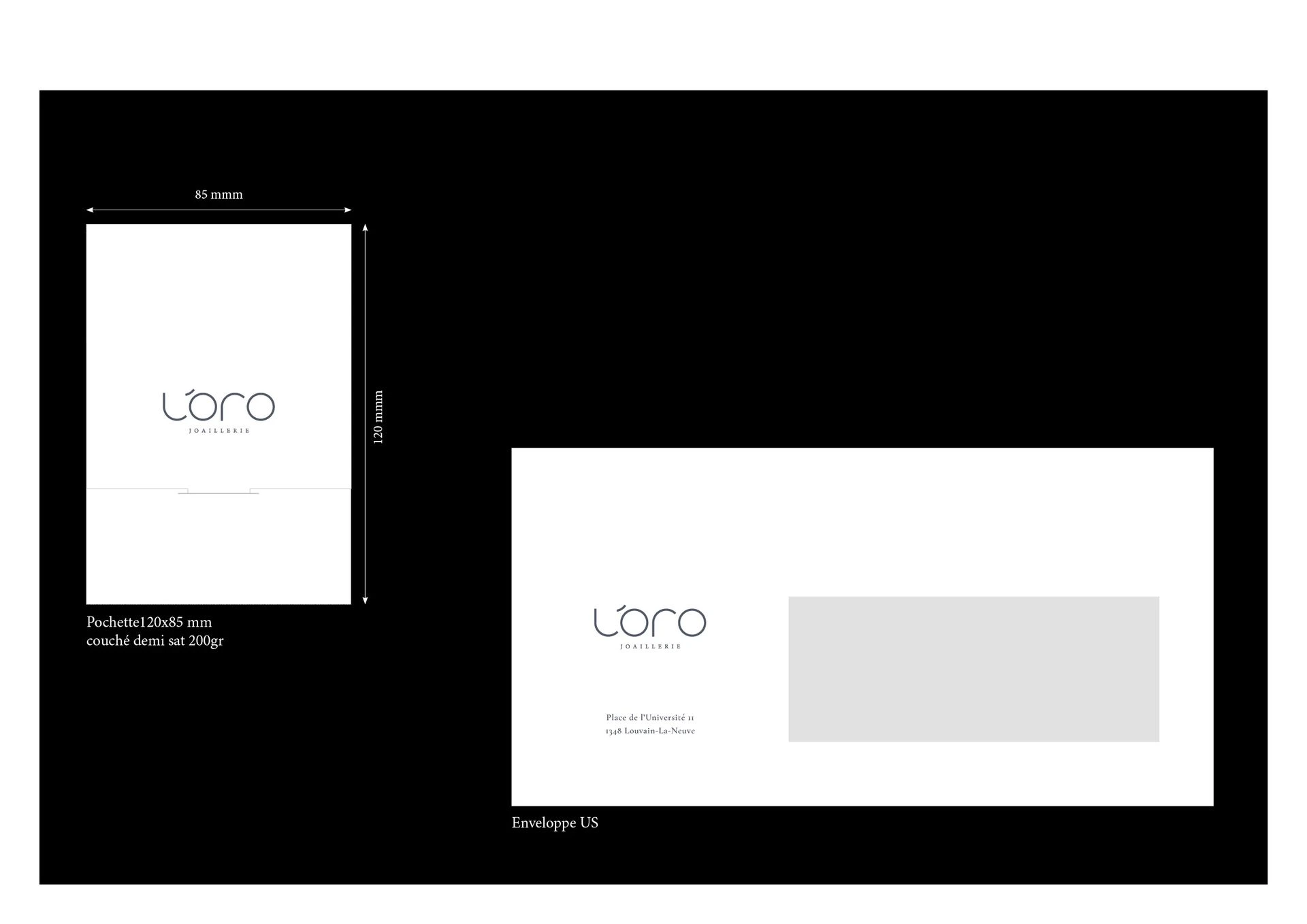
L'Oro is a jewelry store located in Louvain la Neuve where you can find prestigious brands of watchmaking and jewelry as well as the exclusive creations of Roberto Pellone.

Project Description

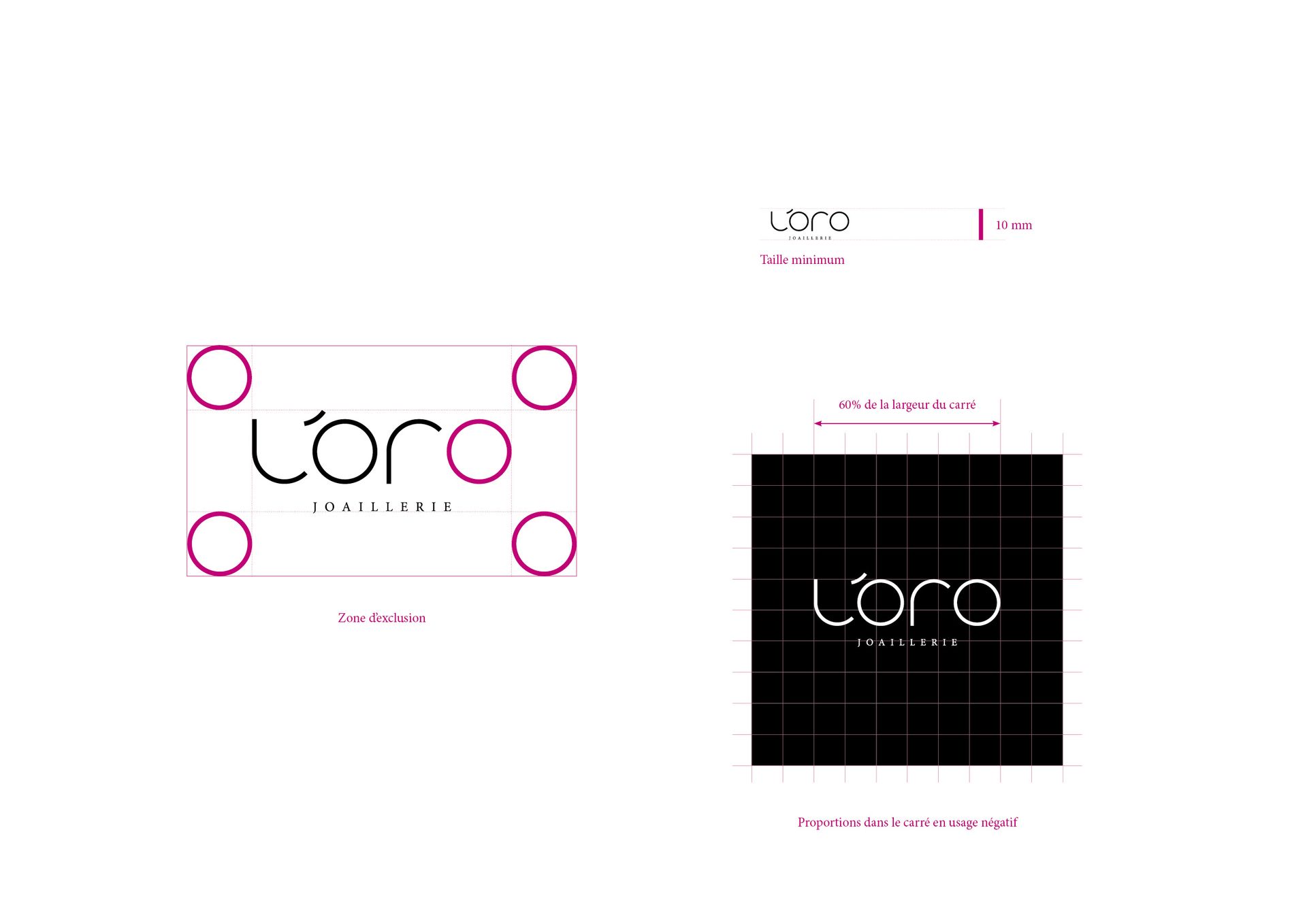
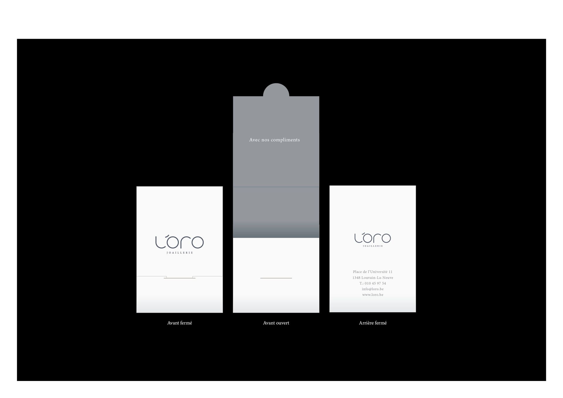
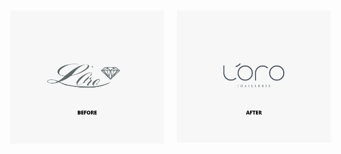
The idea was to rework the logo and visual environment of the jewelry store to align it with the quality of the brands and services offered by this high-end jewelry store. We completely modified the graphic approach of the logo created 30 years ago to achieve a modern and timeless result. The new website, published by the agency A2Com, will be online soon.


INVEST CONSEIL

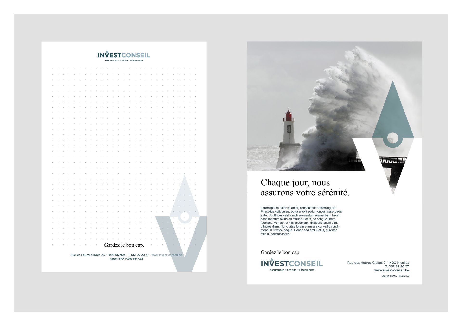
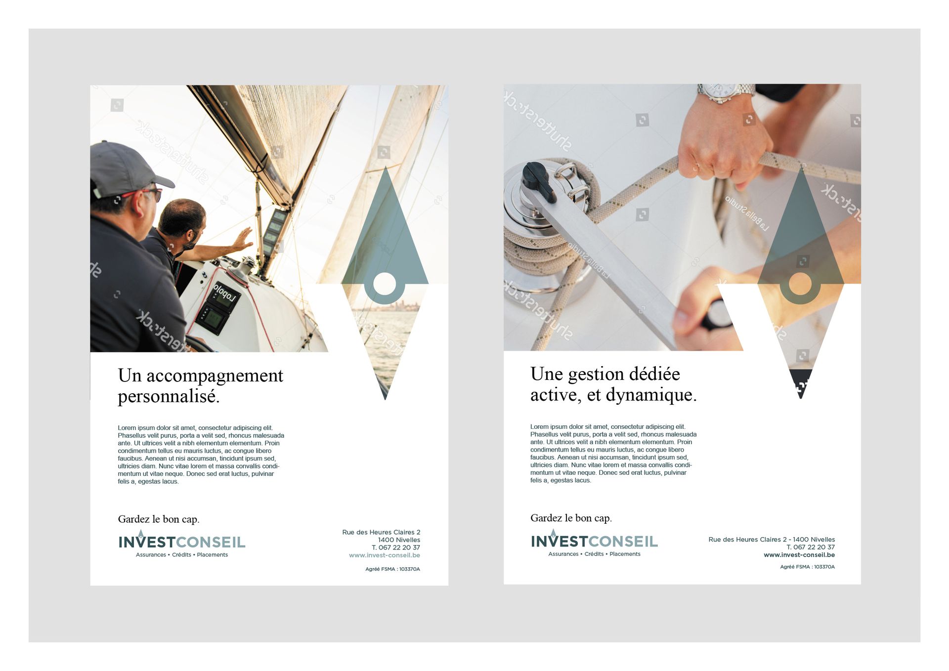
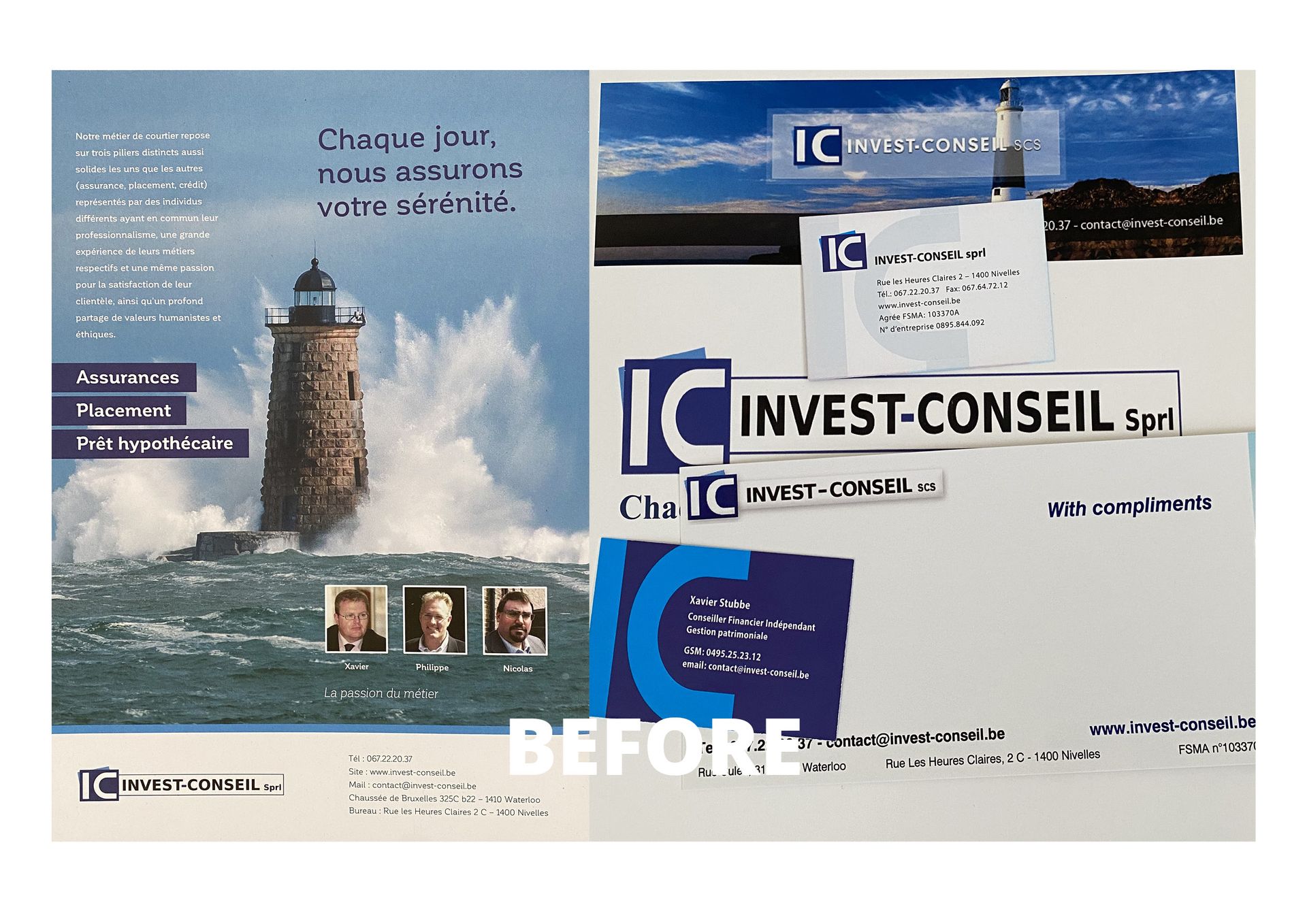
Invest Conseil is a company that offers services in insurance, credit, and wealth management.

Project Description

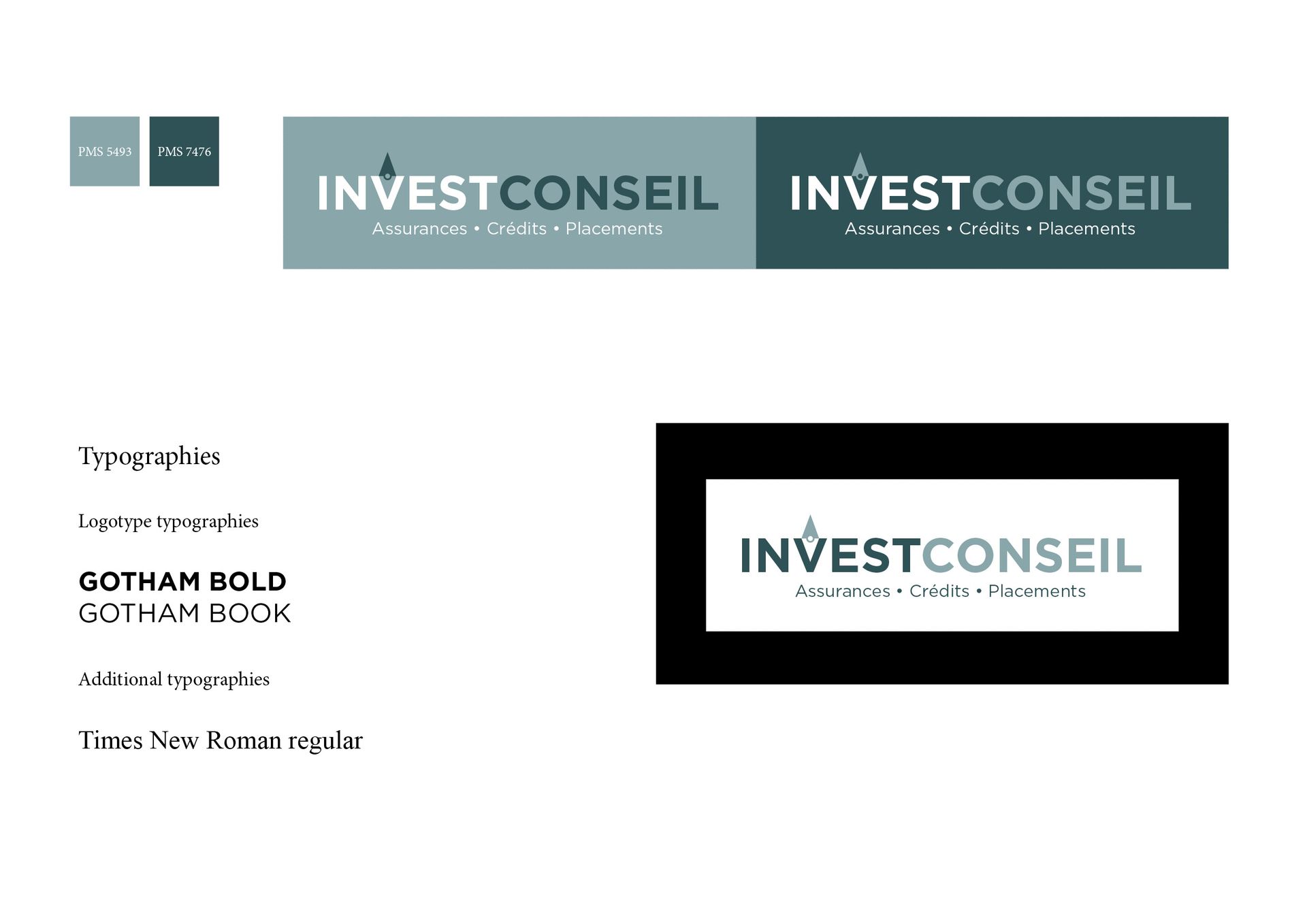
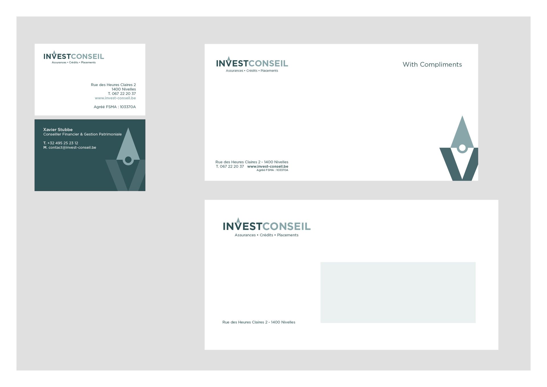
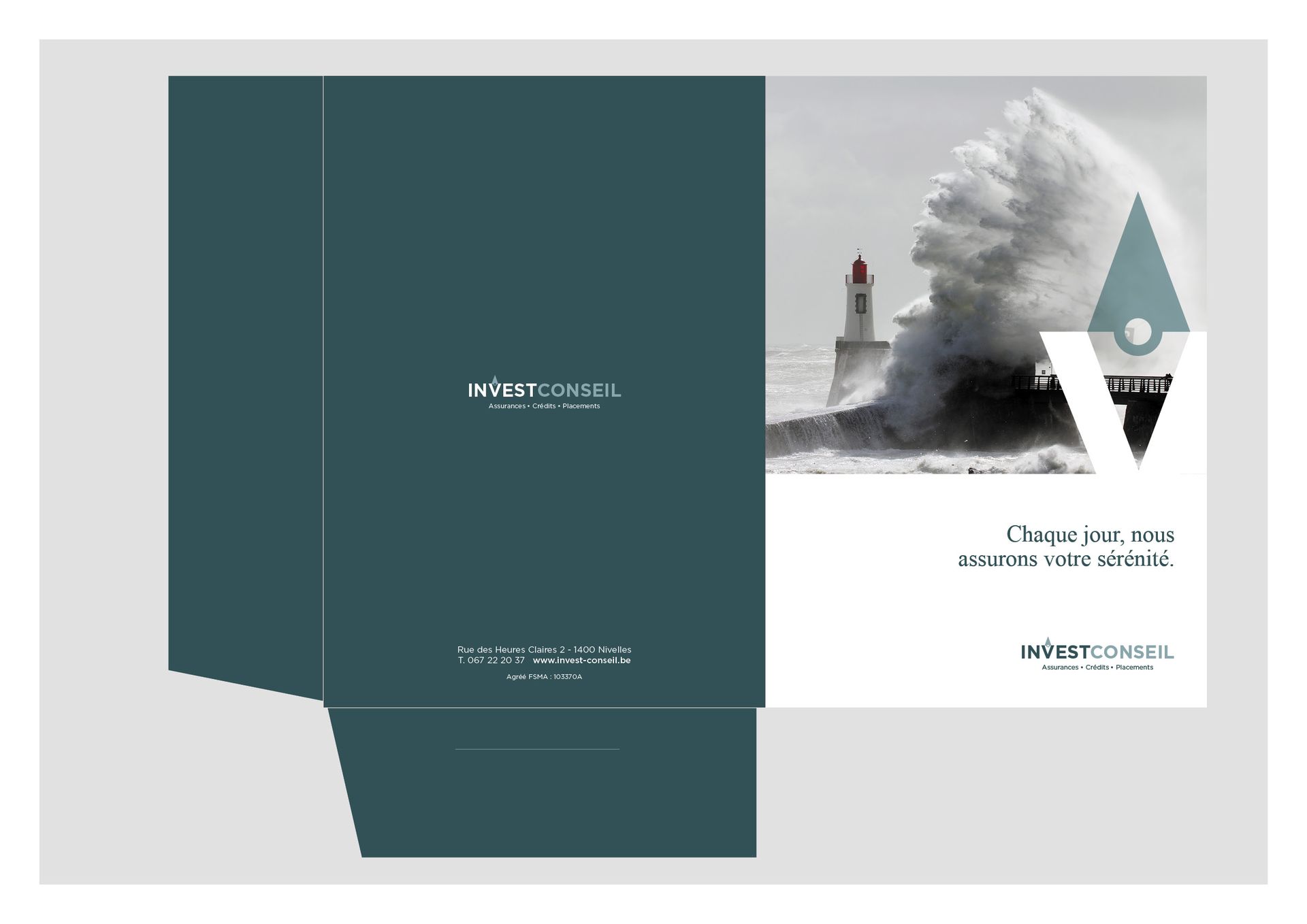
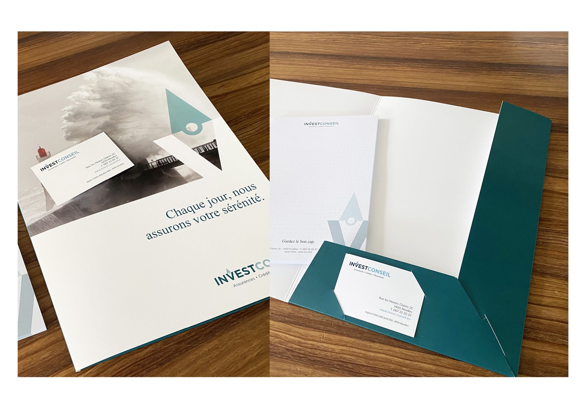
We designed a new visual identity for Invest Conseil. The design had to reflect the trust, dynamism, and transparency of the service offered by a financial company, including a human approach and a visual orientation towards the world of sailing and the sea.


MENTORINQ

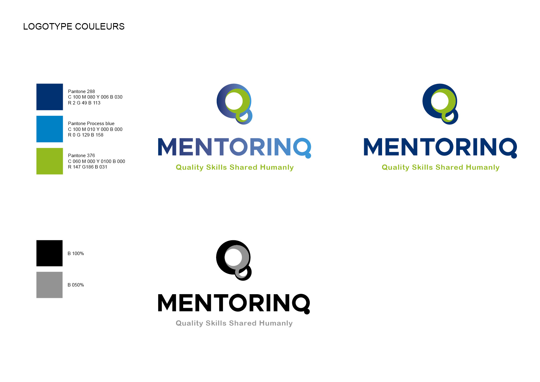
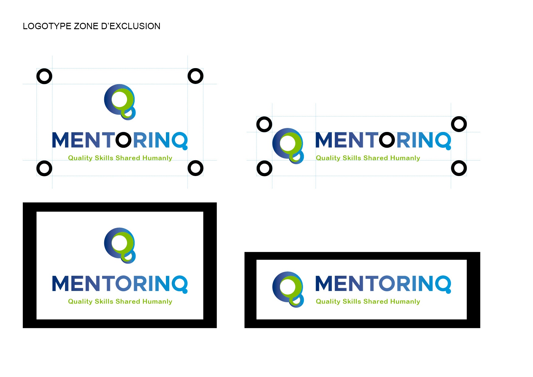
MentorinQ is a company focused on human relationships, aiming to boost confidence, communication, and an understanding of each individual's constraints—thereby enhancing performance and quality within a positive mindset!

Project Description

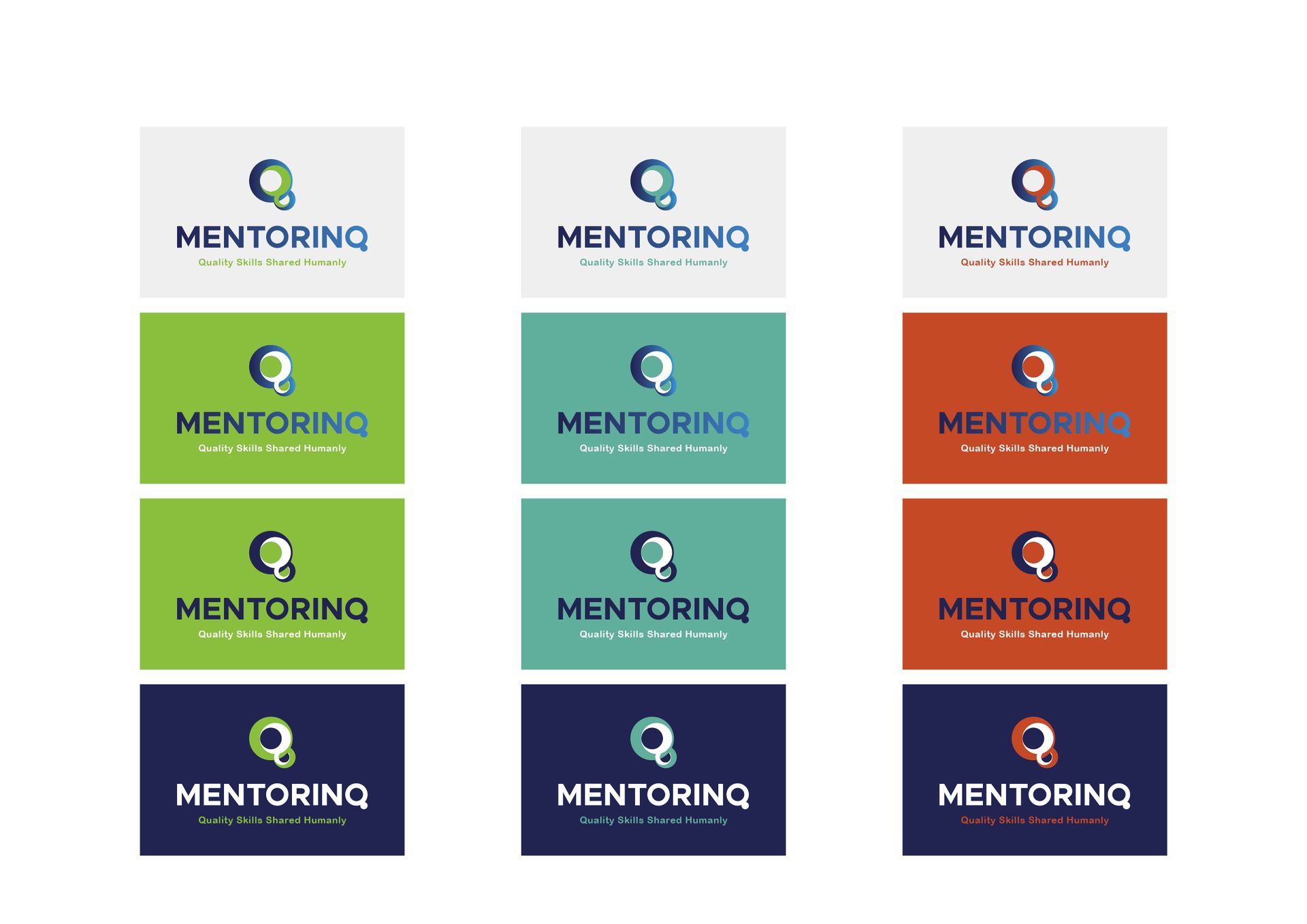
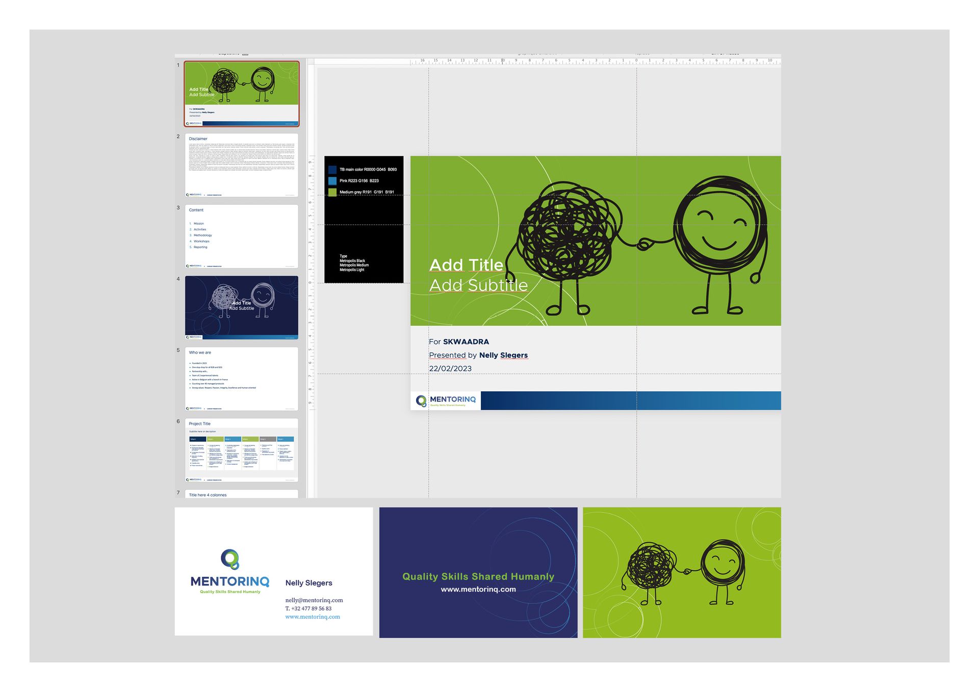
We designed the visual identity of MentorinQ by integrating the concept of human collaboration and a dynamic aesthetic approach that reflects Nelly Slegers' innovative approach to Coaching, Learning, and Mentoring.


IMMOCORP

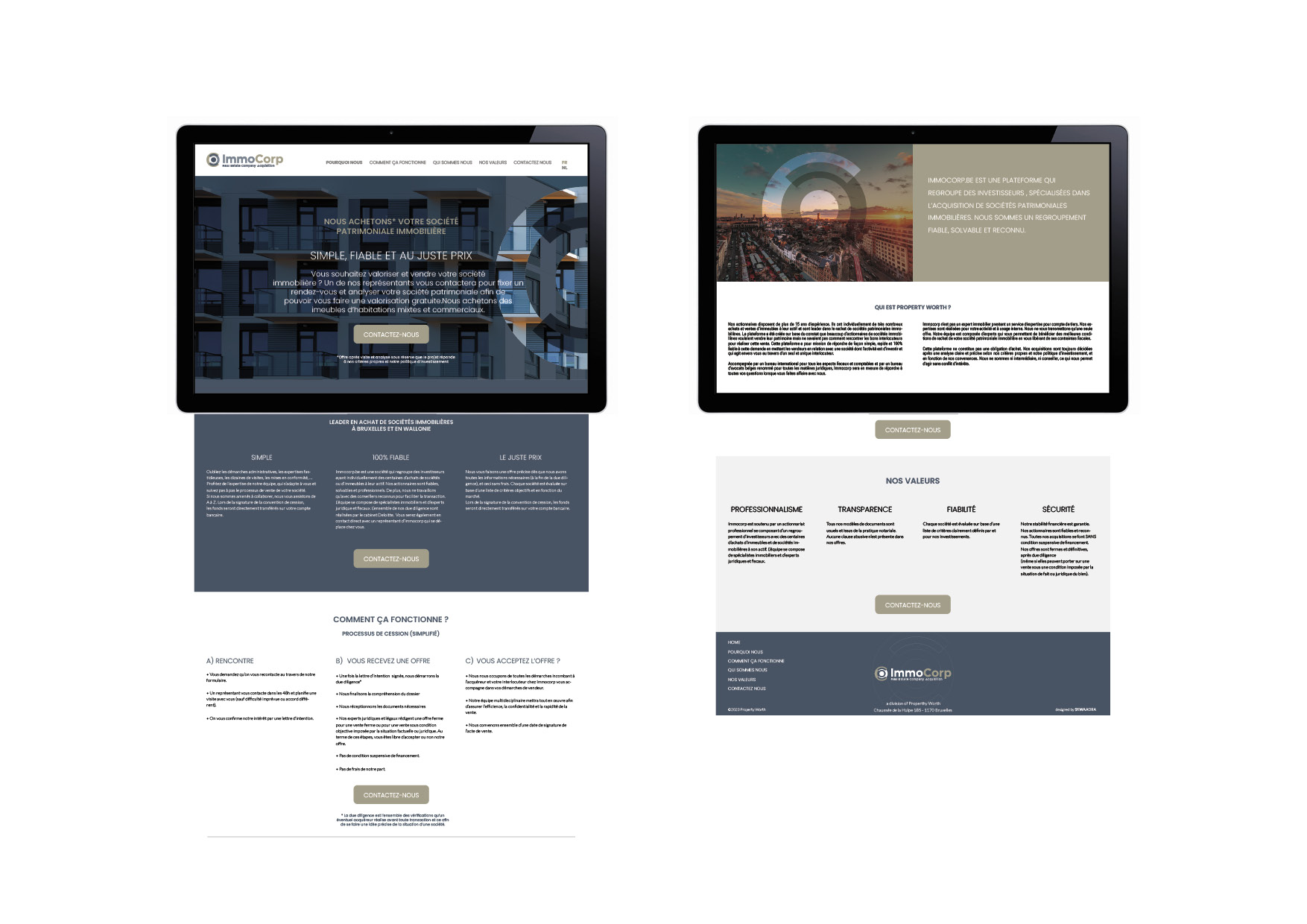
Immocorp.be is a platform bringing together investors, specializing in the acquisition of real estate heritage companies.

Project Description

We designed the visual identity of IMMOCORP by integrating the concept of a corporate company rather than that of a real estate agency. The design had to reflect the trust, dynamism, and transparency of the service offered. We also designed the website.


DOMAINE DU BERCUIT

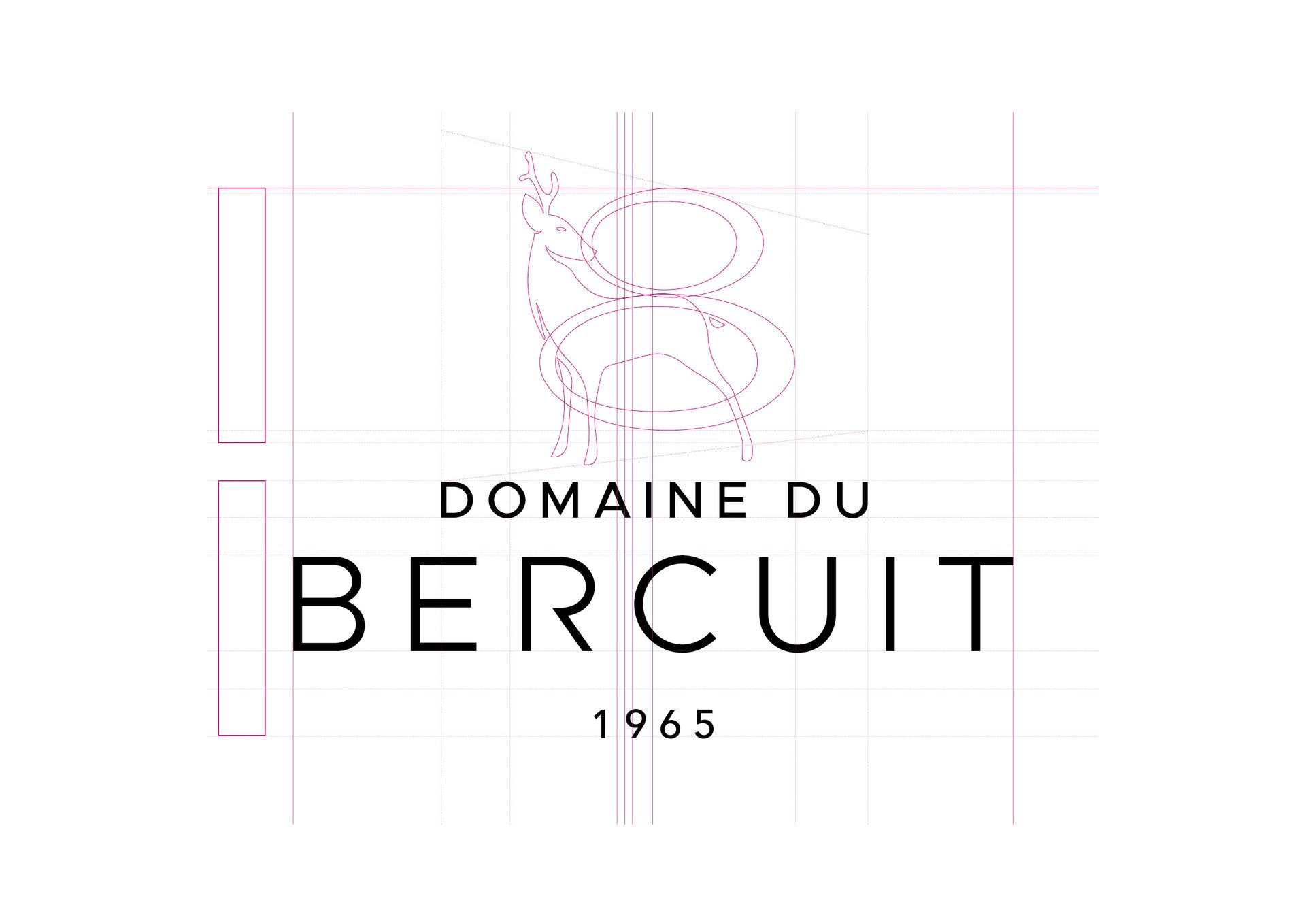
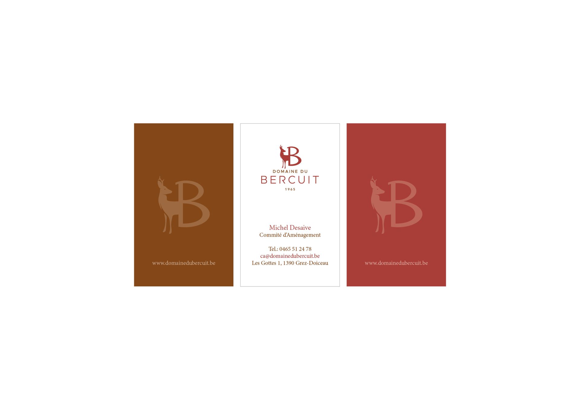
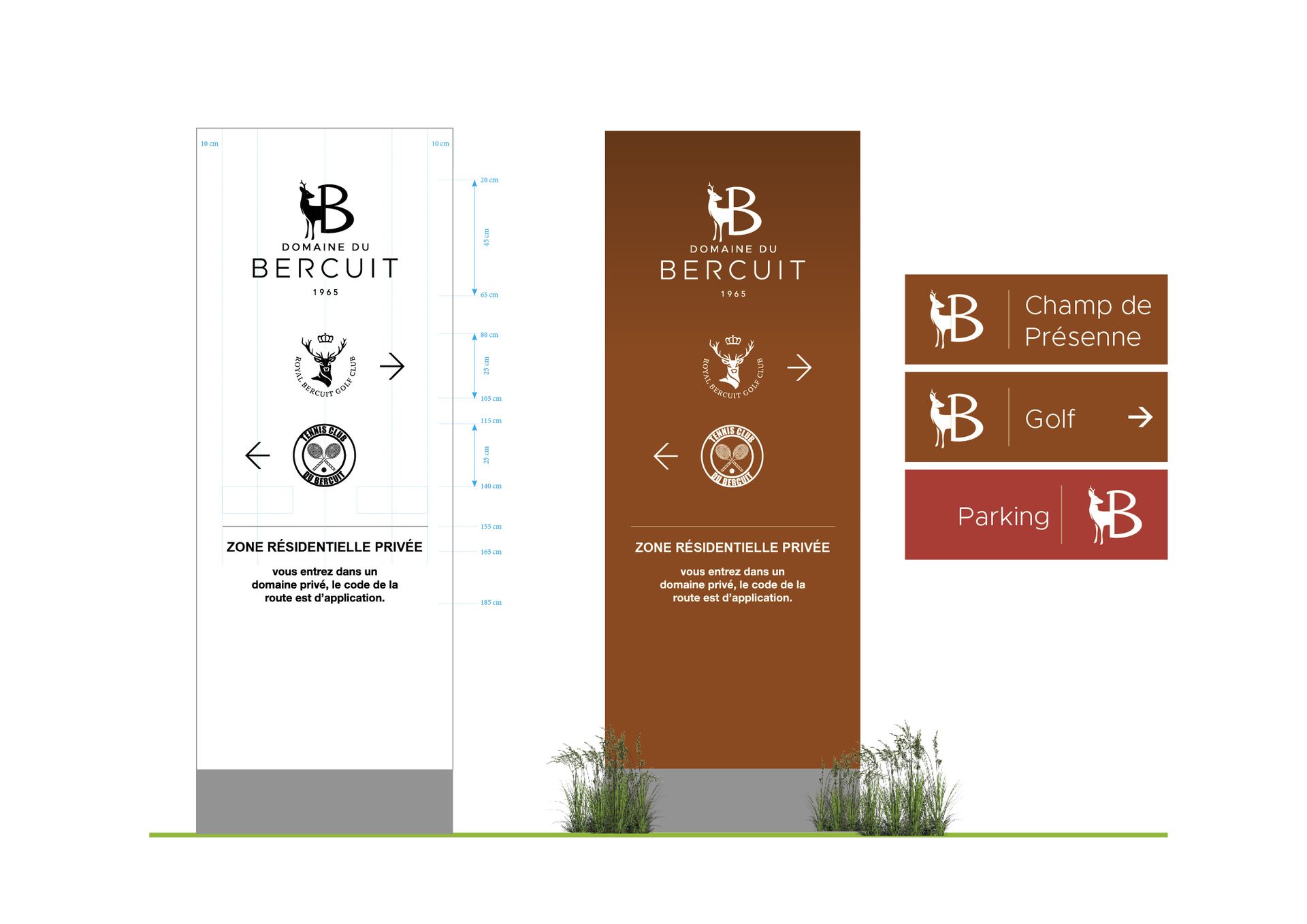
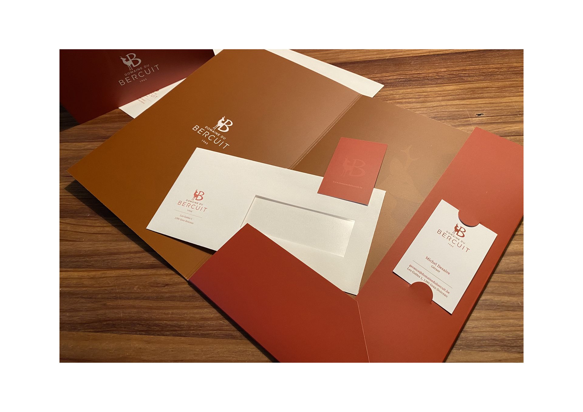
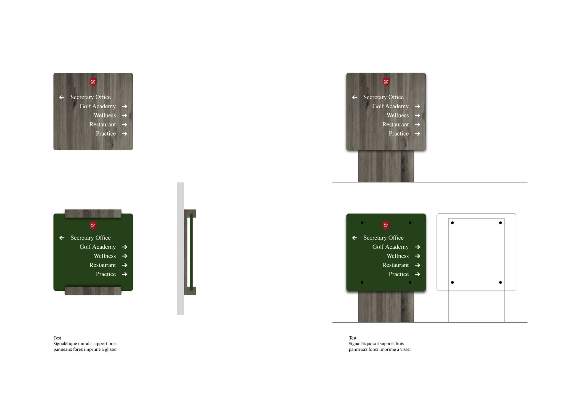
A true gem, The Domaine du Bercuit is a high-end residential estate built around a golf course that spans more or less 110 hectares in the heart of nature.

Project Description

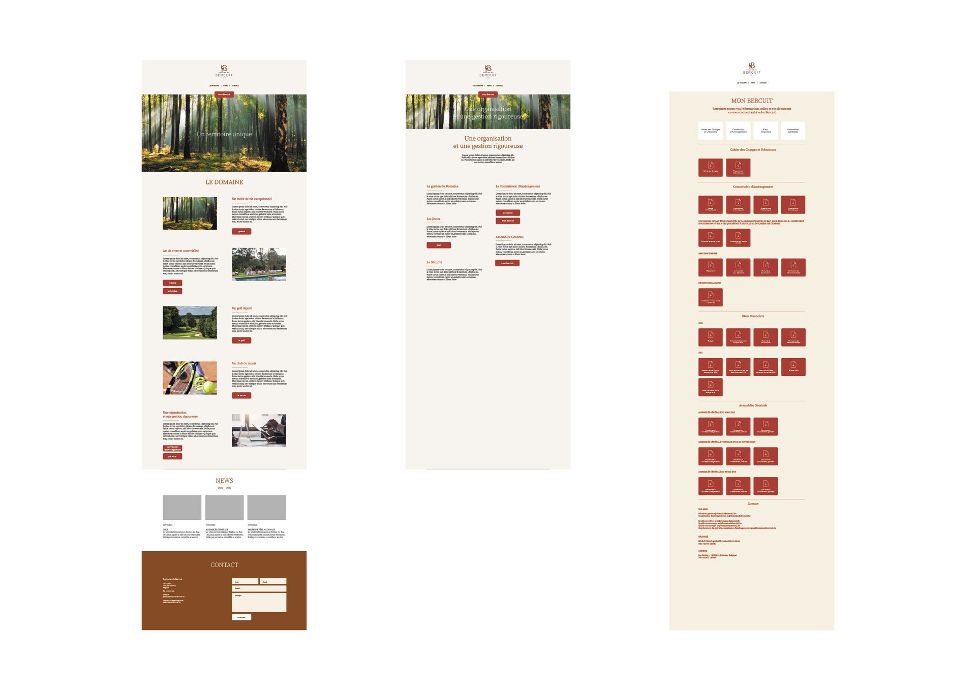
We designed the visual identity of the Domaine du Bercuit by integrating the notion of nature and a dynamic aesthetic approach that reflects the standing and unique aspect of this place.


LANDSCAPE DESIGN PARTNERSHIP

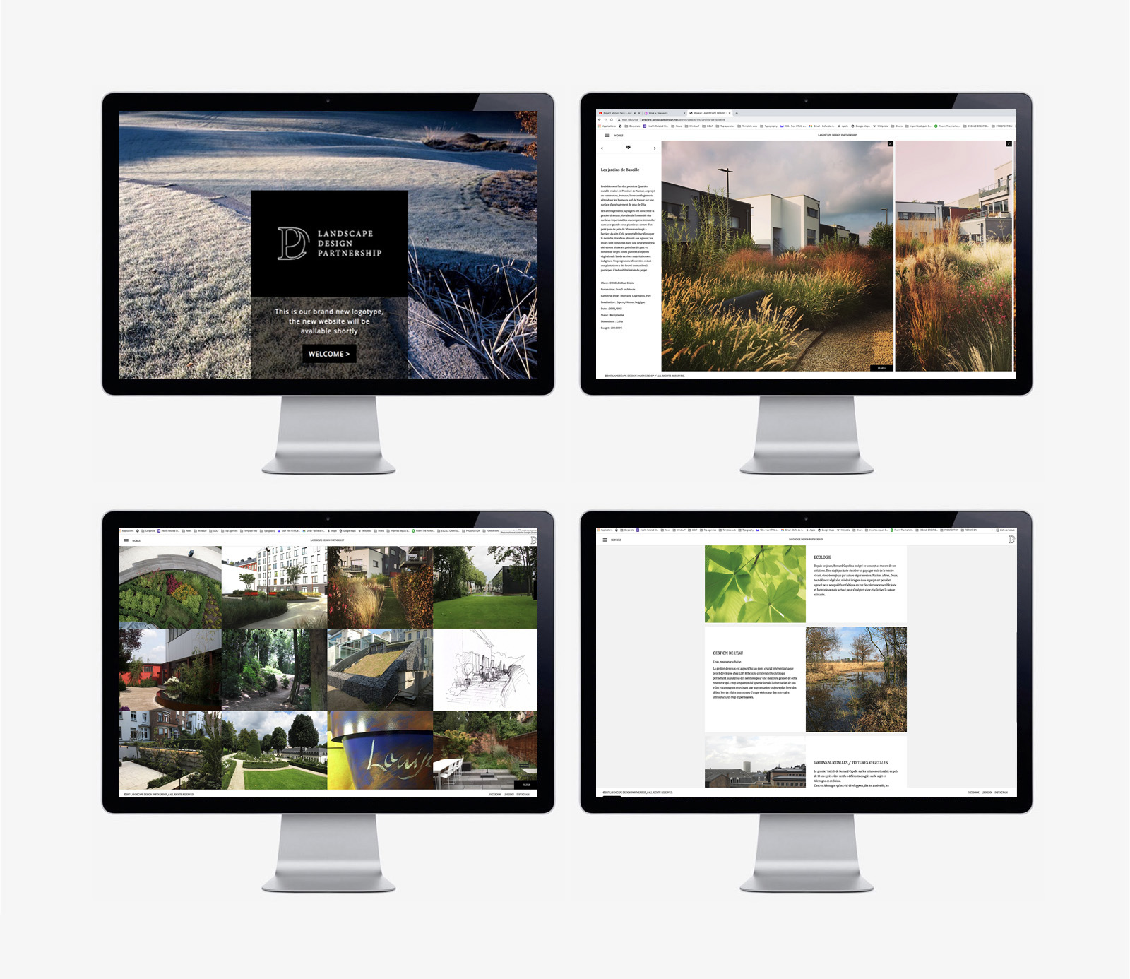
LDP is a landscape architecture study office created by Bernard Capelle in 1993.

Project Description

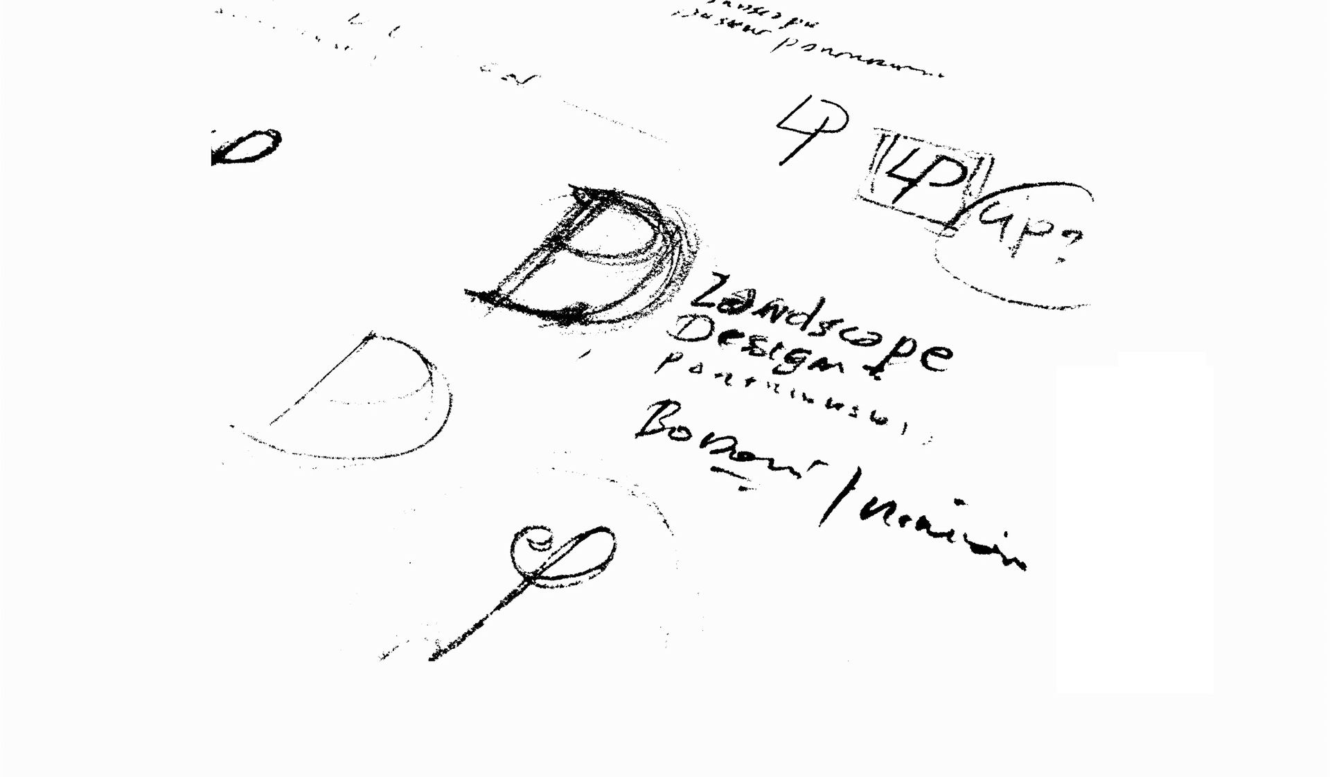
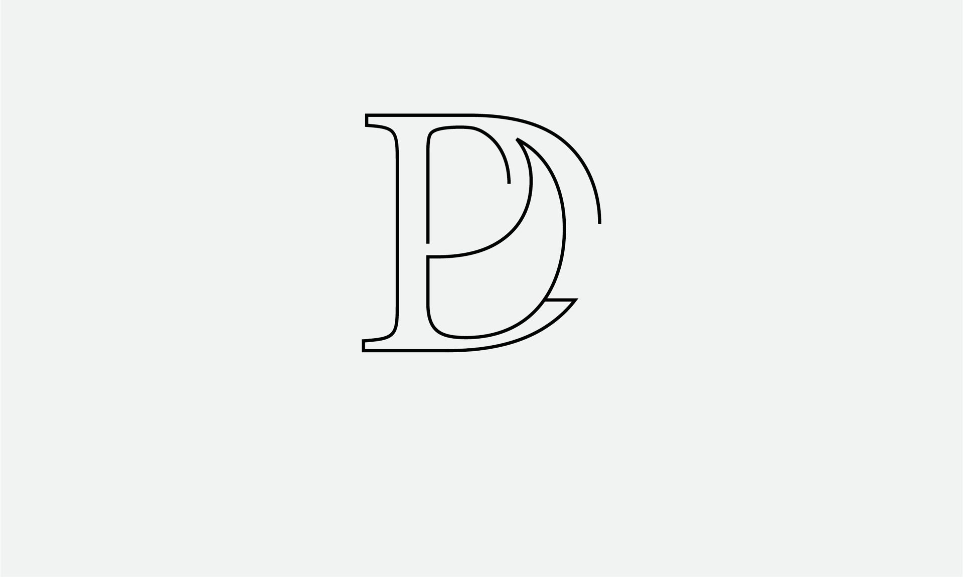
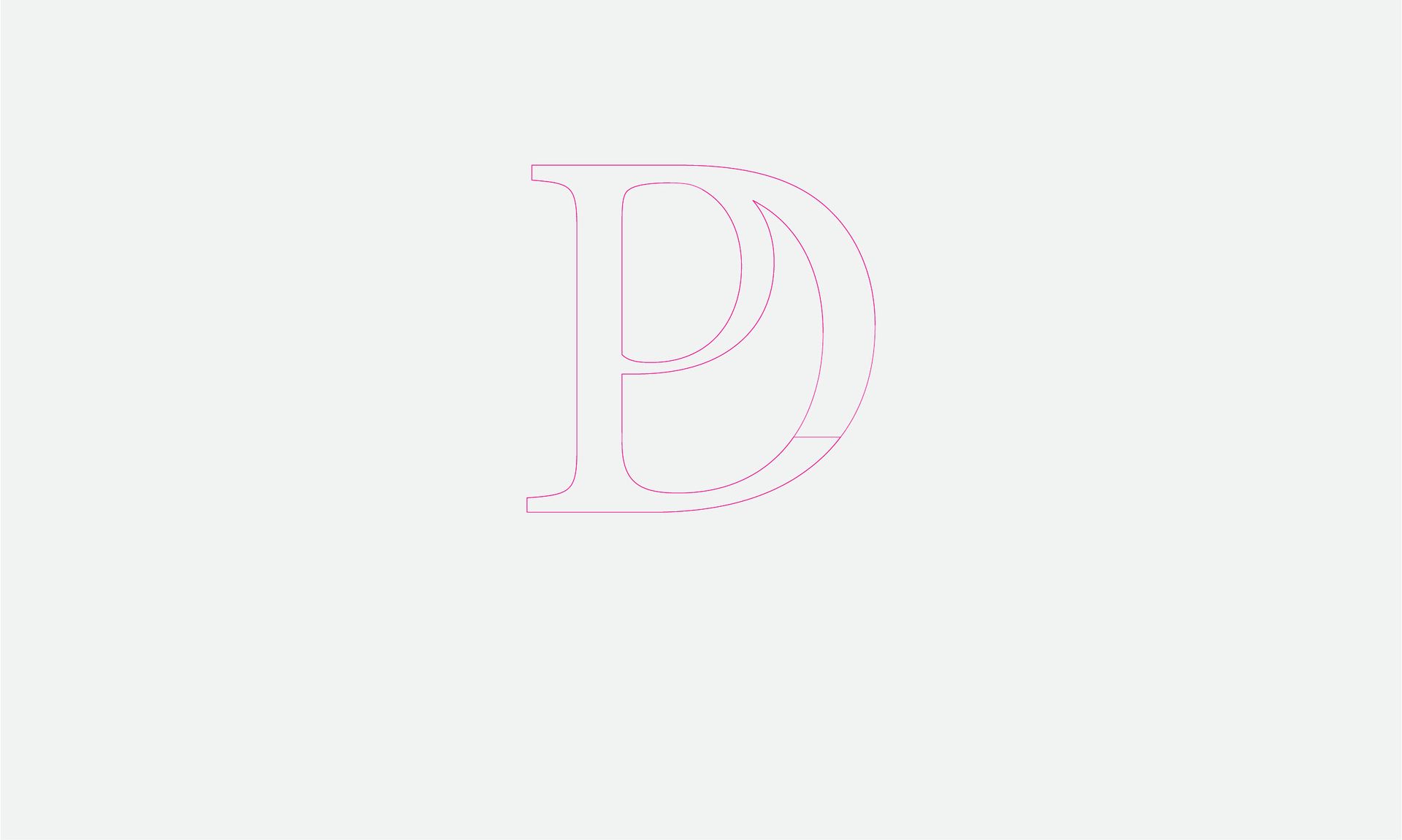
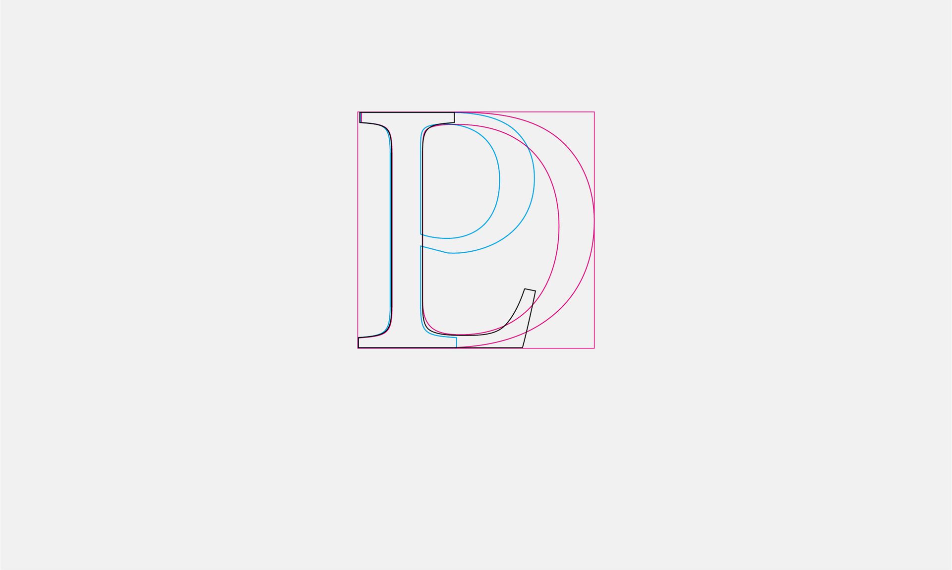
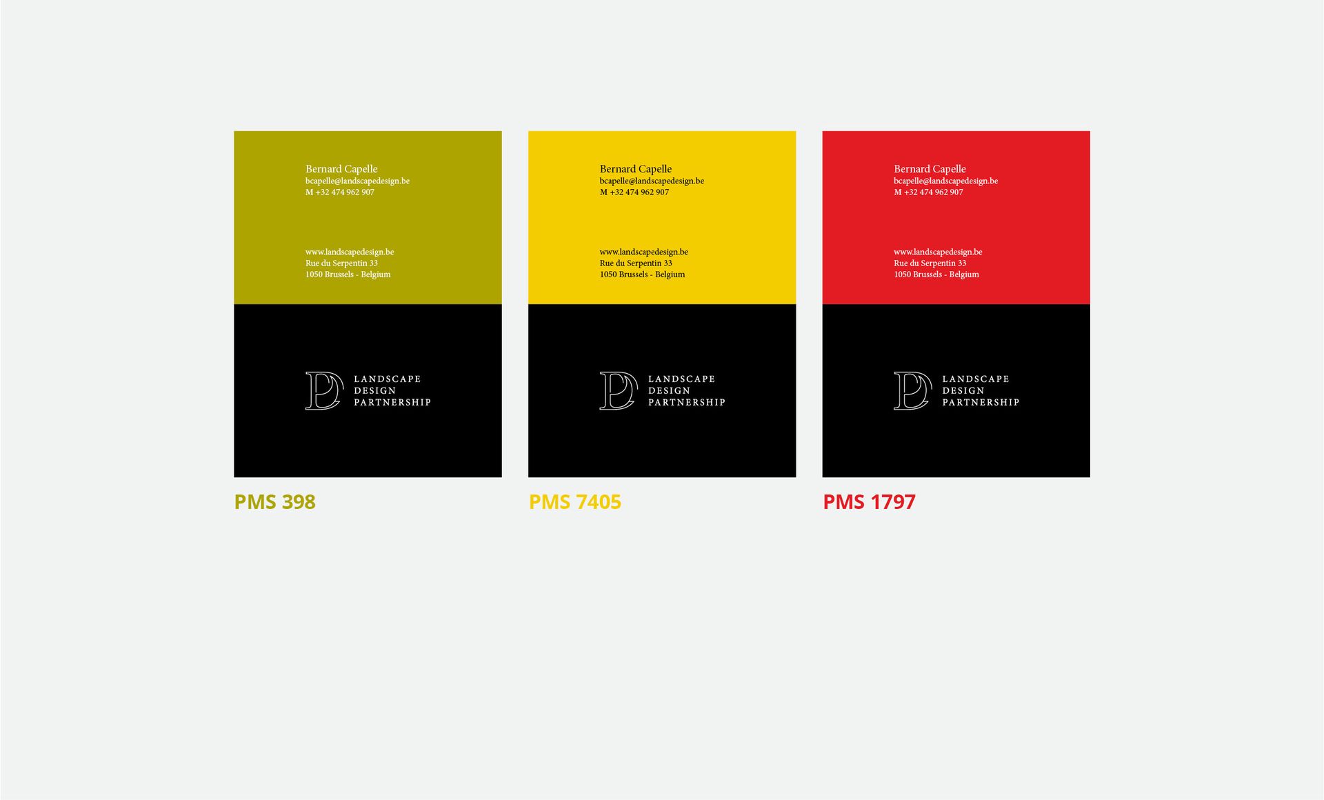
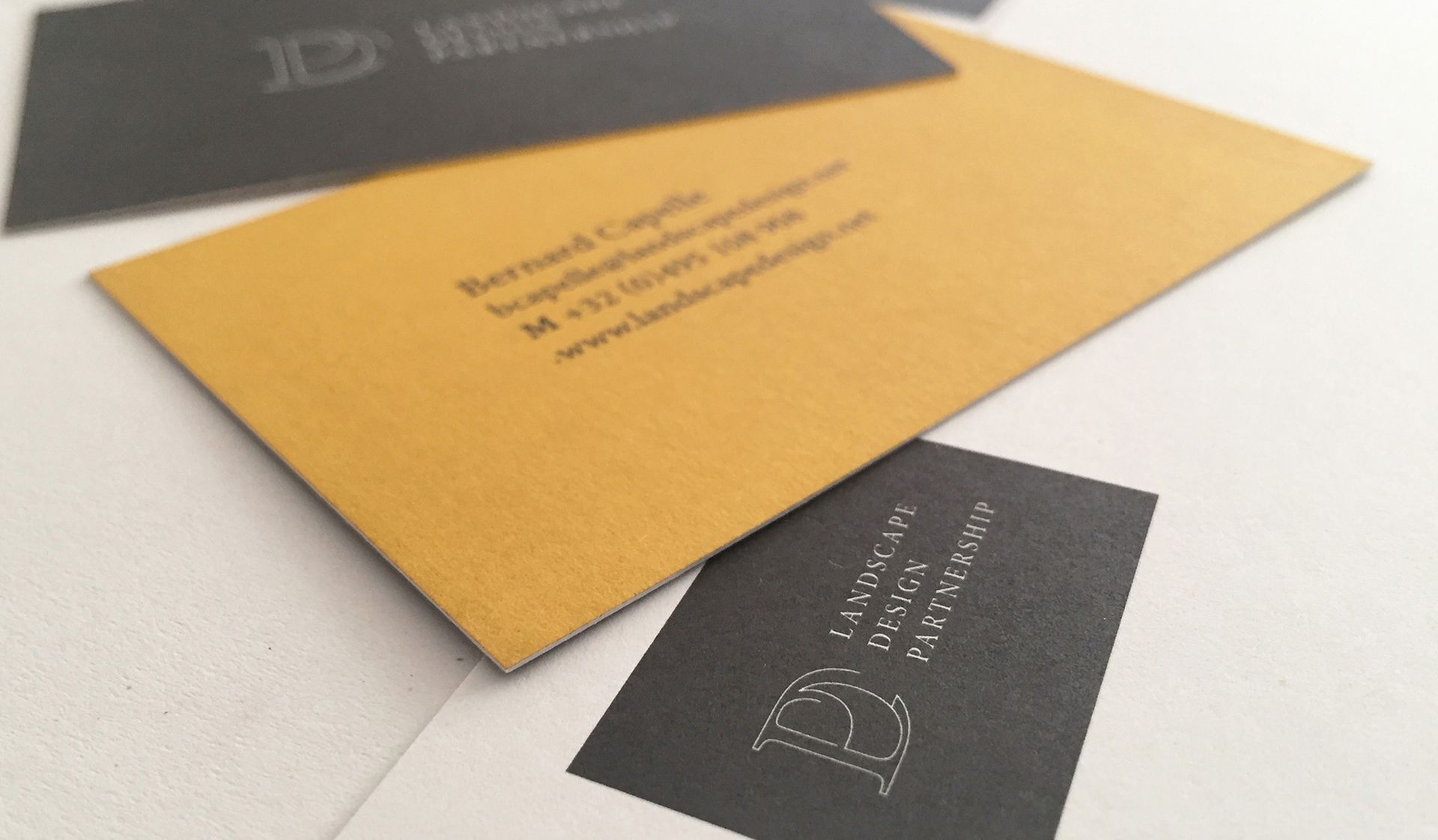
The new visual identity of Landscape Design Partnership had to integrate both the notion of partnership and a highly developed aesthetic approach that is found as a main element of LDP's approach through the various projects developed.


PHICAP GROUP

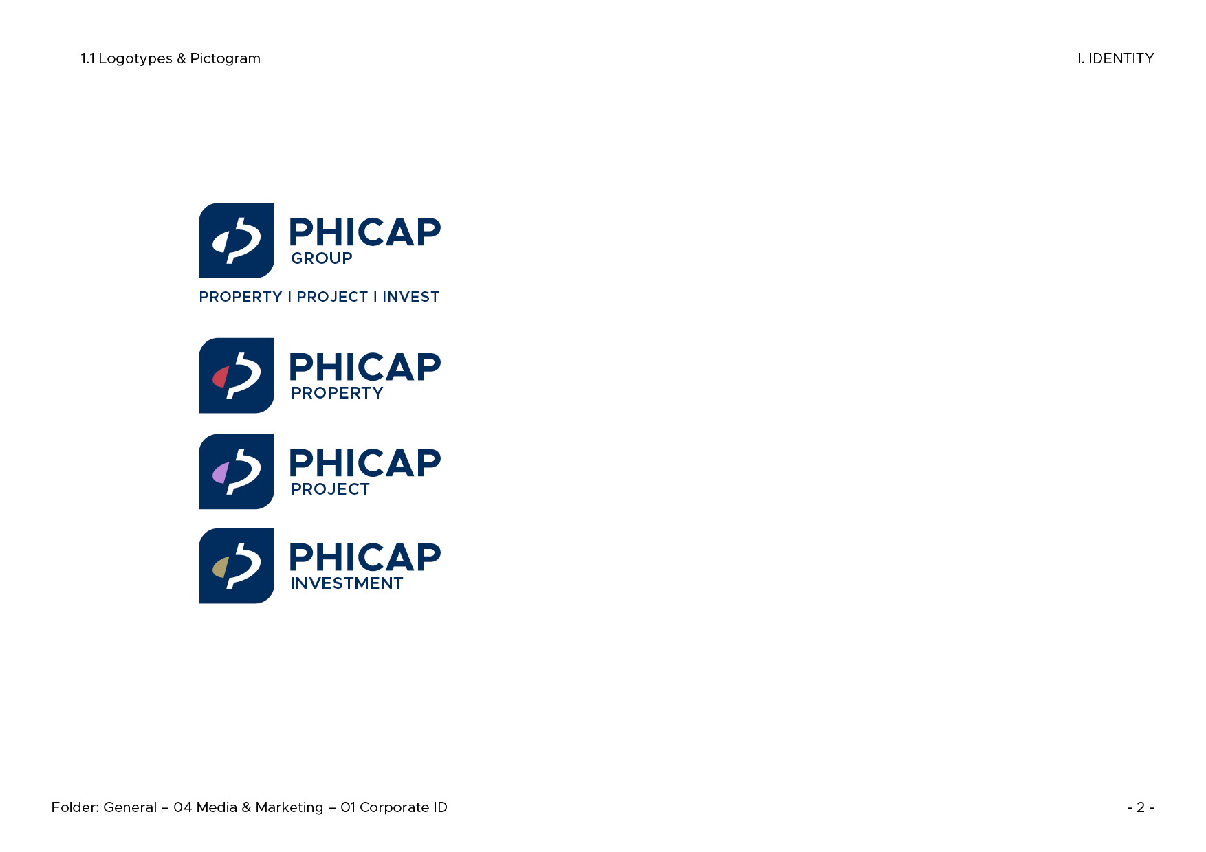
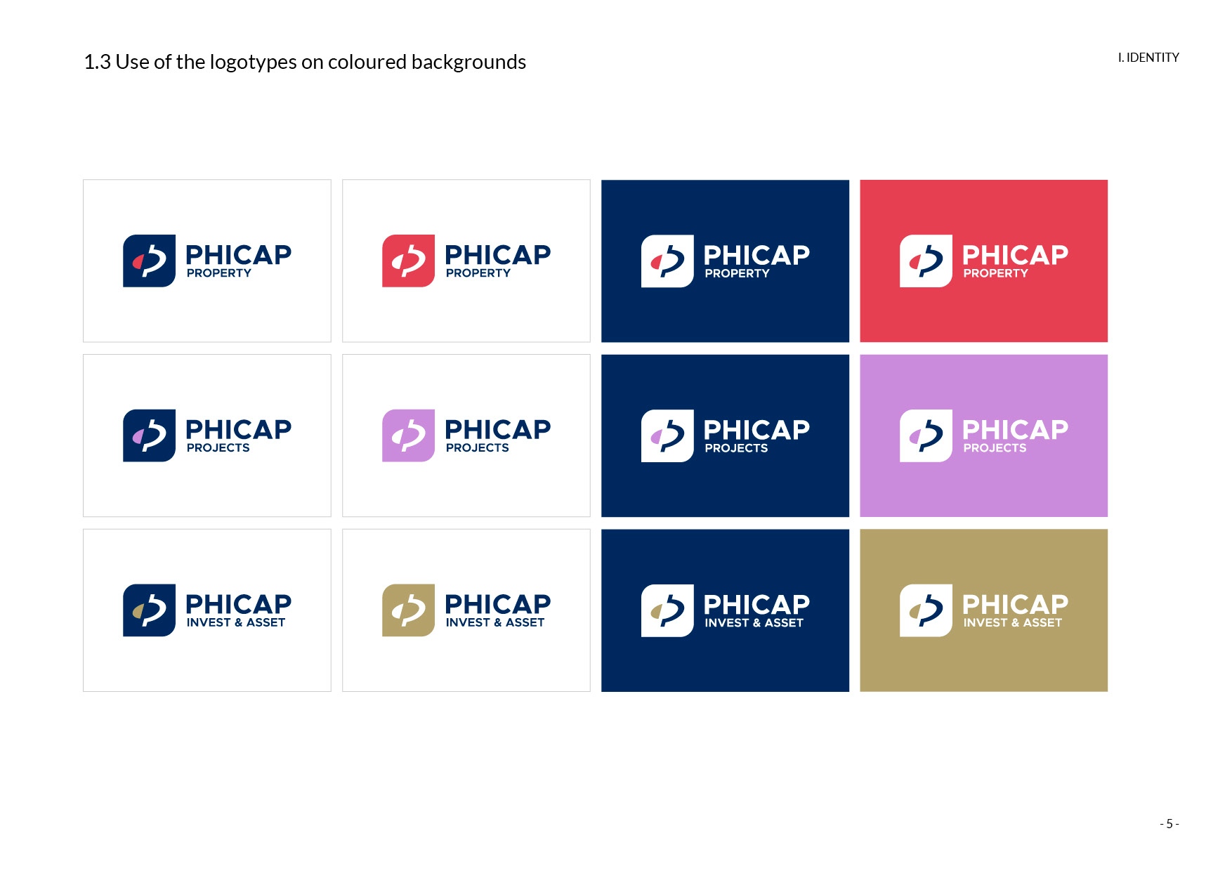
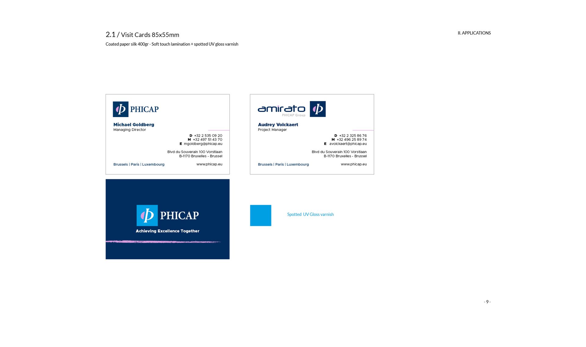
Phicap manages real estate in all asset classes on behalf of companies, public organizations, and family offices. We present ourselves as a unique platform. Our team offers innovative services in real estate management, projects, and financing.

Project Description

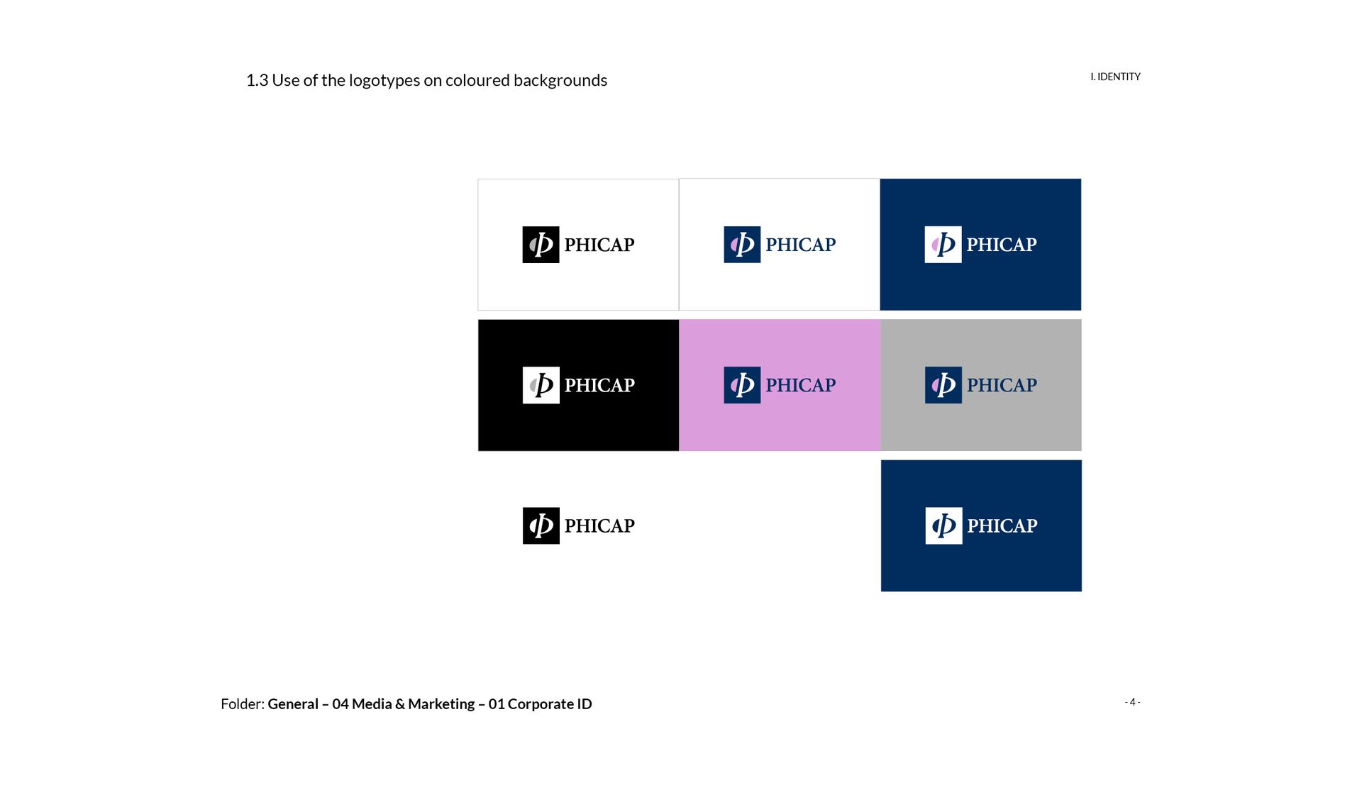
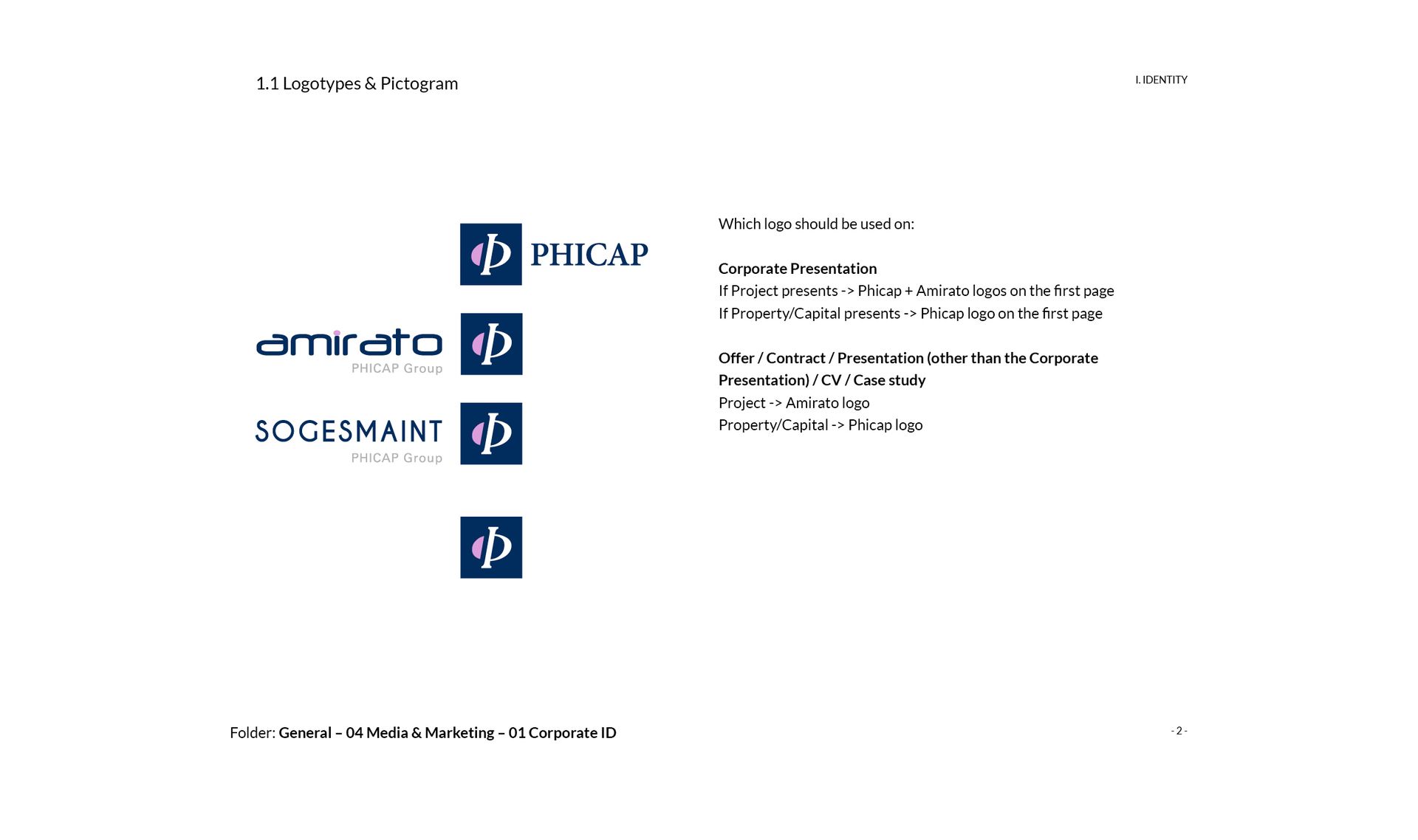
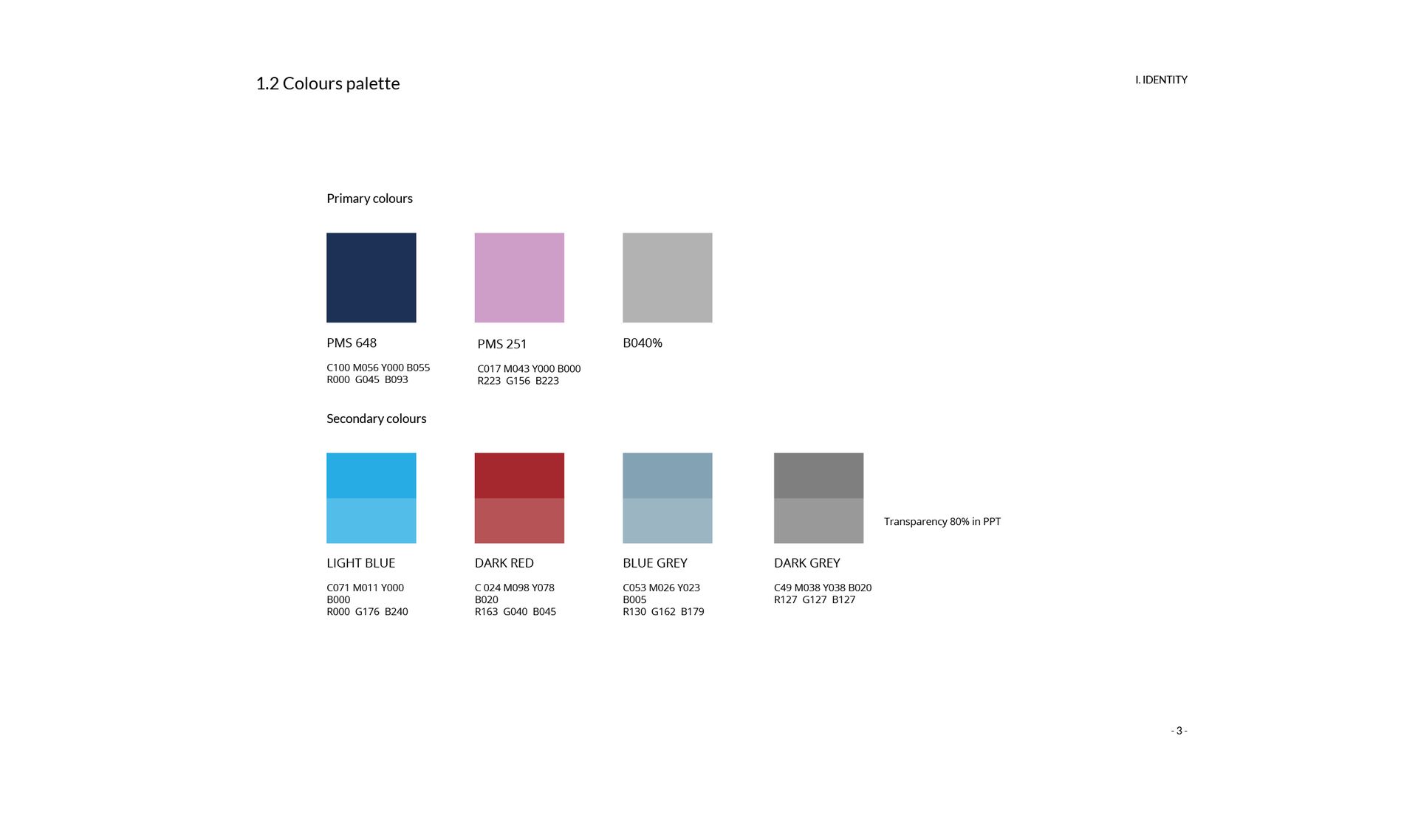
Following the integration of new entities (Amirato and Sogesmaint), we have incorporated a new color into the visual identity of Phicap and adapted the various documents used for their communication. This year, to celebrate its 10th anniversary, Phicap underwent a restructuring and an update of its logo for its departments.


DAVID GOTLIB

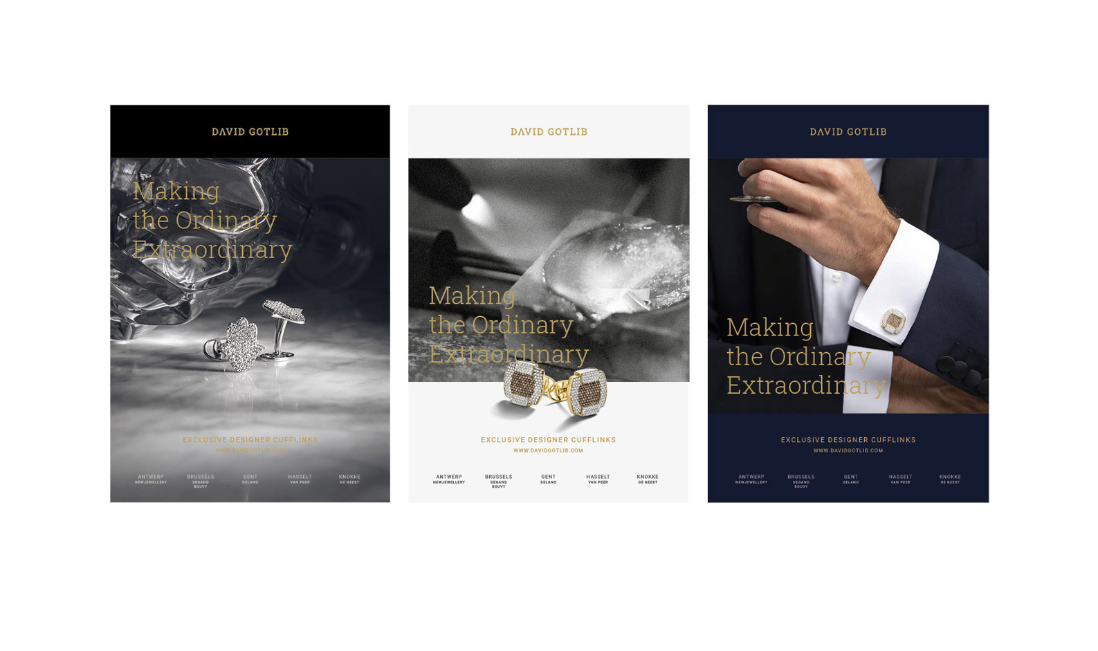
Inspired by the iconic and refined character of the cufflinks inherited from his late grandfather, his ambition was to create exclusive and timeless jewelry for men, blending his family's rich diamond heritage with both traditional and contemporary cufflink designs.

Project Description

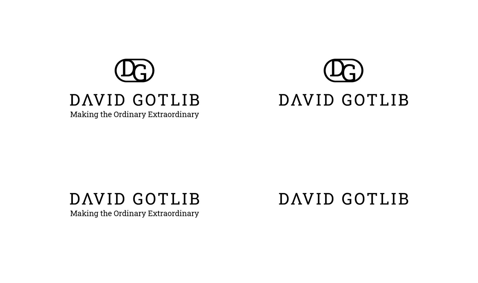
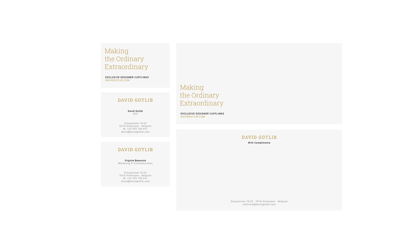
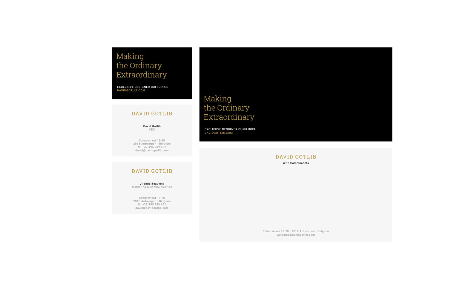
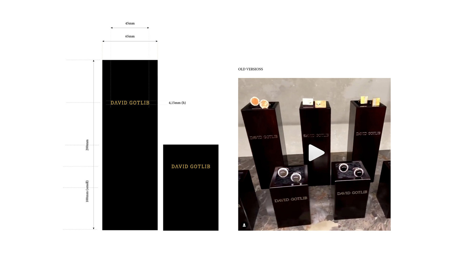
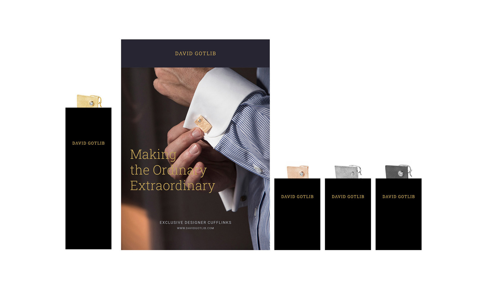
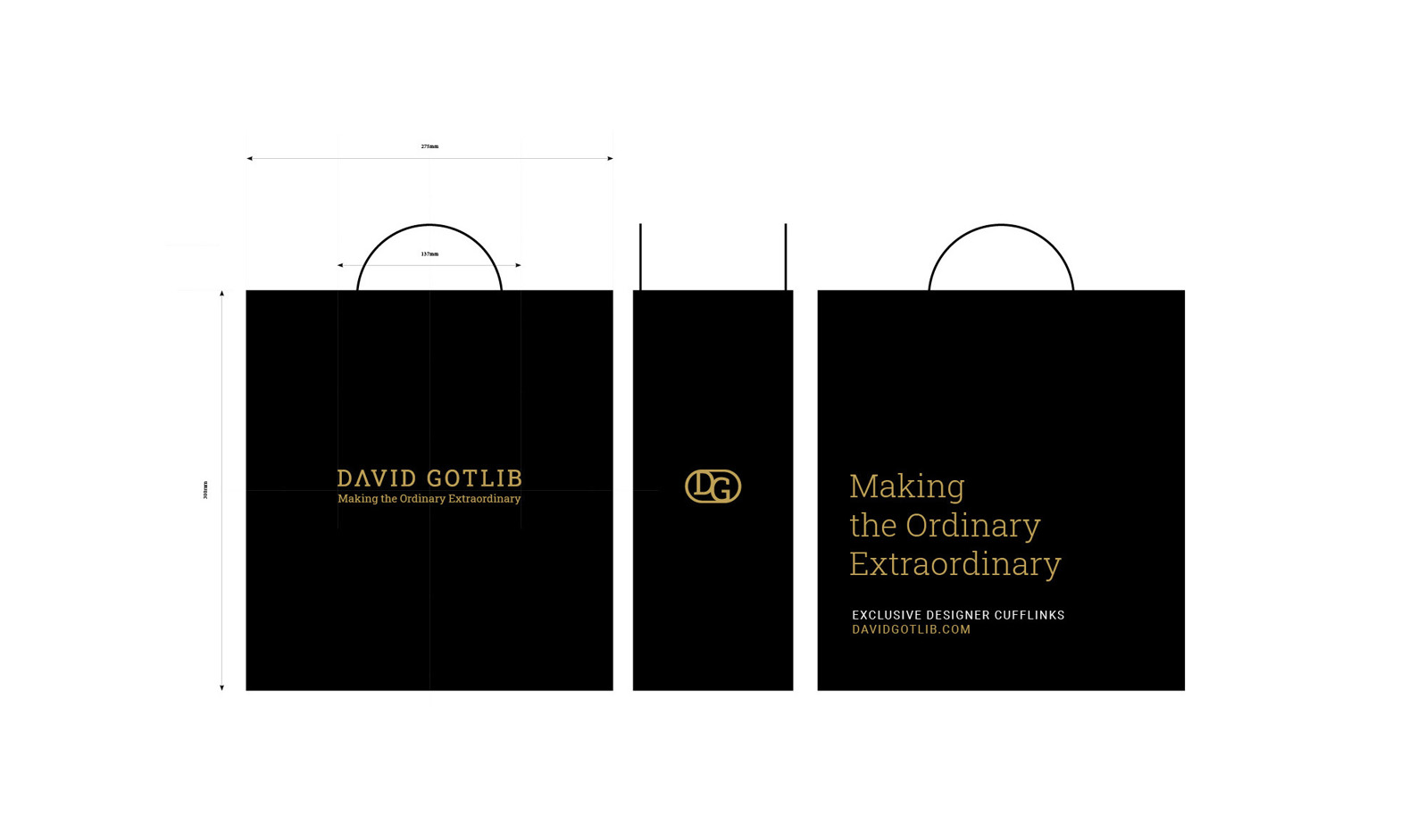
At the request of David Gotlib and with the marketing expertise of Joachim Rubin, we rethought the brand image of DAVID GOTLIB, the iconic cufflink brand. A typographic rebranding was studied and integrated across all communication materials. Special attention was also given to the choice of visuals that perpetuate the tradition and craftsmanship of this extraordinary artisan.


SDA HOLDING

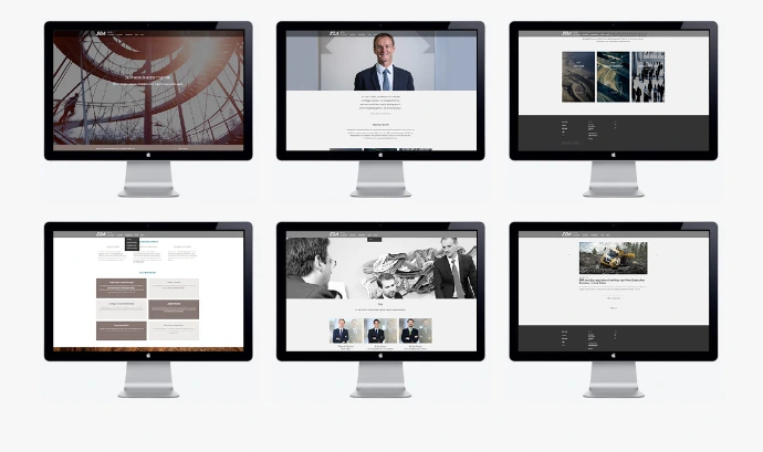
SDA is a private investment company dedicated to long-term entrepreneurial growth.

Project Description

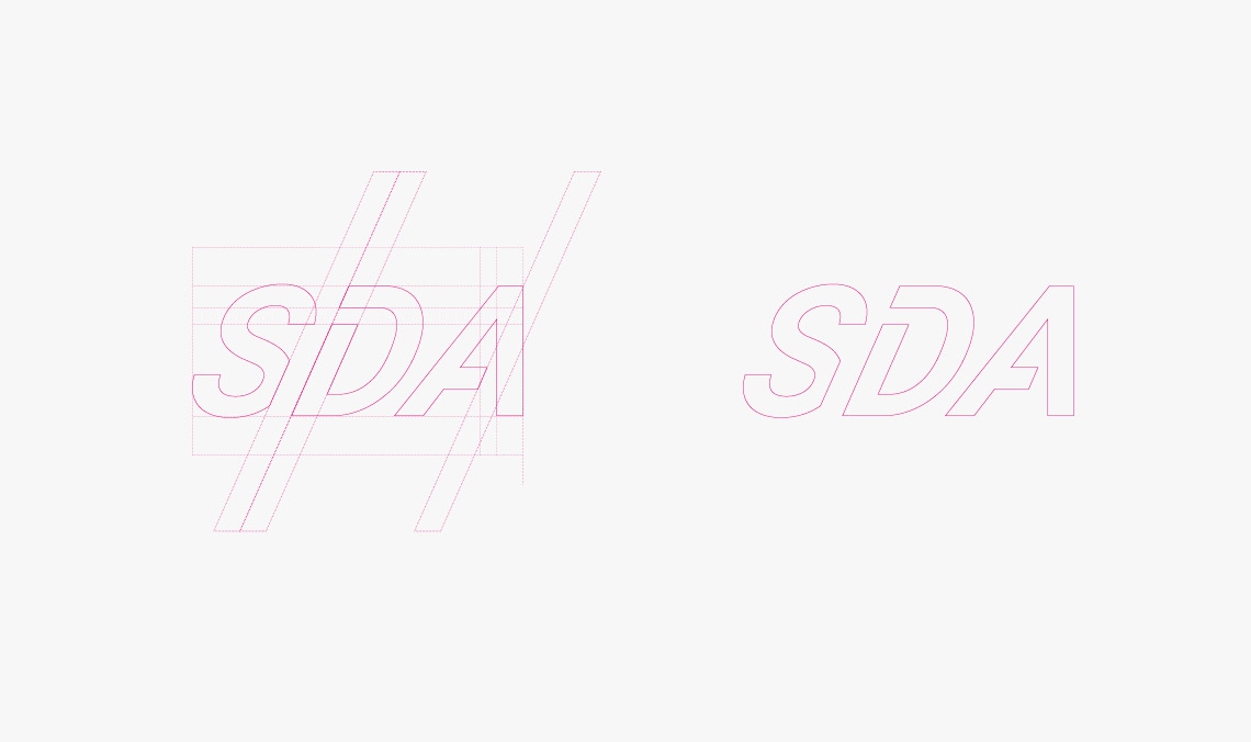
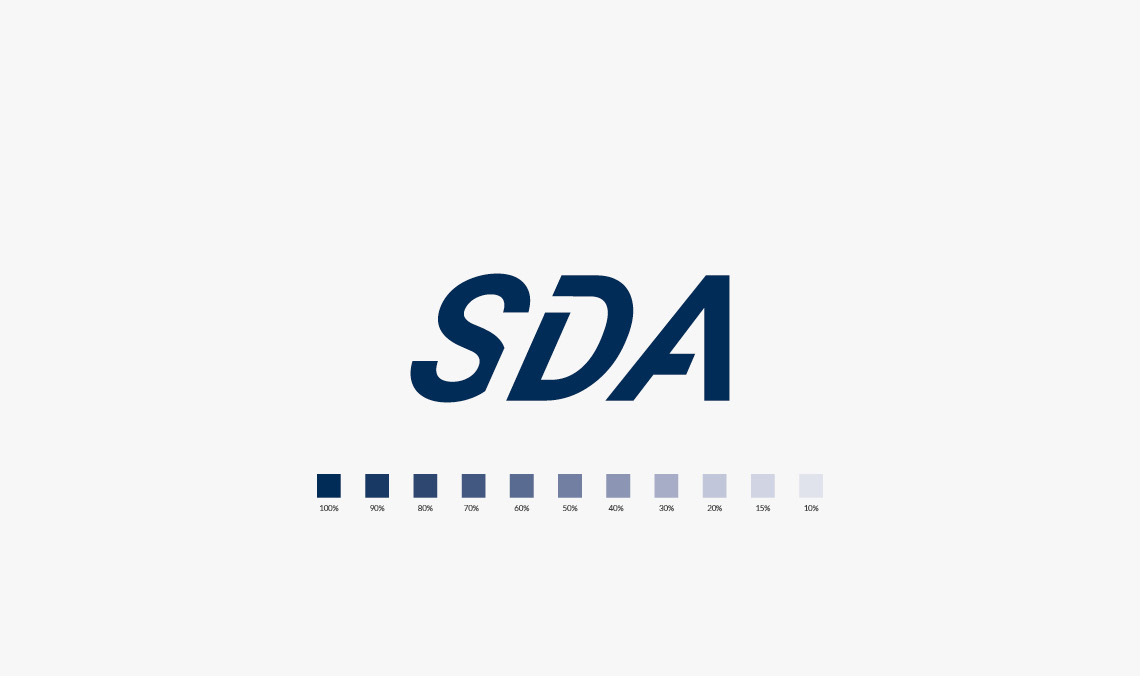
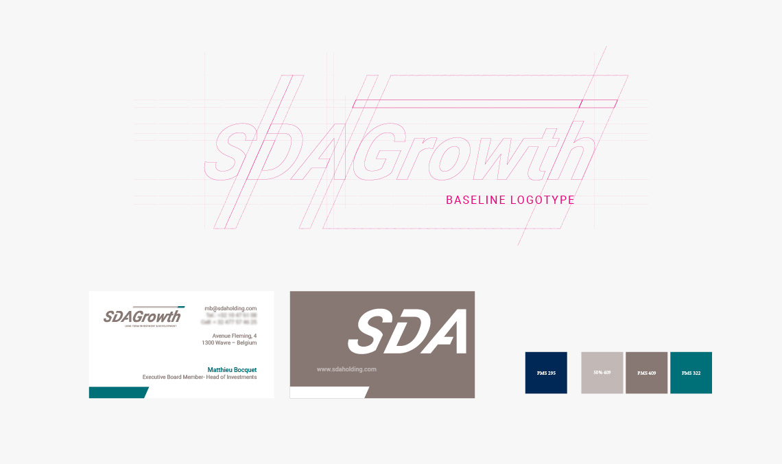
SDA Groupe, an automotive industry company, sought to rethink its identity by modernizing it and shifting its focus more towards the investment sector through its new division, SDA Growth.

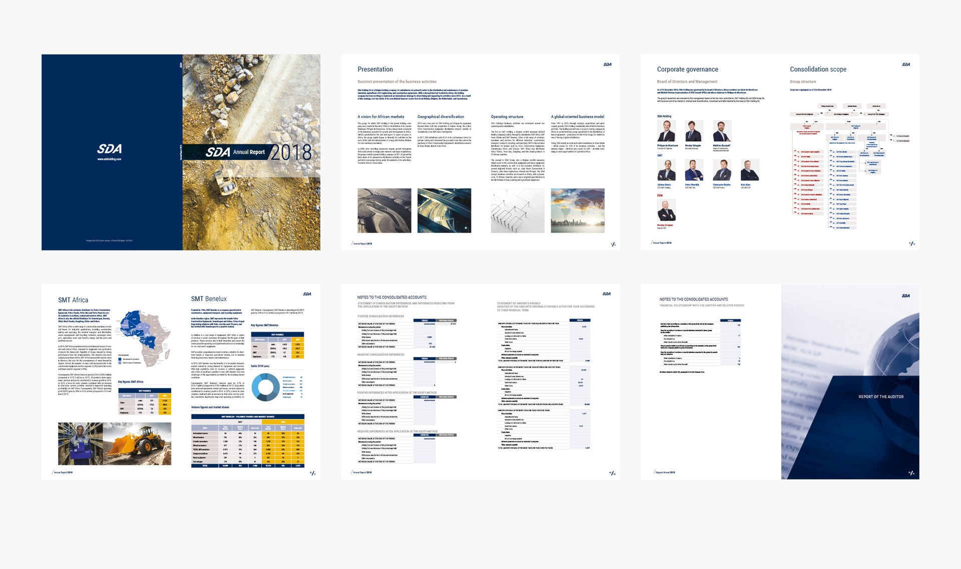
After winning the competition, Skwaadra developed the identity for the new entity; however, it soon became clear that the SDA logo was no longer consistent with the new visual style. Extensive work was undertaken to harmonize and refine the visual identity across all assets—including the creation of a new website and content adaptation—while also refreshing the brand's overall style. The goal was to revitalize the SDA Group's image while remaining true to its roots.


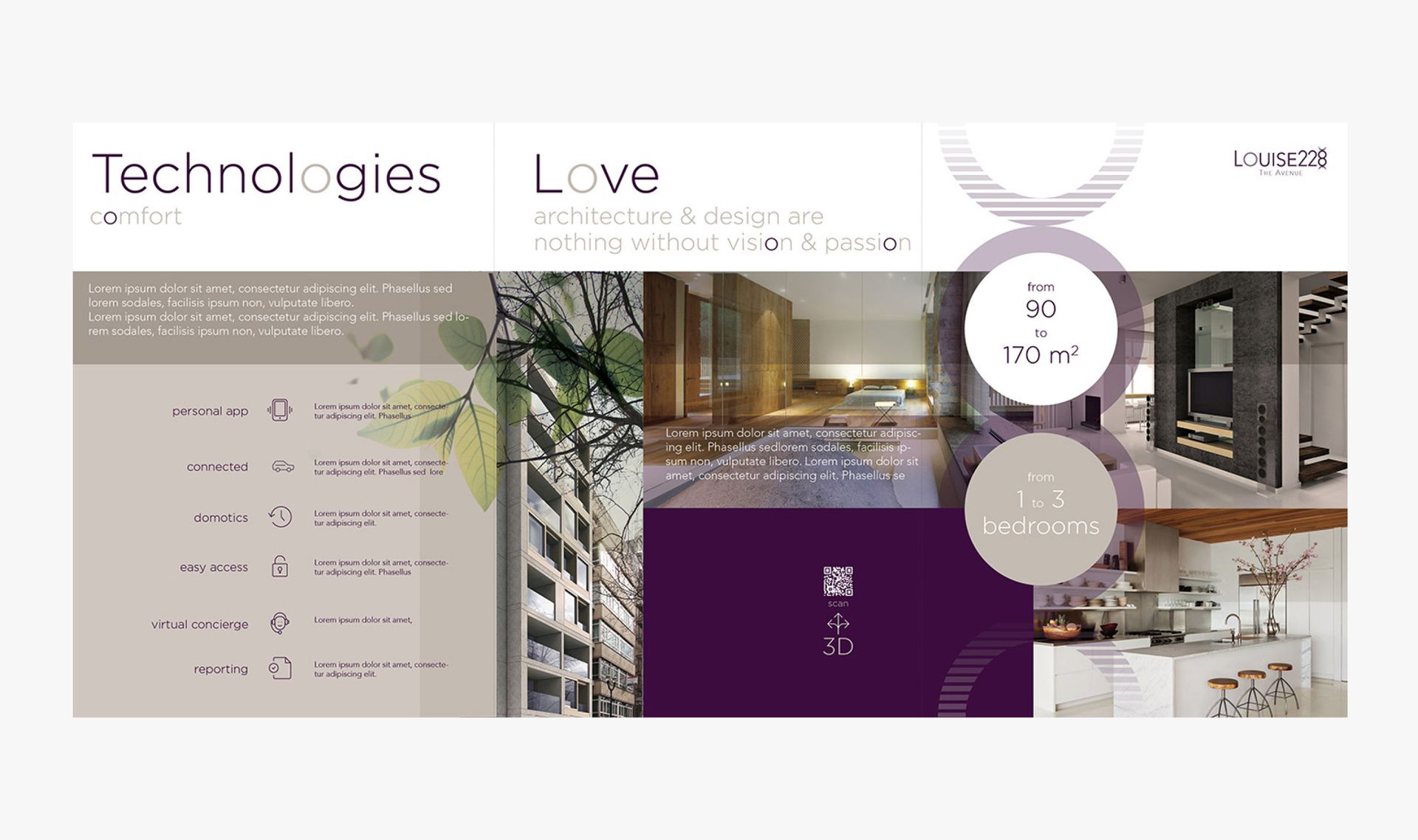
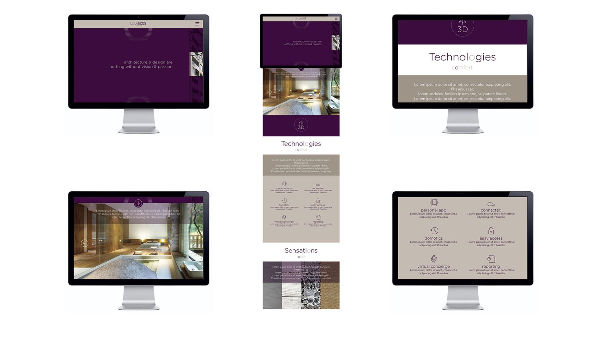
LOUISE 228

A prestigious real estate project on the famous Avenue Louise in the heart of Brussels, the capital of Europe.

Project Description

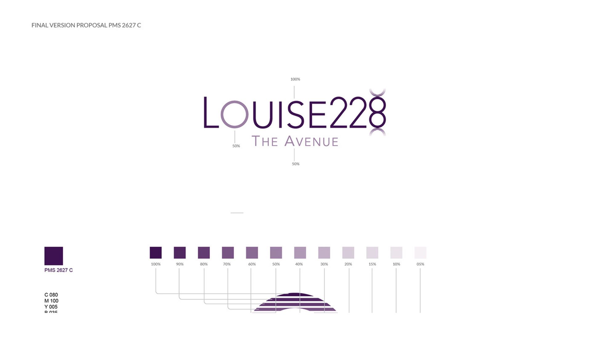
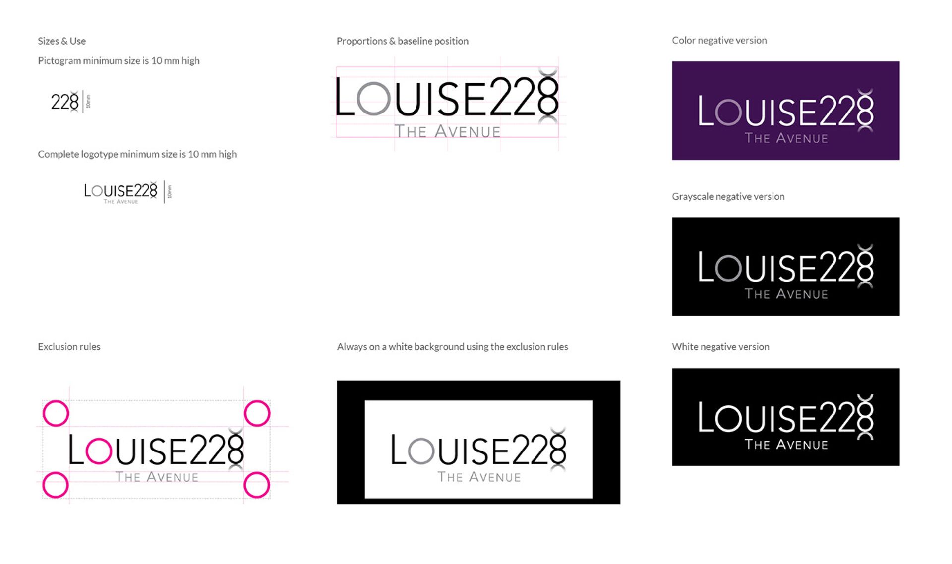
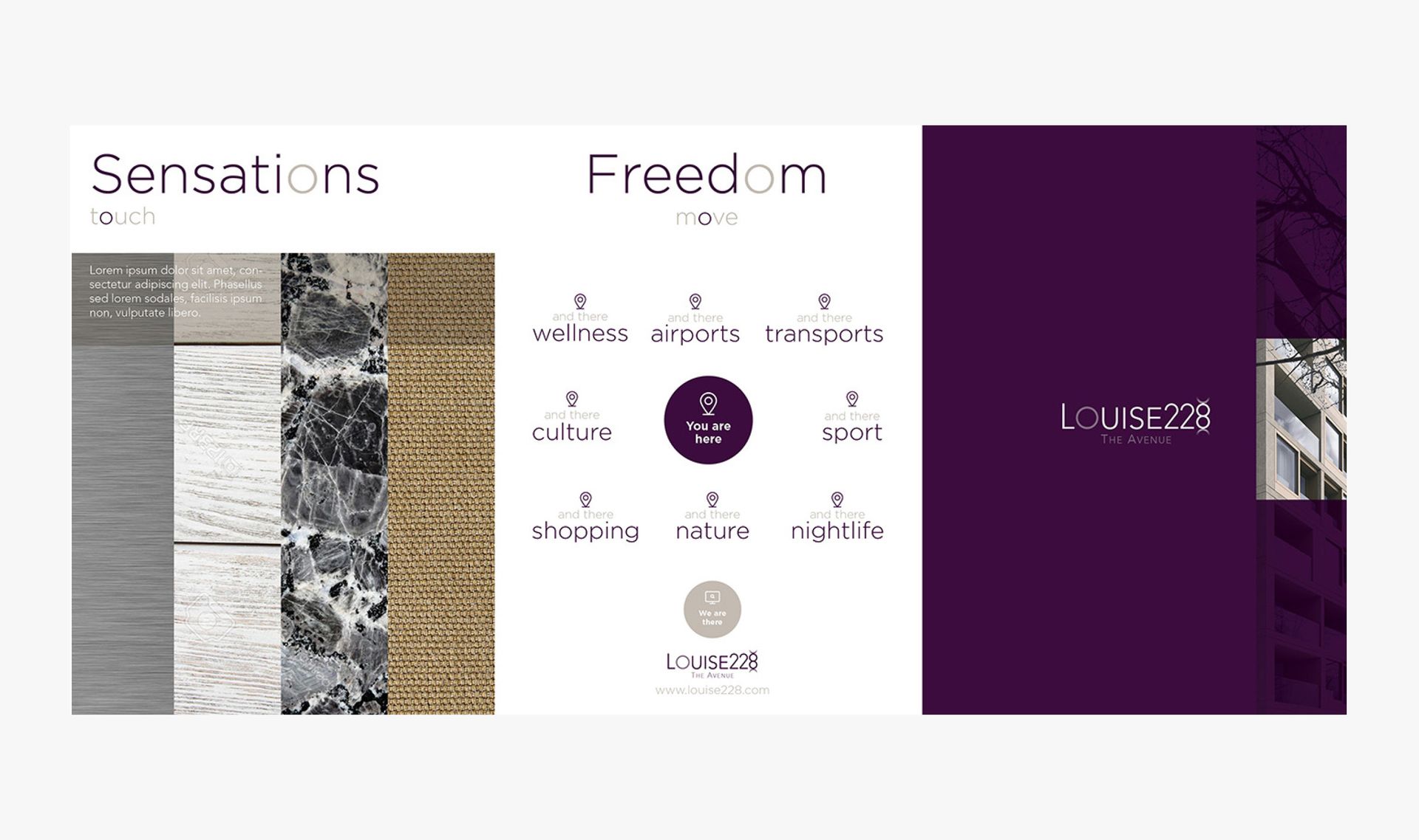
We designed a visual identity for a prestigious real estate project on the famous Avenue Louise in the heart of Brussels. Logo, branding materials, and design of commercial items to reflect the highest standards of this exceptional real estate project.


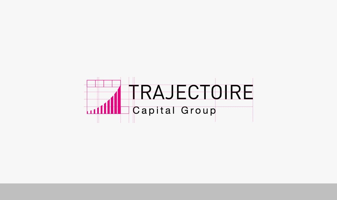
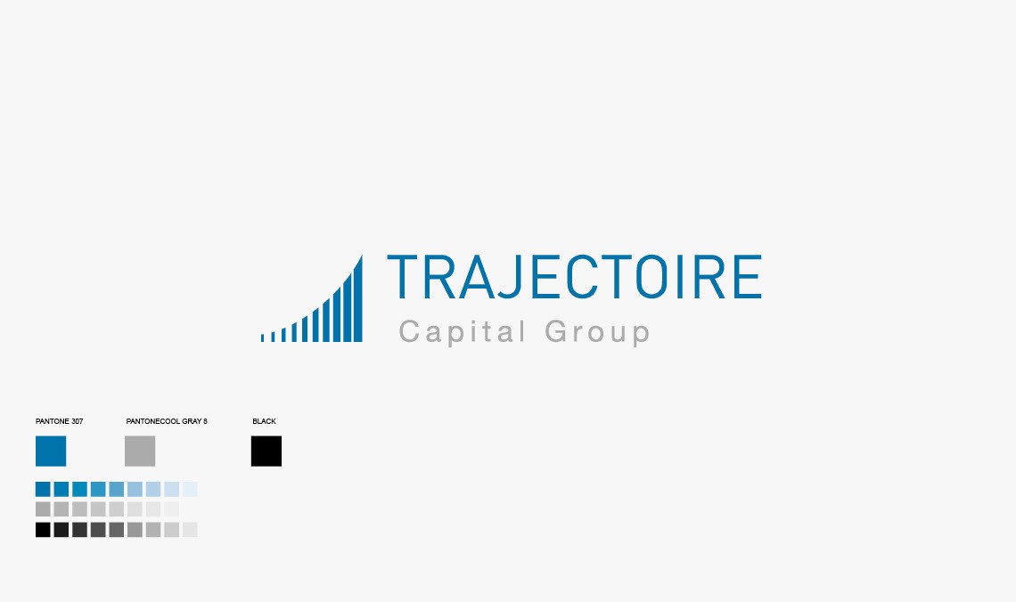
TRAJECTOIRE CAPITAL GROUP

Trajectory Capital Group is a financial management and investment consulting firm based in Geneva with development in major international financial centers.

Project Description

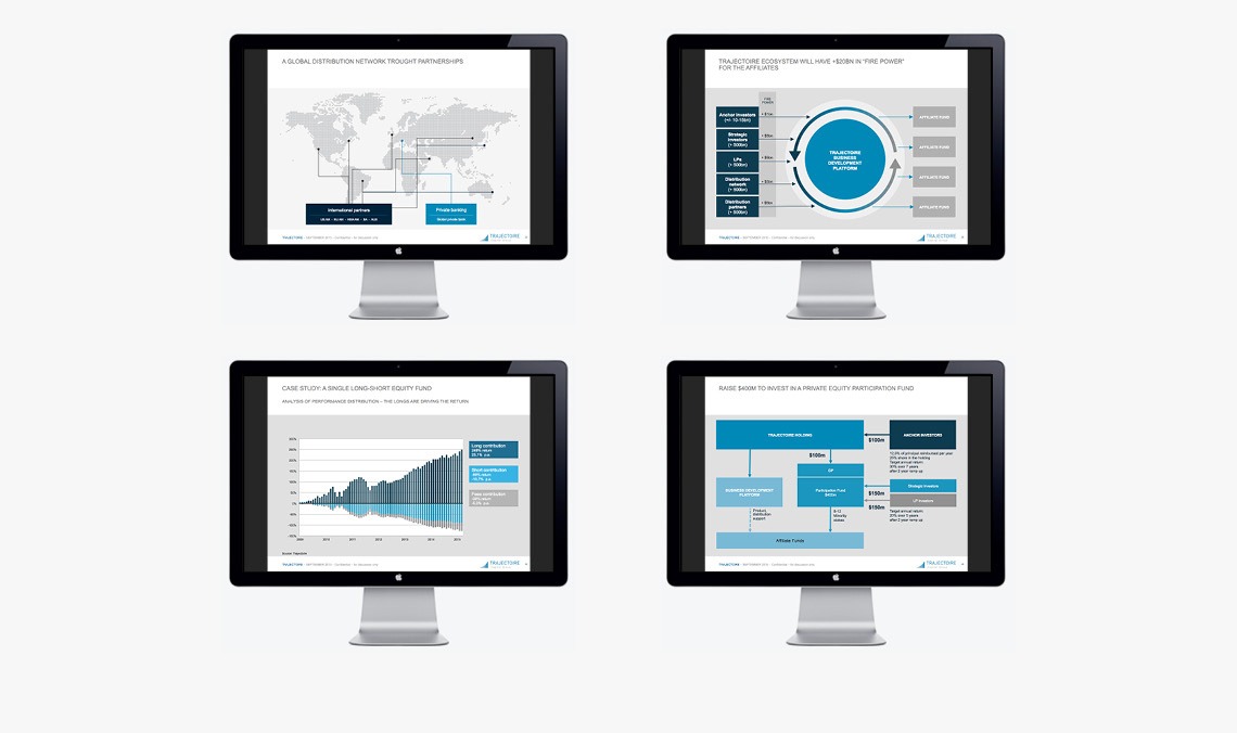
Rigor and dynamism were the two concepts that needed to be reflected in the visual identity. The symbol was developed in direct line with the company's name and represents an ideal and controlled growth curve. The various vertical elements express the diversity of the PEOPLE ENGAGED in the project. A website project is under study for 2016 and several pilot versions will be reduced to a single level of visual identity. A PowerPoint presentation has also been developed for this project as well as business cards.


LEVANT PARTNERS

Levant Partners is a consulting and financial management firm based in Athens, Greece. This company is active on projects in the Middle East and emerging countries.

Project Description

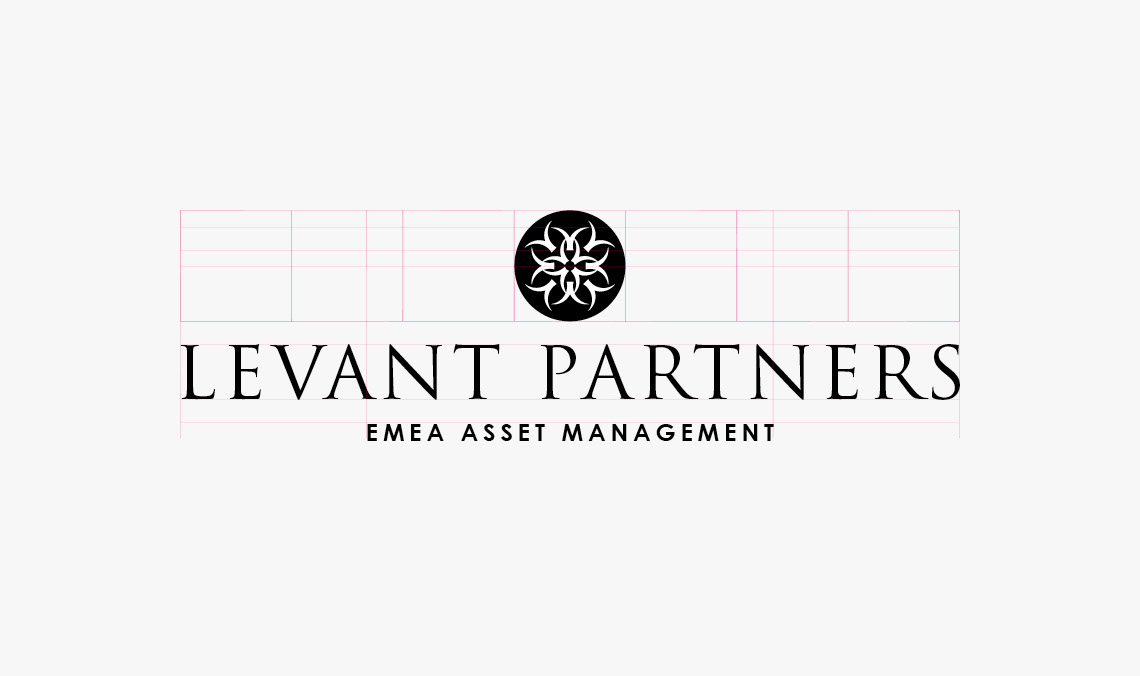
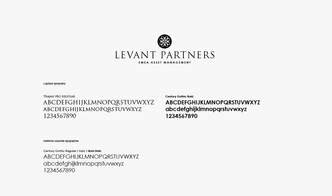
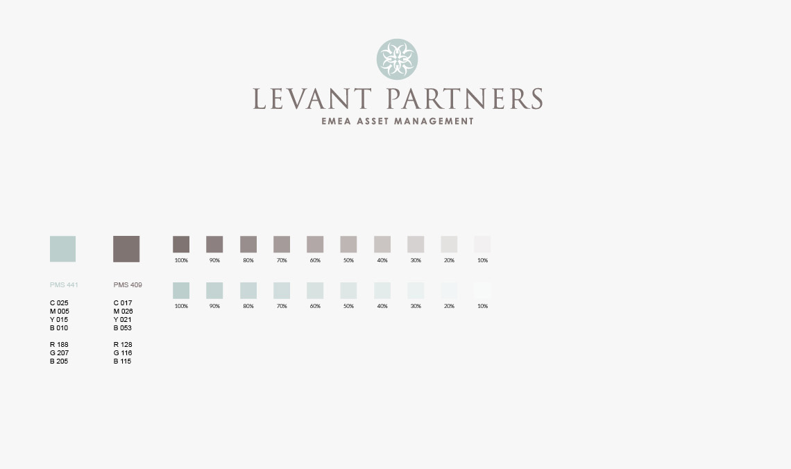
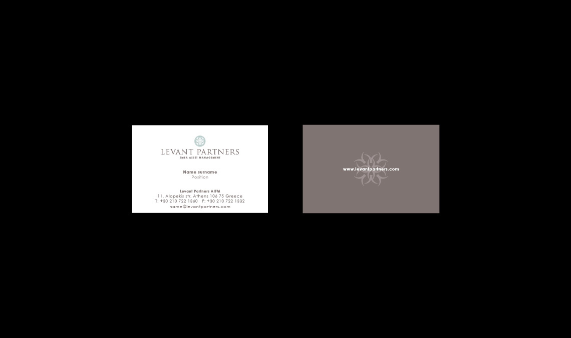
Levant Partners asked Skwaadra to refresh its logo to enhance its perception. We created a new symbol based on a palm leaf to highlight the geographical location of the represented markets. The work on the new colors also aims to increase the premium positioning of Levant Partners.

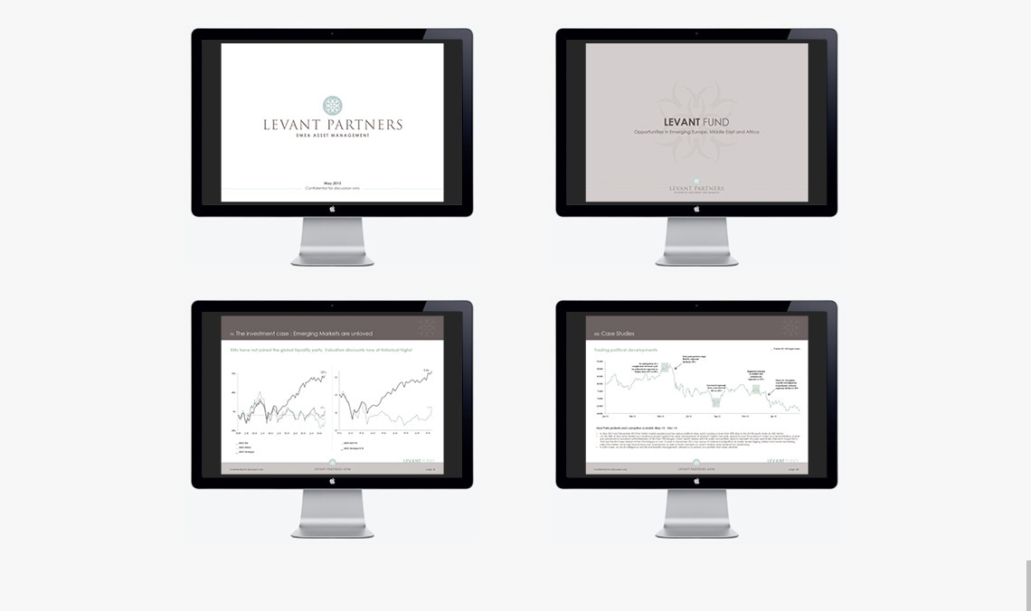
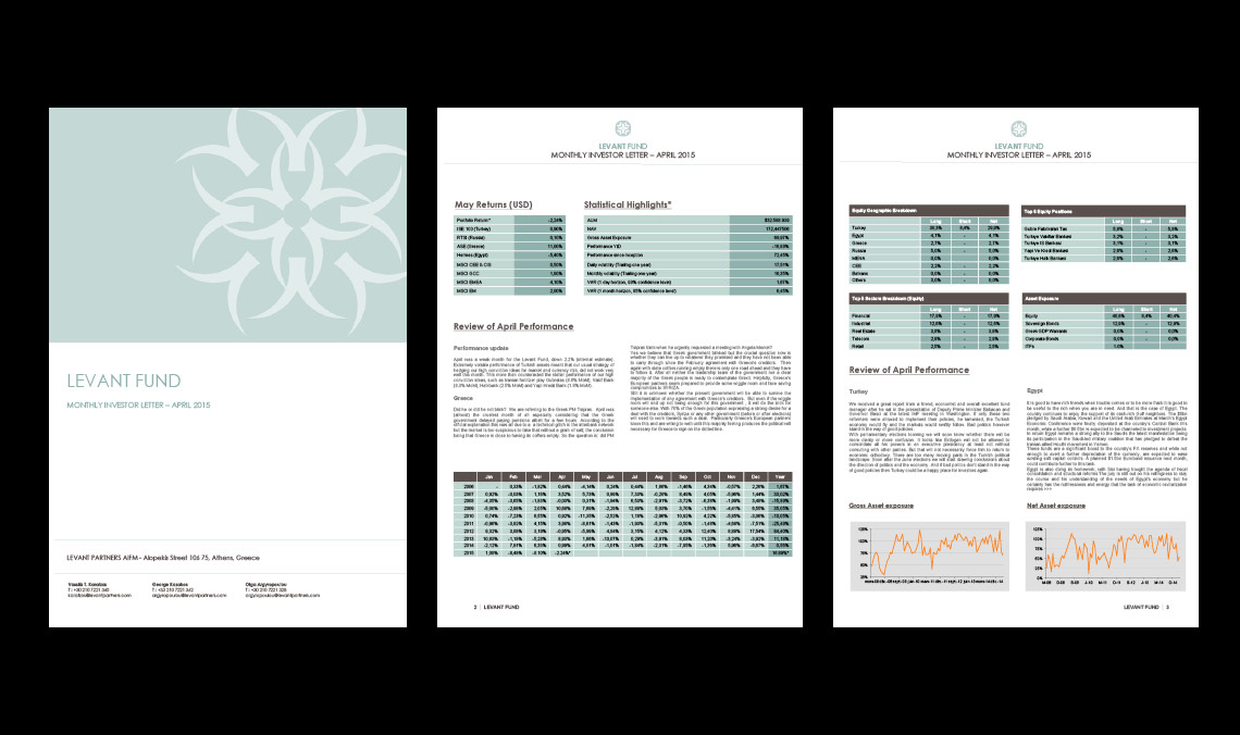
After successfully completing this project, Levant Partners asked us to review all of its internal and external communication, including client presentations and monthly newsletters. We recommended and created a consistent template/format to be used in all its communications.


KHARIS CAPITAL

Kharis Capital is a wealth management company based in Switzerland serving high-net-worth individuals and families. Kharis Capital provides a direct investment platform for like-minded long-term investors in the consumer market.

Project Description

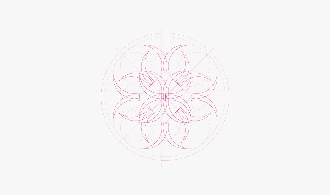
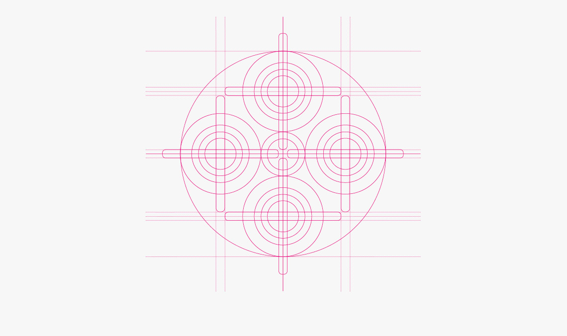
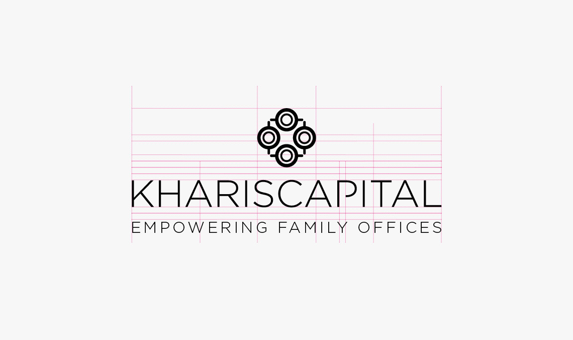
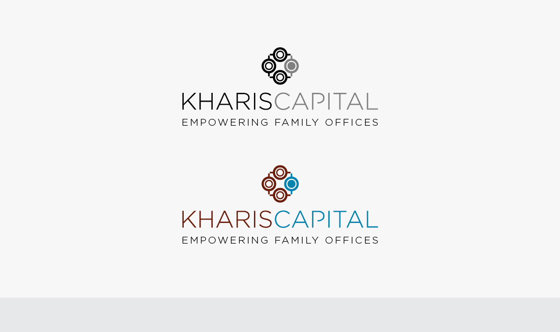
They asked us to create an elegant and meaningful symbol that reflects its values. After thorough analysis, we agreed on the visual concept of a top-down view of amphorae, a chosen symbol representing their business, long-term value, quality investments, and discretion. The colors were chosen to convey a mix of trust and dynamism.


BOOMERANG

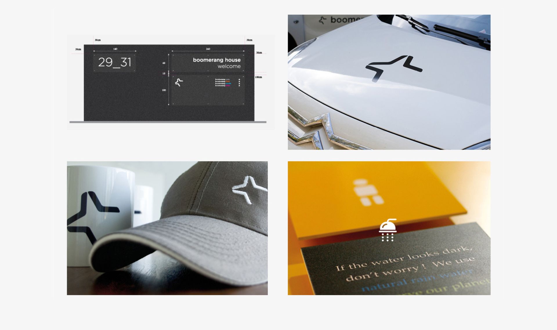
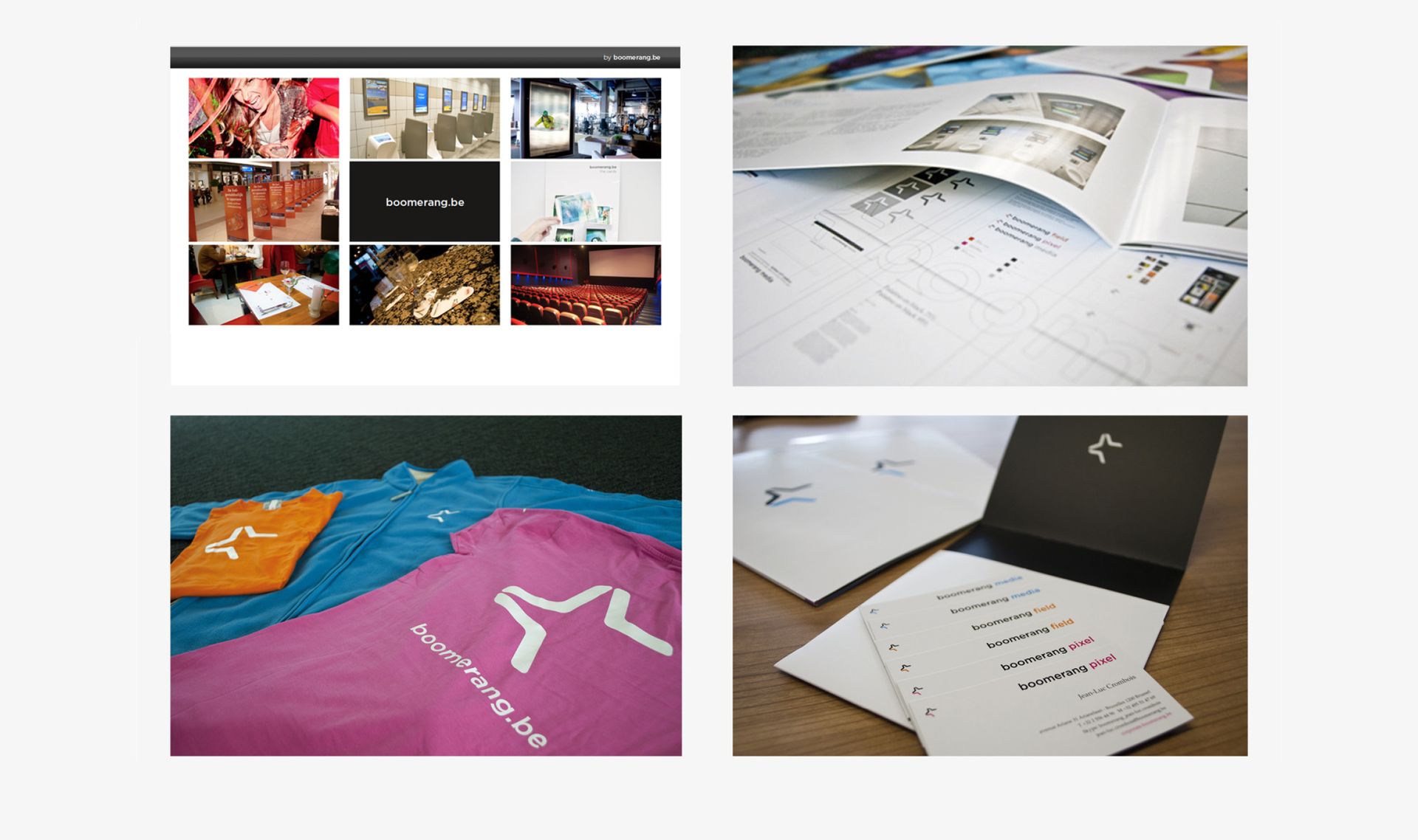
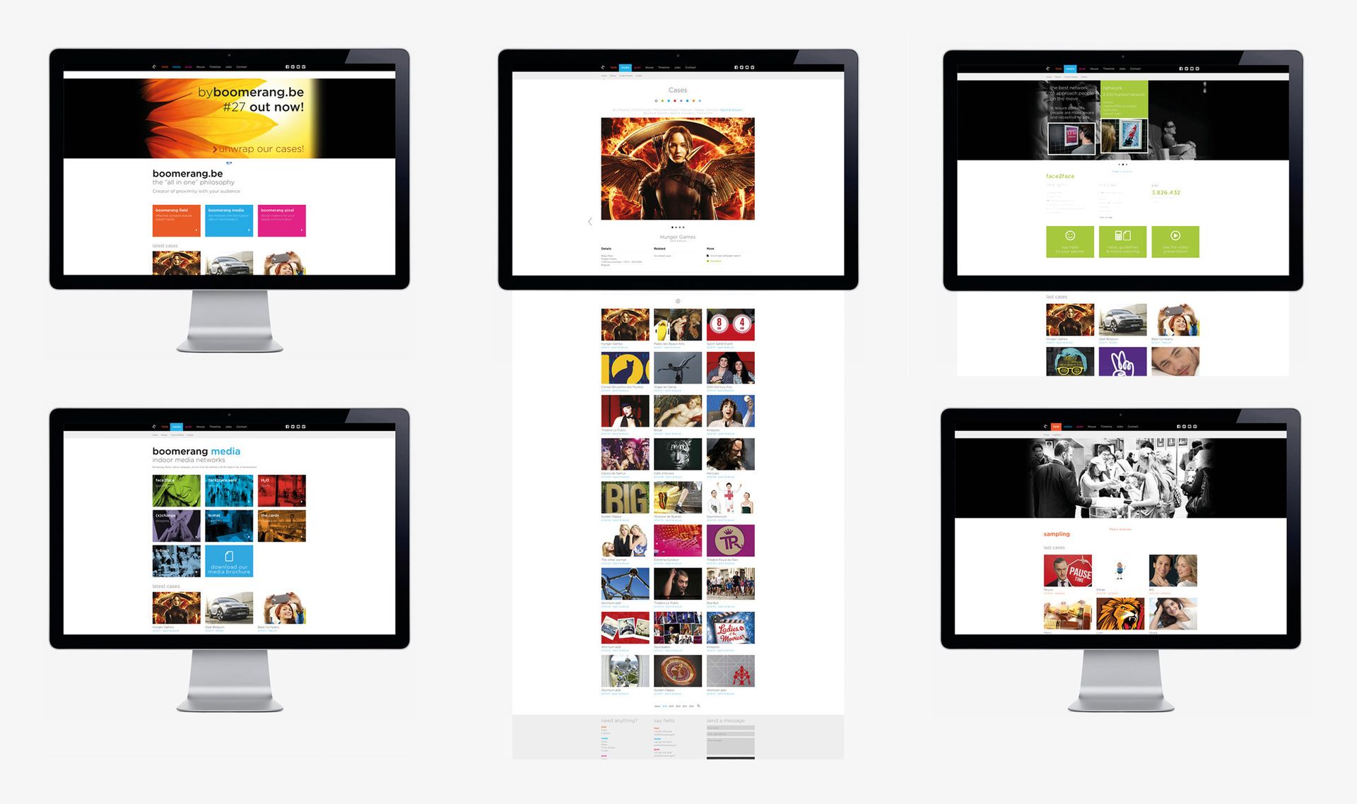
The Boomerang group is a multifaceted advertising agency with three brands; Media, Field, and Pixel. Media is a leader in indoor advertising with several networks such as the famous Boomerang cards.

Project Description

The entire visual identity of Boomerang Pixel has been developed with a 360° approach.


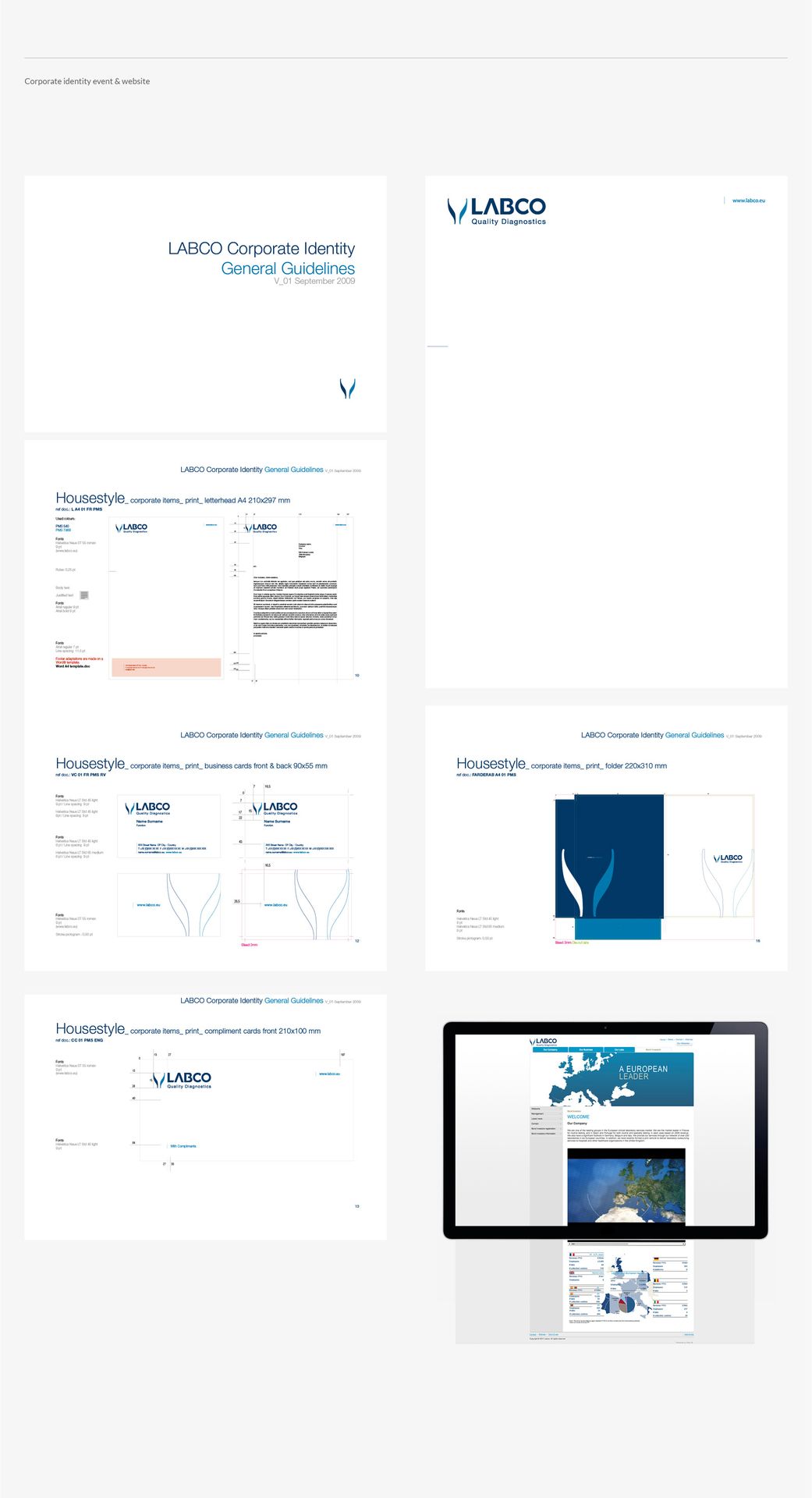
LABCO / SYNLAB

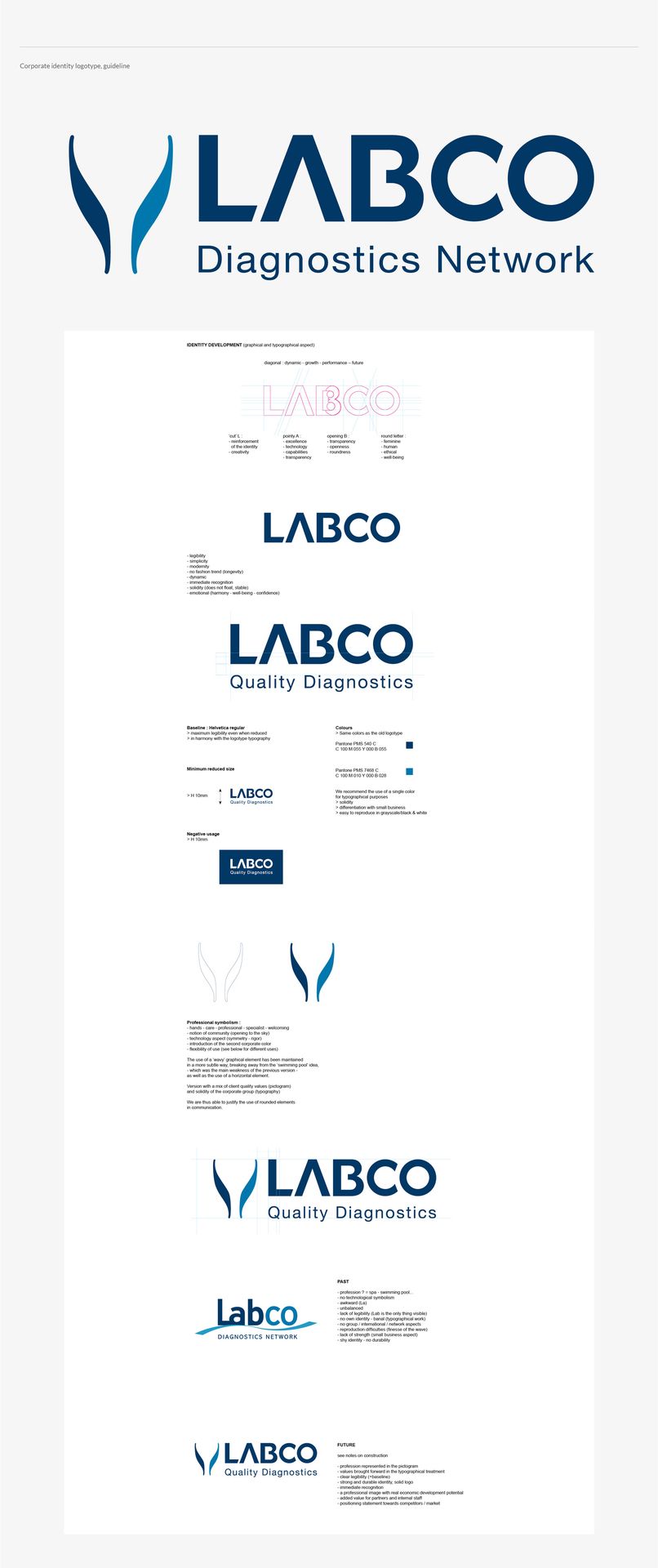
In six years, Labco has become the European leader in medical diagnostics thanks to strong values and commitments. Today it has transformed through acquisition into SynLab.

Project Description

As part of our collaboration with the web agency Sectionmedia, we were tasked with rethinking Labco's visual identity. Discover the result!


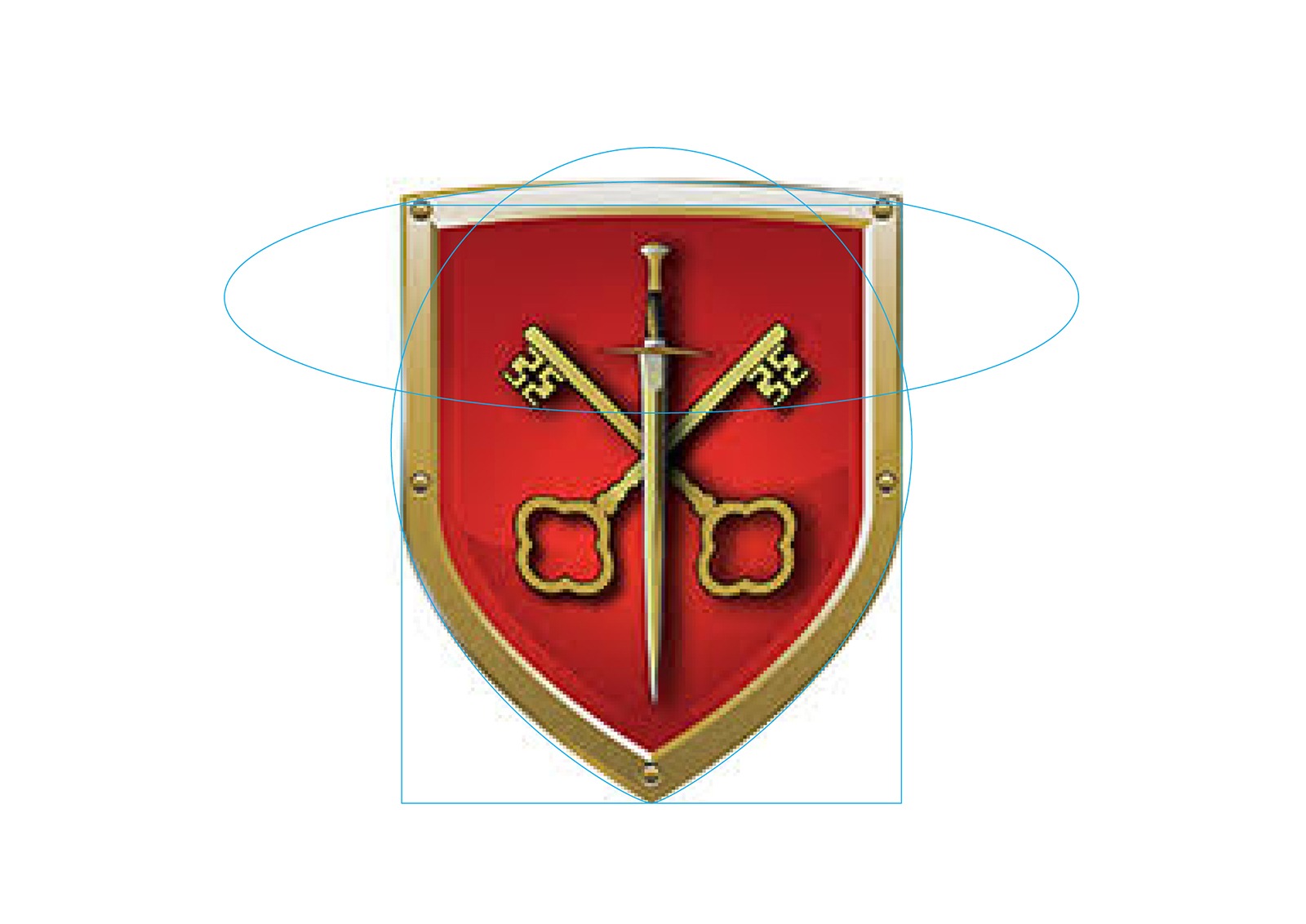
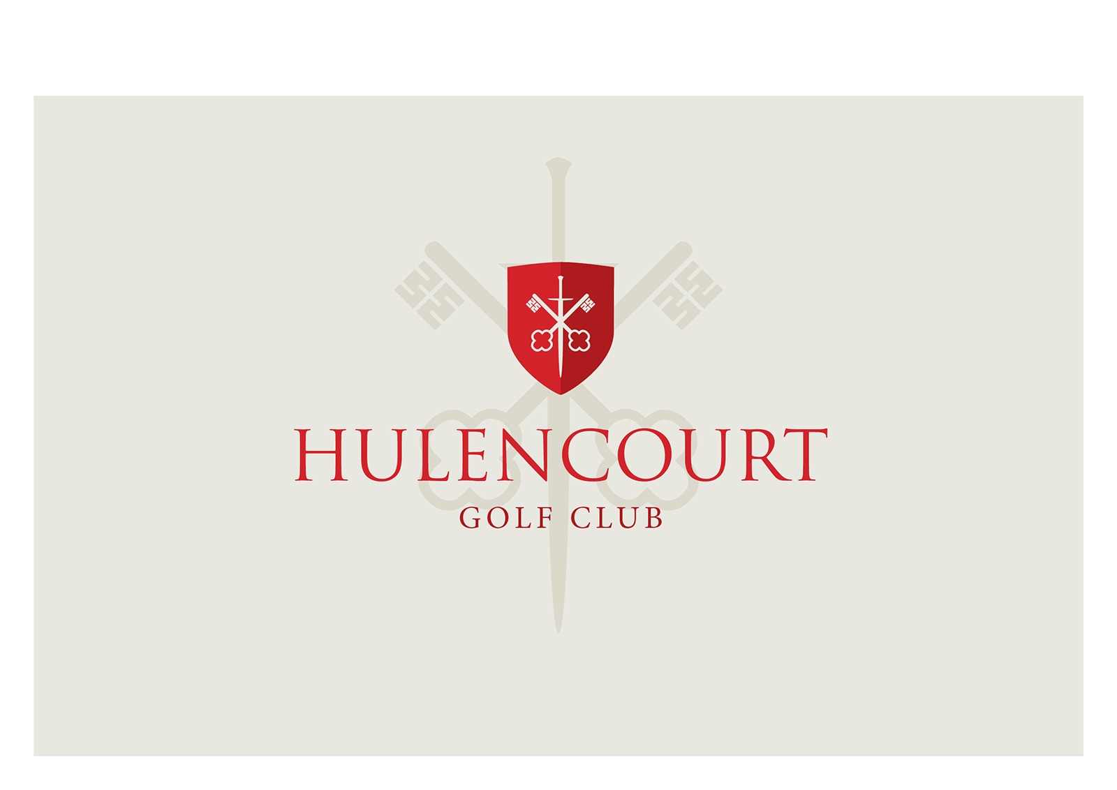
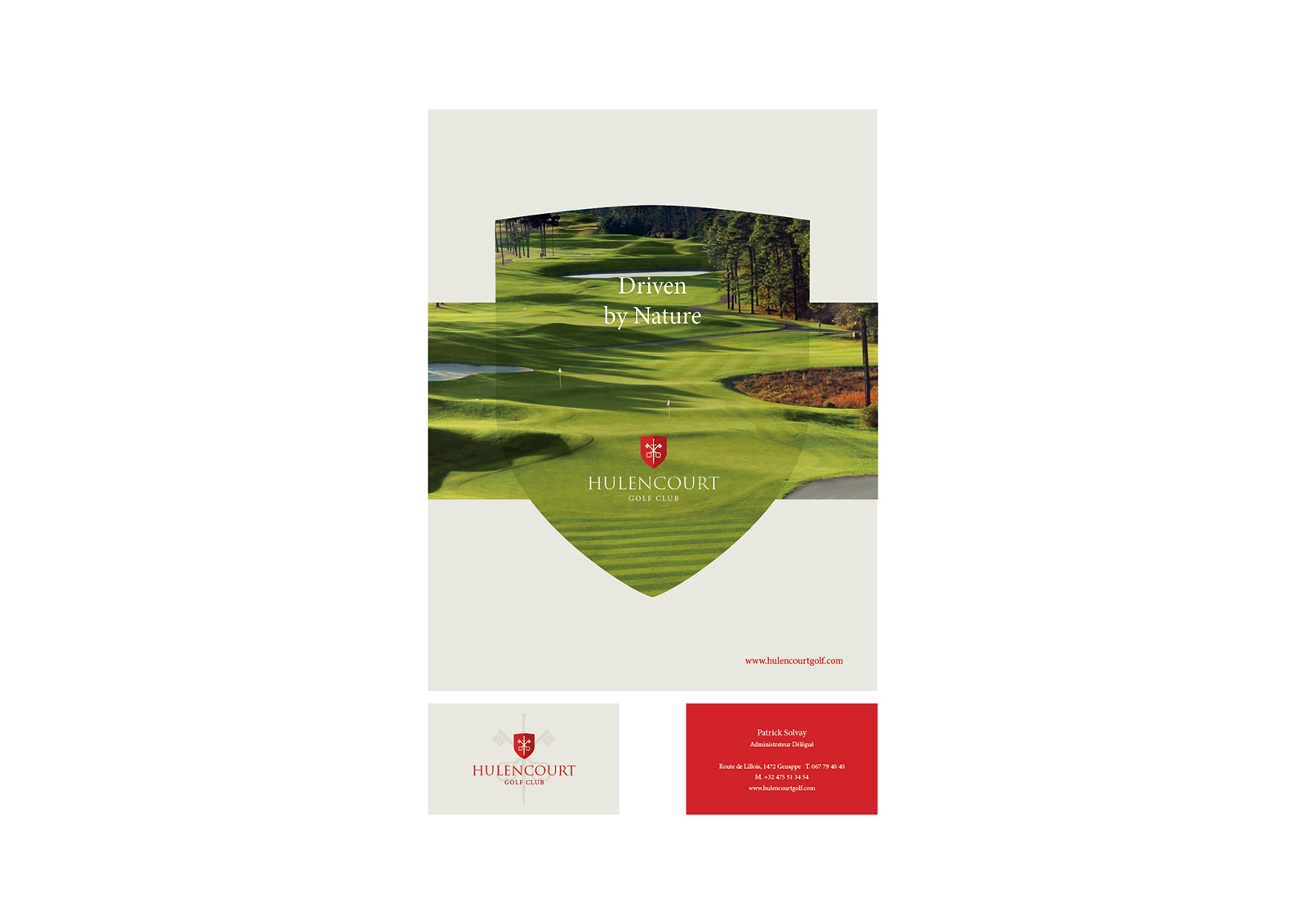
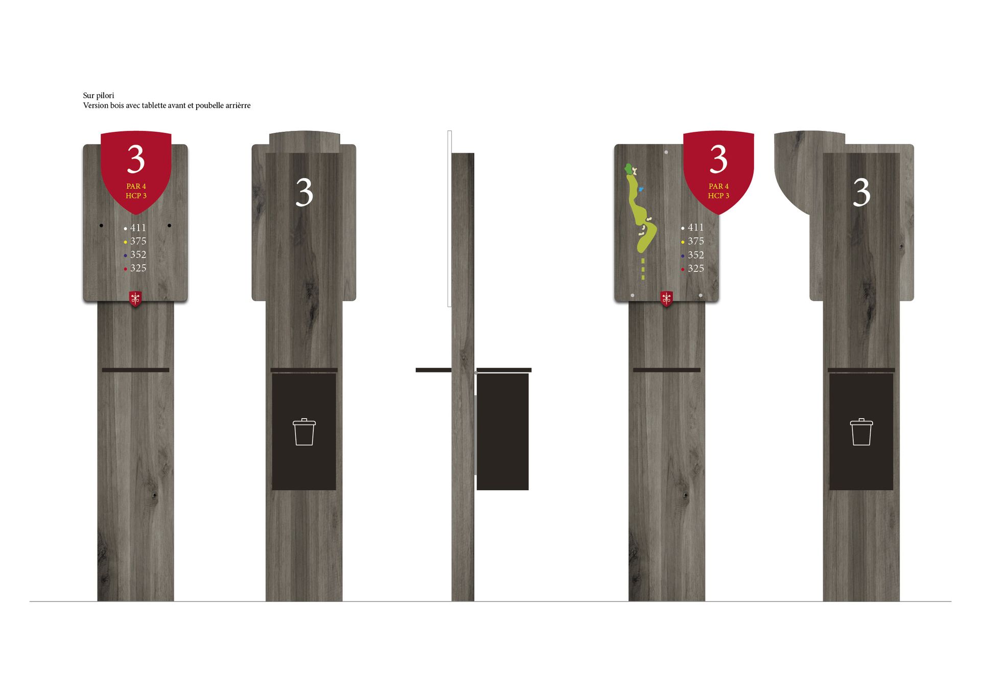
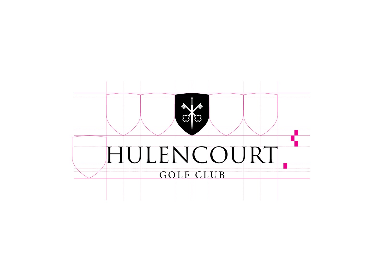
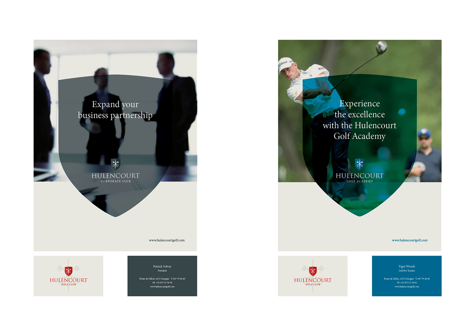
HULENCOURT

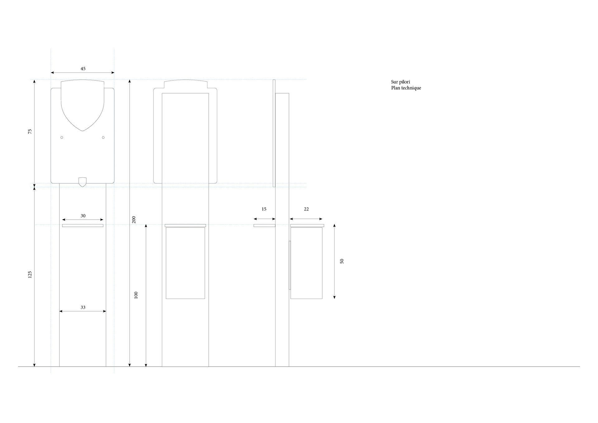
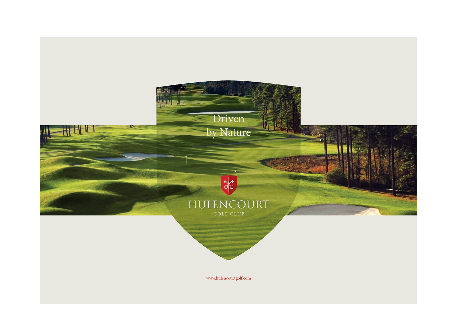
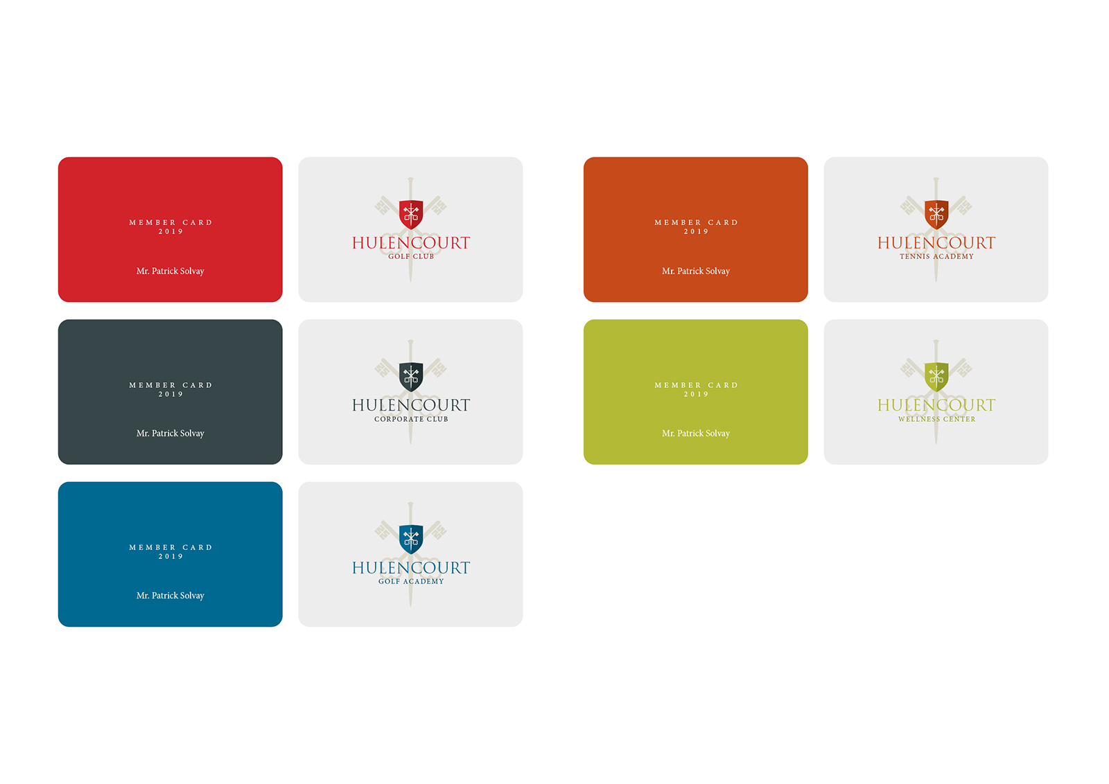
Hulencourt is one of the most beautiful golf courses in Belgium.

Project Description

Dans le cadre de notre collaboration avec l’agence web Sectionmedia, nous Nous avons conçu une nouvelle identité visuelle pour le Golf d’Hulencourt. L’idée était de créer un design épuré tout en préservant le caractère médiéval du site. Hulencourt prévoit également de diversifier les activités qui s’y dérouleront ultérieurement. Le design a été élaboré en tenant compte de cet objectif. À ce stade, il s’agit encore d’un projet.