
48 years without a logo.
And no one noticed.
Test it around you. Ask someone to draw the Decathlon logo. They will draw you a word. Seven blue letters, in uppercase, with that big pointed A. For 48 years, the third largest sports company in the world lived without a symbol. Just a name.
As a graphic designer, this case fascinates me because it poses the opposite question of what I am usually asked. I am often asked to refresh an existing logo. Here, it was necessary to create one for a brand that everyone already knows. It’s a daunting exercise: the slightest misstep, and you give the impression of having changed a brand that no one wanted to see change.
In 2024, Decathlon entrusted this mission to the studio Wolff Olins. The result is called L'Orbit. An open, dynamic circle, with a marked angle and a peak that evokes both the mountain and the wave. Look at it closely: the angle takes from the famous A of the historical wordmark. This is not a detail. It is the entire philosophy of the project.
For the true talent in this redesign is not in what has been created. It is in what has been preserved. The blue, slightly revitalized but immediately recognizable. The wordmark, barely touched. And a custom typography, Decathlon Sans, designed by the Swiss foundry Grilli Type, which extends the geometric spirit of the lettering from the 70s instead of denying it. All the new comes from the old.
Why a symbol, by the way, after half a century without one? The answer is very pragmatic. A seven-letter wordmark does not work on a sock label, a backpack loop, or an app icon. A symbol, yes. Decathlon sells equipment for dozens of sports, on products of all sizes. A short brand was needed, a sign that fits in a square millimeter just as well as on a store facade. It's a lesson I often repeat to my clients: a logo is not a drawing we like, it's a system that must survive all formats.
There is a second lesson, more strategic. Behind L'Orbit, Wolff Olins streamlined a portfolio of 85 internal brands into one. Quechua, Kalenji, Domyos remain, but it is now Decathlon that signs. The company no longer wants to be perceived as a French distributor, but as a global sports brand, in the same mental category as Nike or Adidas. The logo is just the visible part of this repositioning. And that's always how a good redesign works: the graphics reflect a business decision, they do not replace it.
Am I completely convinced? Not entirely. L'Orbit, taken in isolation, could belong to many brands. That's the price of geometric simplicity: you gain versatility what you lose in uniqueness. But I think the bet is right. The symbol is not meant to live alone, it lives with the blue, with the typography, with the orbital movement that animates the entire identity. A logo is never judged alone, it is judged as a system.
One could also criticize the pictogram for being too close to that of Quicksilver, symbolizing the mountain and the sea, but Decathlon's had to be more general and a bit more abstract since it encompasses many more sports than the Quicksilver brand, which outfits riders and surfers on the water and in the mountains.
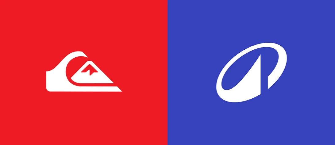
Quicksilver Logo and Decathlon Logo
What I mainly take away is the humility of the gesture. In the face of 48 years of heritage, Wolff Olins did not start from scratch. The studio looked for what existed that deserved to be amplified, and built around it. It is exactly the opposite of the reflex to smooth everything out to make it modern. And it is, in my opinion, the hallmark of redesigns that last.
And above all, today it gives a true visual identity that works very well since for sailing, I took boardshorts from them and in terms of image, it competes with the historic brands like Quicksilver or O’neill.
The next time you pass by a Decathlon, look up. This little open circle that you will see everywhere tells a story of 48 years. It just gives the impression of having always been there. It is the greatest compliment one can give to a new logo.
I’m going back to windsurfing, the wind returned this morning.